最终效果预览
这个模板将包含:
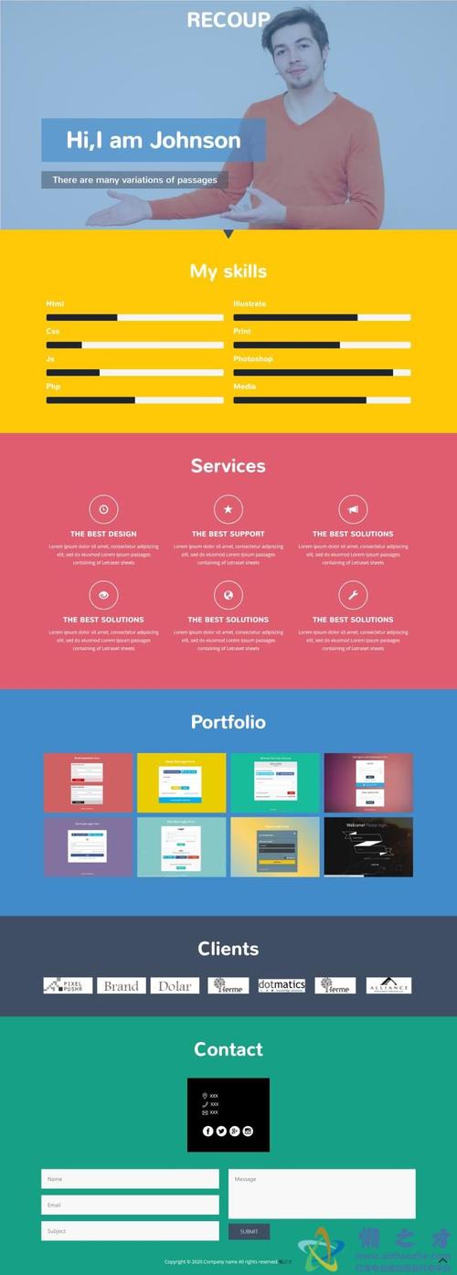
(图片来源网络,侵删)
- 全屏英雄区:带有动态背景和居中标题。
- 区:包含两个部分,一个背景图片滚动较慢,文字内容滚动较快。
- 区:用于展示信息,无视差效果。
- 全屏视频/图片背景区:再次利用视差效果,增强视觉冲击力。
- 页脚:标准的网站底部信息。
你可以直接复制下面的代码,保存为 index.html 文件,然后用浏览器打开即可看到效果。
完整代码 (index.html)
<!DOCTYPE html>
<html lang="zh-CN">
<head>
<meta charset="UTF-8">
<meta name="viewport" content="width=device-width, initial-scale=1.0">HTML5 单页滚动视差模板</title>
<!-- 引入 Google Fonts -->
<link rel="preconnect" href="https://fonts.googleapis.com">
<link rel="preconnect" href="https://fonts.gstatic.com" crossorigin>
<link href="https://fonts.googleapis.com/css2?family=Poppins:wght@400;600;700&display=swap" rel="stylesheet">
<style>
/* --- 全局样式 --- */
* {
margin: 0;
padding: 0;
box-sizing: border-box;
}
html {
scroll-behavior: smooth; /* 平滑滚动 */
}
body {
font-family: 'Poppins', sans-serif;
overflow-x: hidden; /* 隐藏水平滚动条 */
color: #333;
}
/* --- 导航栏 --- */
.navbar {
position: fixed;
top: 0;
left: 0;
width: 100%;
padding: 1.5rem 5%;
background-color: rgba(255, 255, 255, 0.85); /* 半透明背景 */
backdrop-filter: blur(10px); /* 毛玻璃效果 */
z-index: 1000;
transition: all 0.3s ease;
}
.navbar.sticky {
padding: 1rem 5%;
background-color: rgba(255, 255, 255, 0.95);
box-shadow: 0 2px 10px rgba(0, 0, 0, 0.1);
}
.navbar .nav-container {
display: flex;
justify-content: space-between;
align-items: center;
max-width: 1200px;
margin: 0 auto;
}
.logo {
font-size: 1.8rem;
font-weight: 700;
color: #2c3e50;
}
.nav-links {
display: flex;
list-style: none;
gap: 2rem;
}
.nav-links a {
text-decoration: none;
color: #333;
font-weight: 600;
transition: color 0.3s ease;
}
.nav-links a:hover {
color: #3498db;
}
/* --- 区块通用样式 --- */
.section {
min-height: 100vh; /* 每个区块占满一屏高度 */
padding: 5rem 5%;
display: flex;
align-items: center;
justify-content: center;
position: relative;
}
.container {
max-width: 1200px;
margin: 0 auto;
width: 100%;
}
/* --- 1. 英雄区 --- */
#hero {
background: linear-gradient(135deg, #667eea 0%, #764ba2 100%);
color: white;
text-align: center;
}
#hero h1 {
font-size: 4rem;
margin-bottom: 1rem;
animation: fadeInUp 1s ease;
}
#hero p {
font-size: 1.2rem;
margin-bottom: 2rem;
animation: fadeInUp 1s ease 0.2s;
animation-fill-mode: both;
}
.cta-button {
display: inline-block;
padding: 1rem 2rem;
background-color: #fff;
color: #667eea;
text-decoration: none;
border-radius: 50px;
font-weight: 600;
transition: transform 0.3s ease, box-shadow 0.3s ease;
animation: fadeInUp 1s ease 0.4s;
animation-fill-mode: both;
}
.cta-button:hover {
transform: translateY(-5px);
box-shadow: 0 10px 20px rgba(0, 0, 0, 0.2);
}
/* --- 2. 视差内容区 1 --- */
#parallax-1 {
background-color: #f4f4f4;
position: relative;
overflow: hidden;
}
.parallax-bg {
position: absolute;
top: 0;
left: 0;
width: 100%;
height: 120%; /* 背景图稍高,以产生视差效果 */
background-image: url('https://images.unsplash.com/photo-1546441743-3154068983d2?q=80&w=2070&auto=format&fit=crop');
background-size: cover;
background-position: center;
background-attachment: fixed; /* 视差效果的核心属性 */
will-change: transform; /* 性能优化 */
z-index: -1;
}
.parallax-content {
text-align: center;
background-color: rgba(255, 255, 255, 0.9);
padding: 3rem;
border-radius: 15px;
box-shadow: 0 10px 30px rgba(0, 0, 0, 0.1);
}
.parallax-content h2 {
font-size: 3rem;
margin-bottom: 1.5rem;
color: #2c3e50;
}
.parallax-content p {
font-size: 1.1rem;
line-height: 1.8;
color: #555;
}
/* --- 3. 纯色内容区 --- */
#content {
background-color: #fff;
}
.content-wrapper {
display: flex;
flex-wrap: wrap;
gap: 2rem;
justify-content: space-around;
}
.feature-card {
flex: 1;
min-width: 250px;
padding: 2rem;
text-align: center;
border: 1px solid #eee;
border-radius: 10px;
transition: transform 0.3s ease, box-shadow 0.3s ease;
}
.feature-card:hover {
transform: translateY(-10px);
box-shadow: 0 15px 30px rgba(0, 0, 0, 0.1);
}
.feature-icon {
font-size: 3rem;
margin-bottom: 1rem;
}
.feature-card h3 {
font-size: 1.5rem;
margin-bottom: 1rem;
color: #2c3e50;
}
/* --- 4. 视差内容区 2 (视频背景) --- */
#parallax-2 {
position: relative;
display: flex;
align-items: center;
justify-content: center;
color: white;
overflow: hidden;
}
.video-bg {
position: absolute;
top: 50%;
left: 50%;
min-width: 100%;
min-height: 100%;
width: auto;
height: auto;
transform: translateX(-50%) translateY(-50%);
z-index: -2;
}
.video-overlay {
position: absolute;
top: 0;
left: 0;
width: 100%;
height: 100%;
background: rgba(0, 0, 0, 0.5); /* 半透明遮罩,提高文字可读性 */
z-index: -1;
}
.video-content {
text-align: center;
z-index: 1;
}
.video-content h2 {
font-size: 3.5rem;
margin-bottom: 1rem;
}
.video-content p {
font-size: 1.2rem;
max-width: 600px;
margin: 0 auto 2rem;
}
/* --- 5. 页脚 --- */
footer {
background-color: #2c3e50;
color: #ecf0f1;
text-align: center;
padding: 2rem 5%;
}
footer p {
font-size: 1rem;
}
/* --- 动画 --- */
@keyframes fadeInUp {
from {
opacity: 0;
transform: translateY(30px);
}
to {
opacity: 1;
transform: translateY(0);
}
}
/* --- 响应式设计 --- */
@media (max-width: 768px) {
.nav-links {
display: none; /* 在移动端隐藏导航链接,可以换成汉堡菜单 */
}
#hero h1 {
font-size: 2.5rem;
}
.parallax-content h2, .video-content h2 {
font-size: 2rem;
}
.section {
padding: 3rem 5%;
}
}
</style>
</head>
<body>
<!-- 导航栏 -->
<nav class="navbar" id="navbar">
<div class="nav-container">
<div class="logo">MyBrand</div>
<ul class="nav-links">
<li><a href="#hero">首页</a></li>
<li><a href="#parallax-1">lt;/a></li>
<li><a href="#content">服务</a></li>
<li><a href="#parallax-2">联系</a></li>
</ul>
</div>
</nav>
<!-- 1. 英雄区 -->
<section id="hero">
<div class="container">
<h1>欢迎来到未来</h1>
<p>体验令人惊叹的视差滚动效果</p>
<a href="#parallax-1" class="cta-button">探索更多</a>
</div>
</section>
<!-- 2. 视差内容区 1 -->
<section id="parallax-1">
<div class="parallax-bg"></div>
<div class="container">
<div class="parallax-content">
<h2>我们是谁</h2>
<p>我们是一群充满激情的创造者和开发者,致力于打造独一无二的数字体验,通过巧妙的设计和前沿的技术,我们帮助您的品牌在数字世界中脱颖而出,背景图片的滚动速度与内容不同,这就是视差效果的魔力所在。</p>
</div>
</div>
</section>
<!-- 3. 纯色内容区 -->
<section id="content">
<div class="container">
<div class="content-wrapper">
<div class="feature-card">
<div class="feature-icon">🚀</div>
<h3>极速性能</h3>
<p>优化的代码和高效的资源加载,确保您的网站飞快运行。</p>
</div>
<div class="feature-card">
<div class="feature-icon">🎨</div>
<h3>精美设计</h3>
<p>紧跟潮流的设计理念,打造美观且用户友好的界面。</p>
</div>
<div class="feature-card">
<div class="feature-icon">📱</div>
<h3>响应式布局</h3>
<p>完美适配所有设备,从桌面电脑到智能手机,体验始终如一。</p>
</div>
</div>
</div>
</section>
<!-- 4. 视差内容区 2 (视频背景) -->
<section id="parallax-2">
<!--
注意:实际项目中,请使用你的视频文件。
这里使用一个来自 pexels 的示例视频链接。
你也可以使用 <video> 标签并设置 muted autoplay loop。
-->
<div class="video-bg" style="background-image: url('https://player.vimeo.com/external/194837908.sd.mp4?s=c350076905b78c67f74d7ee39fdb4fef01d12420&profile_id=164'); background-size: cover; background-position: center;"></div>
<div class="video-overlay"></div>
<div class="container">
<div class="video-content">
<h2>准备开始了吗?</h2>
<p>让我们一起将您的想法变为现实,联系我们,开启您的数字化之旅。</p>
<a href="mailto:contact@example.com" class="cta-button">联系我们</a>
</div>
</div>
</section>
<!-- 5. 页脚 -->
<footer>
<p>© 2025 MyBrand. 保留所有权利。</p>
</footer>
<script>
// --- 导航栏滚动效果 ---
window.addEventListener('scroll', function() {
const navbar = document.getElementById('navbar');
if (window.scrollY > 50) {
navbar.classList.add('sticky');
} else {
navbar.classList.remove('sticky');
}
});
// --- 视差效果 (JavaScript 实现,用于更复杂的控制) ---
// 这个例子展示了如何用JS实现视差,但上面的CSS `background-attachment: fixed;` 已经足够好用了。
// 这里保留作为高级参考。
/*
window.addEventListener('scroll', () => {
const scrolled = window.pageYOffset;
const parallaxElements = document.querySelectorAll('.parallax-bg-js'); // 假设你有这个class
parallaxElements.forEach(element => {
const speed = 0.5; // 控制滚动速度
const yPos = -(scrolled * speed);
element.style.transform = `translateY(${yPos}px)`;
});
});
*/
</script>
</body>
</html>
核心技术点解析
视差效果实现 (最简单的方法)
这是实现视差效果最简单、性能也相当不错的方法。
.parallax-bg {
    position: absolute;
    top: 0;
    left: 0;
    width: 100%;
    height: 120%; /* 重要:背景图需要比容器高 */
    background-image: url('your-image.jpg');
    background-size: cover;
    background-position: center;
    background-attachment: fixed; /* 核心:背景附着于视口,而非页面 */
}
background-attachment: fixed;:这是关键,它告诉浏览器,这个背景图片是相对于浏览器窗口(viewport)固定的,而不是相对于包含它的元素(.parallax-bg)或整个页面,当你向下滚动页面时,内容会滚动,但背景图片会“滞后”,从而产生视差效果。height: 120%:为了让背景图在滚动时完全覆盖,通常需要设置一个比容器稍高的高度。
视差效果实现 (JavaScript 方法)
这种方法更灵活,可以实现更复杂的视差效果,比如多层背景以不同速度滚动,或者对元素进行3D变换。
window.addEventListener('scroll', () => {
    const scrolled = window.pageYOffset; // 获取当前滚动距离
    const parallaxElements = document.querySelectorAll('.parallax-element'); // 选择所有需要视差效果的元素
    parallaxElements.forEach(element => {
        const speed = 0.5; // 视差因子,值越小,滚动越慢
        const yPos = -(scrolled * speed); // 计算新的Y轴位置
        element.style.transform = `translateY(${yPos}px)`; // 使用transform属性移动元素
    });
});
- 优点:
- 可以对任何元素应用视差,不限于
background-image。 - 可以创建多层、不同速度的视差效果,深度感更强。
- 可以结合
translate3d启用GPU加速,提升性能。
- 可以对任何元素应用视差,不限于
- 缺点:
- 比CSS方法复杂,需要编写JavaScript代码。
- 如果元素很多或滚动性能要求极高,可能会有性能开销。
平滑滚动
html {
    scroll-behavior: smooth;
}
一行CSS代码即可实现点击锚点链接时的平滑滚动效果,极大地提升了用户体验。
(图片来源网络,侵删)
导航栏滚动效果
这个脚本通过监听 scroll 事件,当页面滚动超过一定距离后,给导航栏添加一个 sticky 类,从而改变其样式(变得更小、添加阴影)。
window.addEventListener('scroll', function() {
    const navbar = document.getElementById('navbar');
    if (window.scrollY > 50) { // 滚动超过50px
        navbar.classList.add('sticky');
    } else {
        navbar.classList.remove('sticky');
    }
});
对应的CSS:
.navbar.sticky {
    padding: 1rem 5%;
    background-color: rgba(255, 255, 255, 0.95);
    box-shadow: 0 2px 10px rgba(0, 0, 0, 0.1);
}
如何使用和自定义这个模板
- 保存文件:将上面的完整代码复制并粘贴到一个新的文本文件中,将其命名为
index.html。 - 替换图片:找到
background-image: url(...)的地方,替换成你自己的图片链接或本地图片路径。 - 替换视频:在“视频背景”区,你可以使用一个
<video>标签来嵌入你的视频文件,并设置muted autoplay loop属性,或者像我一样使用一个视频的URL作为背景图。 - 修改文本:直接在HTML中修改
<h1>,<p>,<h2>等标签内的文字内容。 - 调整颜色和字体:在
<style>标签的开头,修改body的font-family或其他颜色变量,或者通过修改CSS类来调整样式。 - 扩展区块:你可以复制
<section id="...">区块来添加更多的页面部分,并相应地更新导航栏的链接。
这个模板为你提供了一个坚实的基础,你可以根据自己的需求进行无限的扩展和美化,祝你玩得开心!
(图片来源网络,侵删)


