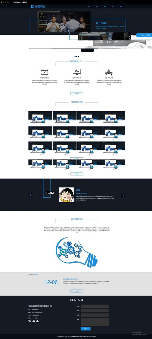
企业门户是企业对外的数字门面,它需要清晰地传达品牌形象、提供关键信息、并引导用户(如客户、合作伙伴、求职者)进行下一步操作。
(图片来源网络,侵删)
下面我将从设计原则、页面结构、HTML 代码、CSS 样式以及响应式设计等多个方面,为你提供一个完整的设计指南和可运行的代码示例。
设计原则与核心模块
在设计之前,先明确企业门户的核心目标,一个典型的企业门户通常包含以下几个关键模块:
- 导航栏:网站的“骨架”,提供清晰的路径,让用户快速找到所需内容,通常包含 Logo、主导航菜单(如:首页、关于我们、产品服务、新闻动态、联系我们)、以及行动号召按钮(如“联系我们”、“申请演示”)。
- 英雄区:页面的“视觉中心”,通常以大尺寸的背景图或视频,配合一句响亮的口号和价值主张,迅速抓住访客眼球。
- 特色/优势:用简短的文字和图标,展示公司的核心优势或服务亮点(如:创新、可靠、专业、全球领先)。
- 产品/服务展示:简要介绍公司的核心产品或服务,通常会链接到更详细的页面。
- 客户案例/合作伙伴:通过展示知名客户或合作伙伴的Logo,建立信任感。
- 新闻/博客动态:展示公司的最新资讯、行业洞察或博客文章,体现公司的活跃度和专业性。
- 页脚:网站的“信息库”,包含公司地址、联系方式、社交媒体链接、网站地图、版权信息等。
HTML 代码结构
HTML 的核心是使用语义化标签来构建页面的骨架,这不仅有助于 SEO(搜索引擎优化),也提高了代码的可读性和可维护性。
下面是一个基于上述模块的 HTML 代码示例:
(图片来源网络,侵删)
<!DOCTYPE html>
<html lang="zh-CN">
<head>
<meta charset="UTF-8">
<meta name="viewport" content="width=device-width, initial-scale=1.0">智慧科技 - 引领数字化转型</title>
<link rel="stylesheet" href="styles.css">
<!-- 引入一个图标库,这里使用 Font Awesome -->
<link rel="stylesheet" href="https://cdnjs.cloudflare.com/ajax/libs/font-awesome/6.0.0-beta3/css/all.min.css">
</head>
<body>
<!-- 导航栏 -->
<header class="main-header">
<div class="container">
<a href="#" class="logo">智慧科技</a>
<nav class="main-nav">
<ul>
<li><a href="#home">首页</a></li>
<li><a href="#about">关于我们</a></li>
<li><a href="#services">产品服务</a></li>
<li><a href="#news">新闻动态</a></li>
<li><a href="#contact" class="cta-button">联系我们</a></li>
</ul>
</nav>
</div>
</header>
<main>
<!-- 英雄区 -->
<section id="home" class="hero">
<div class="hero-content container">
<h1>赋能未来,驱动创新</h1>
<p>我们致力于为企业提供最前沿的数字化转型解决方案,助您在数字时代保持领先。</p>
<a href="#contact" class="cta-button primary">立即咨询</a>
</div>
</section>
<!-- 特色/优势 -->
<section class="features">
<div class="container">
<h2>我们的优势</h2>
<div class="features-grid">
<div class="feature-card">
<i class="fas fa-lightbulb"></i>
<h3>创新驱动</h3>
<p>持续投入研发,探索前沿技术,为客户提供最具竞争力的解决方案。</p>
</div>
<div class="feature-card">
<i class="fas fa-shield-alt"></i>
<h3>安全可靠</h3>
<p>采用国际顶尖的安全标准,保障您的数据和业务安全无忧。</p>
</div>
<div class="feature-card">
<i class="fas fa-users"></i>
<h3>专业团队</h3>
<p>汇聚行业精英,拥有丰富的项目经验,为您提供专业服务。</p>
</div>
</div>
</div>
</section>
<!-- 产品/服务展示 -->
<section id="services" class="services">
<div class="container">
<h2>我们的产品与服务</h2>
<div class="services-grid">
<div class="service-card">
<div class="service-icon">
<i class="fas fa-cloud"></i>
</div>
<h3>云计算解决方案</h3>
<p>提供弹性、安全、高效的云基础设施和服务,助力企业上云。</p>
</div>
<div class="service-card">
<div class="service-icon">
<i class="fas fa-robot"></i>
</div>
<h3>人工智能平台</h3>
<p>整合AI算法与大数据,赋能企业实现智能化决策与运营。</p>
</div>
<div class="service-card">
<div class="service-icon">
<i class="fas fa-chart-line"></i>
</div>
<h3>数据分析服务</h3>
<p>深度挖掘数据价值,将数据转化为洞察,驱动业务增长。</p>
</div>
</div>
</div>
</section>
<!-- 客户案例 -->
<section class="testimonials">
<div class="container">
<h2>客户信赖</h2>
<p>与众多行业领导者携手共创</p>
<div class="clients">
<!-- 这里放置客户Logo -->
<img src="https://via.placeholder.com/150x80/CCCCCC/FFFFFF?text=Logo1" alt="客户Logo 1">
<img src="https://via.placeholder.com/150x80/CCCCCC/FFFFFF?text=Logo2" alt="客户Logo 2">
<img src="https://via.placeholder.com/150x80/CCCCCC/FFFFFF?text=Logo3" alt="客户Logo 3">
<img src="https://via.placeholder.com/150x80/CCCCCC/FFFFFF?text=Logo4" alt="客户Logo 4">
</div>
</div>
</section>
</main>
<!-- 页脚 -->
<footer class="main-footer">
<div class="container">
<div class="footer-grid">
<div class="footer-about">
<h3>智慧科技</h3>
<p>引领数字化转型,共创智慧未来。</p>
<div class="social-links">
<a href="#"><i class="fab fa-weixin"></i></a>
<a href="#"><i class="fab fa-weibo"></i></a>
<a href="#"><i class="fab fa-linkedin-in"></i></a>
</div>
</div>
<div class="footer-links">
<h4>快速链接</h4>
<ul>
<li><a href="#">关于我们</a></li>
<li><a href="#">产品中心</a></li>
<li><a href="#">解决方案</a></li>
<li><a href="#">加入我们</a></li>
</ul>
</div>
<div class="footer-contact">
<h4>联系我们</h4>
<p><i class="fas fa-map-marker-alt"></i> 北京市朝阳区科技园区A座</p>
<p><i class="fas fa-phone"></i> 400-123-4567</p>
<p><i class="fas fa-envelope"></i> contact@smartech.com</p>
</div>
</div>
<div class="footer-bottom">
<p>© 2025 智慧科技有限公司 版权所有.</p>
</div>
</div>
</footer>
</body>
</html>
CSS 样式设计
CSS 负责将 HTML 结构美化成视觉上吸引人的页面,我们将使用现代 CSS 特性,如 Flexbox 和 Grid 布局,来创建灵活且强大的布局。
/* --- 全局样式和变量 --- */
:root {
    --primary-color: #007bff; /* 主色调,如蓝色 */
    --secondary-color: #343a40; /* 次要色,如深灰色 */
    --text-color: #333;
    --light-color: #f8f9fa;
    --dark-color: #212529;
    --font-family: 'Segoe UI', Tahoma, Geneva, Verdana, sans-serif;
}
* {
    margin: 0;
    padding: 0;
    box-sizing: border-box;
}
body {
    font-family: var(--font-family);
    line-height: 1.6;
    color: var(--text-color);
}
.container {
    width: 90%;
    max-width: 1200px;
    margin: 0 auto;
    padding: 0 15px;
}
h1, h2, h3 {
    margin-bottom: 1rem;
    line-height: 1.2;
}
a {
    text-decoration: none;
    color: var(--primary-color);
}
img {
    max-width: 100%;
    height: auto;
}
section {
    padding: 80px 0;
}
.cta-button {
    display: inline-block;
    padding: 12px 25px;
    background-color: var(--primary-color);
    color: white;
    border-radius: 5px;
    font-weight: bold;
    transition: background-color 0.3s ease, transform 0.3s ease;
}
.cta-button:hover {
    background-color: #0056b3;
    transform: translateY(-2px);
}
/* --- 导航栏 --- */
.main-header {
    background-color: white;
    box-shadow: 0 2px 5px rgba(0,0,0,0.1);
    position: sticky;
    top: 0;
    z-index: 1000;
}
.main-header .container {
    display: flex;
    justify-content: space-between;
    align-items: center;
    padding: 15px 0;
}
.logo {
    font-size: 1.8rem;
    font-weight: bold;
    color: var(--dark-color);
}
.main-nav ul {
    list-style: none;
    display: flex;
}
.main-nav ul li {
    margin-left: 25px;
}
.main-nav a {
    color: var(--dark-color);
    font-weight: 500;
}
.main-nav a:hover, .main-nav a.active {
    color: var(--primary-color);
}
/* --- 英雄区 --- */
.hero {
    background: linear-gradient(rgba(0, 0, 0, 0.5), rgba(0, 0, 0, 0.5)), url('https://images.unsplash.com/photo-1551434678-e076c223a692?ixlib=rb-4.0.3&ixid=M3wxMjA3fDB8MHxwaG90by1wYWdlfHx8fGVufDB8fHx8fA%3D%3D&auto=format&fit=crop&w=1740&q=80') no-repeat center center/cover;
    color: white;
    text-align: center;
    padding: 150px 0;
}
.hero-content h1 {
    font-size: 3.5rem;
    margin-bottom: 1rem;
}
.hero-content p {
    font-size: 1.2rem;
    margin-bottom: 2rem;
}
.cta-button.primary {
    background-color: white;
    color: var(--primary-color);
}
.cta-button.primary:hover {
    background-color: #e9ecef;
}
/* --- 特色/优势 --- */
.features h2, .services h2, .testimonials h2 {
    text-align: center;
    margin-bottom: 3rem;
    font-size: 2.5rem;
}
.features-grid {
    display: grid;
    grid-template-columns: repeat(auto-fit, minmax(300px, 1fr));
    gap: 30px;
    text-align: center;
}
.feature-card i {
    font-size: 3rem;
    color: var(--primary-color);
    margin-bottom: 1rem;
}
/* --- 产品/服务 --- */
.services-grid {
    display: grid;
    grid-template-columns: repeat(auto-fit, minmax(300px, 1fr));
    gap: 30px;
    text-align: center;
}
.service-icon {
    background-color: #e9ecef;
    width: 80px;
    height: 80px;
    border-radius: 50%;
    display: flex;
    align-items: center;
    justify-content: center;
    margin: 0 auto 1.5rem;
    font-size: 2rem;
    color: var(--primary-color);
}
/* --- 客户案例 --- */
.testimonials p {
    text-align: center;
    margin-bottom: 2rem;
    font-size: 1.1rem;
    color: #666;
}
.clients {
    display: flex;
    justify-content: center;
    align-items: center;
    flex-wrap: wrap;
    gap: 40px;
}
.clients img {
    filter: grayscale(100%);
    opacity: 0.7;
    transition: filter 0.3s ease, opacity 0.3s ease;
}
.clients img:hover {
    filter: grayscale(0%);
    opacity: 1;
}
/* --- 页脚 --- */
.main-footer {
    background-color: var(--dark-color);
    color: white;
    padding: 60px 0 20px;
}
.footer-grid {
    display: grid;
    grid-template-columns: repeat(auto-fit, minmax(250px, 1fr));
    gap: 30px;
    margin-bottom: 40px;
}
.footer-about p {
    margin-bottom: 1rem;
}
.social-links a {
    color: white;
    margin-right: 15px;
    font-size: 1.5rem;
}
.social-links a:hover {
    color: var(--primary-color);
}
.footer-links h4, .footer-contact h4 {
    margin-bottom: 1rem;
    position: relative;
    padding-bottom: 0.5rem;
}
.footer-links h4::after {
    content: '';
    position: absolute;
    left: 0;
    bottom: 0;
    width: 50px;
    height: 2px;
    background-color: var(--primary-color);
}
.footer-links ul {
    list-style: none;
}
.footer-links ul li {
    margin-bottom: 10px;
}
.footer-links a {
    color: #ccc;
}
.footer-links a:hover {
    color: white;
}
.footer-contact p {
    margin-bottom: 10px;
}
.footer-contact i {
    margin-right: 10px;
    color: var(--primary-color);
}
.footer-bottom {
    text-align: center;
    padding-top: 20px;
    border-top: 1px solid #444;
    font-size: 0.9rem;
    color: #aaa;
}
/* --- 响应式设计 --- */
@media (max-width: 768px) {
    .main-header .container {
        flex-direction: column;
        text-align: center;
    }
    .main-nav ul {
        margin-top: 15px;
        flex-direction: column;
    }
    .main-nav ul li {
        margin: 10px 0;
    }
    .hero-content h1 {
        font-size: 2.5rem;
    }
    section {
        padding: 60px 0;
    }
}
关键设计点解析
-
响应式设计:
- 通过媒体查询
@media (max-width: 768px),当屏幕宽度小于 768px 时,导航栏会从水平布局变为垂直布局,以适应手机等小屏幕设备。 - 使用
max-width: 100%确保图片不会溢出容器。 - 使用相对单位(如
rem,em, )而非绝对单位(如px),使页面元素能根据屏幕大小灵活缩放。
- 通过媒体查询
-
现代布局技术:
- Flexbox:用于导航栏、英雄区内容等需要在一行内对齐和分布的场景,非常灵活。
- CSS Grid:用于特色卡片、服务卡片、页脚等模块化布局。
grid-template-columns: repeat(auto-fit, minmax(300px, 1fr))是一个强大的组合,它可以根据容器宽度自动创建列,每列至少300px,剩余空间平均分配,使布局既整齐又自适应。
-
视觉层次与对比:
 (图片来源网络,侵删)
- 颜色:定义了
--primary-color等CSS变量,方便全局统一管理颜色,主色调用于按钮、链接和重点元素,形成视觉焦点。 - 字体:通过
h1, h2, h3的不同字号和行高,建立清晰的标题层级。 - 间距:使用
padding和margin为各个区块和内容元素留出呼吸空间,避免页面显得拥挤。
- 颜色:定义了
-
交互与动效:
transition属性为按钮的background-color和transform添加了平滑的过渡效果,当鼠标悬停时,按钮颜色会变深,并且会轻微上浮,提供即时反馈,提升用户体验。- 客户Logo的悬停效果(去灰、变亮)也是一种微妙的交互,鼓励用户探索。
如何使用
- 创建一个文件夹,
corporate-portal。 - 在该文件夹中创建两个文件:
index.html和styles.css。 - 将上面的 HTML 代码完整复制到
index.html文件中。 - 将上面的 CSS 代码完整复制到
styles.css文件中。 - 在
index.html中,<head>标签里的<link rel="stylesheet" href="styles.css">确保了 HTML 文件能找到并应用 CSS 样式。 - 用浏览器打开
index.html文件,你就可以看到一个完整的企业门户网页了。
这个示例为你提供了一个坚实的基础,你可以根据自己企业的具体需求,替换文本、图片、颜色和布局,打造出独一无二的专属门户。


