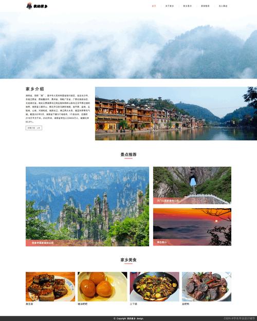
我将从简单到复杂,提供三个不同层次的示例:
(图片来源网络,侵删)
- 基础版: 一个单页面的静态旅游介绍网站,结构清晰,适合初学者。
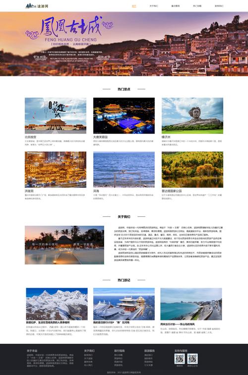
- 进阶版: 一个带有轮播图和交互功能的单页面应用,更接近真实项目。
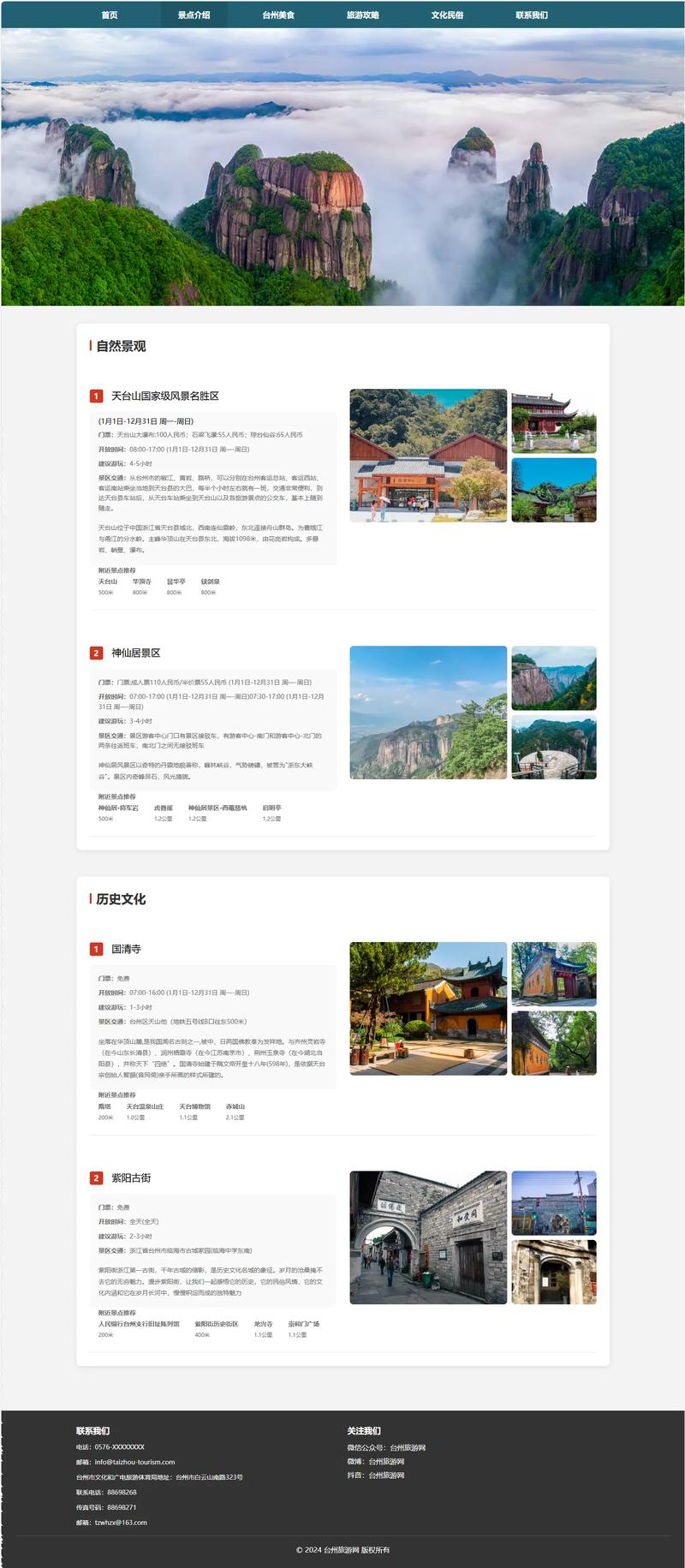
- 完整版: 一个多页面的响应式旅游网站,包含首页、目的地列表、详情页和联系表单,适合作为毕业设计或项目模板。
基础版 - 静态旅游介绍页面
这个项目非常适合初学者,它包含了HTML、CSS和JavaScript的基础用法,旨在帮助你理解网页的基本结构和样式。
项目特点:
- 纯静态: 无需后端,所有内容都写在HTML文件中。
- 结构清晰: 包含了头部、导航、特色介绍、图片展示和页脚。
- 基础交互: 使用JavaScript实现一个简单的图片轮播。
文件结构:
travel-basic/
├── index.html
├── css/
│   └── style.css
└── js/
    └── script.js
源码:
index.html
<!DOCTYPE html>
<html lang="zh-CN">
<head>
<meta charset="UTF-8">
<meta name="viewport" content="width=device-width, initial-scale=1.0">探索世界 - 您的旅行伙伴</title>
<link rel="stylesheet" href="css/style.css">
<link rel="stylesheet" href="https://cdnjs.cloudflare.com/ajax/libs/font-awesome/6.0.0-beta3/css/all.min.css">
</head>
<body>
<!-- 头部导航 -->
<header>
<div class="container">
<div class="logo">
<i class="fas fa-globe-americas"></i> 探索世界
</div>
<nav>
<ul>
<li><a href="#home">首页</a></li>
<li><a href="#destinations">目的地</a></li>
<li><a href="#about">关于我们</a></li>
<li><a href="#contact">联系我们</a></li>
</ul>
</nav>
</div>
</header>
<main>
<!-- 英雄区域/轮播图 -->
<section id="home" class="hero">
<div class="slideshow-container">
<div class="mySlides fade">
<img src="https://images.unsplash.com/photo-1506905925346-21bda4d32df4?ixlib=rb-4.0.3&ixid=M3wxMjA3fDB8MHxwaG90by1wYWdlfHx8fGVufDB8fHx8fA%3D%3D&auto=format&fit=crop&w=1770&q=80" style="width:100%; height:500px; object-fit:cover;">
<div class="hero-text">
<h1>发现巴厘岛的神秘之美</h1>
<p>探索热带天堂,体验独特的文化与自然风光。</p>
<a href="#" class="btn">立即预订</a>
</div>
</div>
<div class="mySlides fade">
<img src="https://images.unsplash.com/photo-1564507592333-c60657eea523?ixlib=rb-4.0.3&ixid=M3wxMjA3fDB8MHxwaG90by1wYWdlfHx8fGVufDB8fHx8fA%3D%3D&auto=format&fit=crop&w=1770&q=80" style="width:100%; height:500px; object-fit:cover;">
<div class="hero-text">
<h1>漫步京都的古老街道</h1>
<p>感受千年古都的宁静与禅意,品味传统日式风情。</p>
<a href="#" class="btn">了解更多</a>
</div>
</div>
<div class="mySlides fade">
<img src="https://images.unsplash.com/photo-1544735716-392fe2489ffa?ixlib=rb-4.0.3&ixid=M3wxMjA3fDB8MHxwaG90by1wYWdlfHx8fGVufDB8fHx8fA%3D%3D&auto=format&fit=crop&w=1770&q=80" style="width:100%; height:500px; object-fit:cover;">
<div class="hero-text">
<h1>探索冰岛的极致风光</h1>
<p>在冰川、火山与极光之间,开启一场奇幻的冒险之旅。</p>
<a href="#" class="btn">探索路线</a>
</div>
</div>
</div>
</section>
<!-- 目的地展示 -->
<section id="destinations" class="destinations">
<div class="container">
<h2>热门目的地</h2>
<div class="destination-grid">
<div class="destination-card">
<img src="https://images.unsplash.com/photo-1518709268805-4e9042af2176?ixlib=rb-4.0.3&ixid=M3wxMjA3fDB8MHxwaG90by1wYWdlfHx8fGVufDB8fHx8fA%3D%3D&auto=format&fit=crop&w=1770&q=80" alt="巴黎">
<h3>巴黎,法国</h3>
<p>浪漫之都,艺术与时尚的殿堂。</p>
</div>
<div class="destination-card">
<img src="https://images.unsplash.com/photo-1564013799919-ab600027ffc6?ixlib=rb-4.0.3&ixid=M3wxMjA3fDB8MHxwaG90by1wYWdlfHx8fGVufDB8fHx8fA%3D%3D&auto=format&fit=crop&w=1770&q=80" alt="马尔代夫">
<h3>马尔代夫</h3>
<p>一岛一酒店的奢华海岛体验。</p>
</div>
<div class="destination-card">
<img src="https://images.unsplash.com/photo-1558591710-4b4a1ae0f04d?ixlib=rb-4.0.3&ixid=M3wxMjA3fDB8MHxwaG90by1wYWdlfHx8fGVufDB8fHx8fA%3D%3D&auto=format&fit=crop&w=1770&q=80" alt="纽约">
<h3>纽约,美国</h3>
<p>不夜城,梦想与机遇的交汇点。</p>
</div>
</div>
</div>
</section>
<!-- 关于我们 -->
<section id="about" class="about">
<div class="container">
<h2>关于我们</h2>
<p>我们是一支充满激情的旅行专家团队,致力于为您打造独一无二、终生难忘的旅行体验,从行程规划到酒店预订,从当地体验到紧急支援,我们全程陪伴,让您的每一次出行都轻松、愉快、安心。</p>
</div>
</section>
</main>
<!-- 页脚 -->
<footer id="contact">
<div class="container">
<p>© 2025 探索世界旅游网. 保留所有权利.</p>
</div>
</footer>
<script src="js/script.js"></script>
</body>
</html>
css/style.css
/* --- 全局样式 --- */
* {
    margin: 0;
    padding: 0;
    box-sizing: border-box;
    font-family: 'Arial', sans-serif;
}
body {
    line-height: 1.6;
    color: #333;
}
.container {
    max-width: 1200px;
    margin: 0 auto;
    padding: 0 20px;
}
h1, h2, h3 {
    margin-bottom: 20px;
    color: #222;
}
p {
    margin-bottom: 15px;
}
.btn {
    display: inline-block;
    background: #ff6b6b;
    color: #fff;
    padding: 12px 25px;
    text-decoration: none;
    border-radius: 5px;
    transition: background 0.3s ease;
}
.btn:hover {
    background: #ff5252;
}
/* --- 头部导航 --- */
header {
    background: #fff;
    box-shadow: 0 2px 5px rgba(0,0,0,0.1);
    position: sticky;
    top: 0;
    z-index: 1000;
}
header .container {
    display: flex;
    justify-content: space-between;
    align-items: center;
    padding: 20px;
}
.logo {
    font-size: 1.8em;
    font-weight: bold;
    color: #ff6b6b;
}
nav ul {
    list-style: none;
    display: flex;
}
nav ul li a {
    text-decoration: none;
    color: #333;
    margin-left: 30px;
    font-weight: 500;
    transition: color 0.3s ease;
}
nav ul li a:hover {
    color: #ff6b6b;
}
/* --- 英雄区域/轮播图 --- */
.hero {
    position: relative;
    height: 500px;
    overflow: hidden;
}
.mySlides {
    display: none;
}
.mySlides img {
    width: 100%;
    height: 100%;
}
.hero-text {
    position: absolute;
    top: 50%;
    left: 50%;
    transform: translate(-50%, -50%);
    text-align: center;
    color: white;
    text-shadow: 2px 2px 4px rgba(0,0,0,0.5);
}
.hero-text h1 {
    font-size: 3em;
    margin-bottom: 15px;
}
.hero-text p {
    font-size: 1.2em;
    margin-bottom: 25px;
}
/* --- 目的地展示 --- */
.destinations {
    padding: 80px 0;
    background: #f9f9f9;
}
.destinations h2 {
    text-align: center;
    margin-bottom: 50px;
}
.destination-grid {
    display: grid;
    grid-template-columns: repeat(auto-fit, minmax(300px, 1fr));
    gap: 30px;
}
.destination-card {
    background: white;
    border-radius: 10px;
    overflow: hidden;
    box-shadow: 0 5px 15px rgba(0,0,0,0.1);
    transition: transform 0.3s ease;
}
.destination-card:hover {
    transform: translateY(-10px);
}
.destination-card img {
    width: 100%;
    height: 200px;
    object-fit: cover;
}
.destination-card-content {
    padding: 20px;
}
.destination-card h3 {
    margin-bottom: 10px;
}
/* --- 关于我们 --- */
.about {
    padding: 80px 0;
    text-align: center;
}
.about .container {
    max-width: 800px;
    margin: 0 auto;
}
/* --- 页脚 --- */
footer {
    background: #333;
    color: #fff;
    text-align: center;
    padding: 20px 0;
}
js/script.js
(图片来源网络,侵删)
// 轮播图功能
let slideIndex = 1;
showSlides(slideIndex);
// 自动播放轮播图
setInterval(function() {
    plusSlides(1);
}, 5000); // 每5秒切换一次
function plusSlides(n) {
    showSlides(slideIndex += n);
}
function currentSlide(n) {
    showSlides(slideIndex = n);
}
function showSlides(n) {
    let i;
    let slides = document.getElementsByClassName("mySlides");
    if (n > slides.length) { slideIndex = 1 }
    if (n < 1) { slideIndex = slides.length }
    for (i = 0; i < slides.length; i++) {
        slides[i].style.display = "none";
    }
    slides[slideIndex - 1].style.display = "block";
}
进阶版 - 带有交互功能的旅游网站
这个项目在基础版上增加了更多交互功能,如平滑滚动、图片悬停效果和动态加载的旅行故事。
项目特点:
- 平滑滚动: 点击导航菜单,页面会平滑滚动到对应部分。
- 图片悬停效果: 鼠标悬停在目的地卡片上时,图片会放大。
- : 旅行故事部分通过JavaScript动态加载,模拟从服务器获取数据。
文件结构:
travel-advanced/
├── index.html
├── css/
│   └── style.css
└── js/
    └── script.js
源码 (与基础版的主要区别):
index.html (新增"旅行故事"部分)
<!-- 在 main 标签内,about 部分之后添加 -->
<section id="stories" class="stories">
    <div class="container">
        <h2>旅行者的故事</h2>
        <div id="stories-container" class="stories-grid">
            <!-- 故事将通过JS动态加载 -->
        </div>
    </div>
</section>
css/style.css (新增悬停效果样式)
/* 在 .destination-card 样式下添加 */
.destination-card img {
    width: 100%;
    height: 200px;
    object-fit: cover;
    transition: transform 0.5s ease; /* 添加过渡效果 */
}
.destination-card:hover img {
    transform: scale(1.1); /* 悬停时放大 */
}
/* 新增故事卡片样式 */
.stories-grid {
    display: grid;
    grid-template-columns: repeat(auto-fit, minmax(350px, 1fr));
    gap: 30px;
    margin-top: 40px;
}
.story-card {
    background: white;
    border-radius: 10px;
    overflow: hidden;
    box-shadow: 0 5px 15px rgba(0,0,0,0.1);
}
.story-card img {
    width: 100%;
    height: 200px;
    object-fit: cover;
}
.story-card-content {
    padding: 20px;
}
.story-card-content h4 {
    margin-bottom: 10px;
    color: #ff6b6b;
}
/* 平滑滚动行为 */
html {
    scroll-behavior: smooth;
}
js/script.js (新增平滑滚动和动态加载功能)
(图片来源网络,侵删)
// 轮播图功能 (与基础版相同)
let slideIndex = 1;
showSlides(slideIndex);
setInterval(function() {
    plusSlides(1);
}, 5000);
function plusSlides(n) { showSlides(slideIndex += n); }
function currentSlide(n) { showSlides(slideIndex = n); }
function showSlides(n) {
    let i; let slides = document.getElementsByClassName("mySlides");
    if (n > slides.length) { slideIndex = 1; }
    if (n < 1) { slideIndex = slides.length; }
    for (i = 0; i < slides.length; i++) { slides[i].style.display = "none"; }
    slides[slideIndex - 1].style.display = "block";
}
// --- 新增功能 ---
// 1. 平滑滚动 (CSS中已设置 html { scroll-behavior: smooth; },这里可以保留或移除)
// document.querySelectorAll('a[href^="#"]').forEach(anchor => {
//     anchor.addEventListener('click', function (e) {
//         e.preventDefault();
//         document.querySelector(this.getAttribute('href')).scrollIntoView({
//             behavior: 'smooth'
//         });
//     });
// });
// 2. 动态加载旅行故事
const storiesData = [
    {
        title: "在西藏寻找灵魂的宁静",
        author: "张明",
        image: "https://images.unsplash.com/photo-1544735716-392fe2489ffa?ixlib=rb-4.0.3&ixid=M3wxMjA3fDB8MHxwaG90by1wYWdlfHx8fGVufDB8fHx8fA%3D%3D&auto=format&fit=crop&w=1770&q=80",
        content: "海拔4500米的米拉山口,风在耳边呼啸,却吹不散内心的平静,我找到了久违的宁静与自我。"
    },
    {
        title: "东京的霓虹与禅意",
        author: "李静",
        image: "https://images.unsplash.com/photo-1518709268805-4e9042af2176?ixlib=rb-4.0.3&ixid=M3wxMjA3fDB8MHxwaG90by1wYWdlfHx8fGVufDB8fHx8fA%3D%3D&auto=format&fit=crop&w=1770&q=80",
        content: "从涩谷的十字路口到浅草寺的宁静,东京完美地融合了现代的喧嚣与古典的禅意。"
    },
    {
        title: "冰岛,冰与火之歌",
        author: "王浩",
        image: "https://images.unsplash.com/photo-1564507592333-c60657eea523?ixlib=rb-4.0.3&ixid=M3wxMjA3fDB8MHxwaG90by1wYWdlfHx8fGVufDB8fHx8fA%3D%3D&auto=format&fit=crop&w=1770&q=80",
        content: "在蓝湖温泉中仰望星空,在黑沙滩上感受大西洋的怒吼,冰岛是一场视觉与感官的盛宴。"
    }
];
function loadStories() {
    const container = document.getElementById('stories-container');
    storiesData.forEach(story => {
        const storyCard = document.createElement('div');
        storyCard.className = 'story-card';
        storyCard.innerHTML = `
            <img src="${story.image}" alt="${story.title}">
            <div class="story-card-content">
                <h4>${story.title}</h4>
                <p>作者: ${story.author}</p>
                <p>${story.content}</p>
            </div>
        `;
        container.appendChild(storyCard);
    });
}
// 页面加载完成后执行
window.onload = loadStories;
完整版 - 多页面响应式旅游网站
这是一个更接近商业项目的模板,包含了多个页面、响应式布局和更完善的交互。
项目特点:
- 多页面结构: 包含
index.html(首页),destinations.html(目的地列表),destination-detail.html(目的地详情),contact.html(联系我们)。 - 响应式设计: 使用媒体查询,在手机、平板和桌面电脑上都有良好的显示效果。
- 导航高亮: 当前页面的导航项会高亮显示。
- 联系表单: 包含基本的表单验证和提交逻辑。
文件结构:
travel-complete/
├── index.html
├── destinations.html
├── destination-detail.html
├── contact.html
├── css/
│   └── style.css
└── js/
    └── script.js
核心源码 (以 index.html 和 style.css 为例):
index.html (新增了响应式导航栏的汉堡菜单)
<!DOCTYPE html>
<html lang="zh-CN">
<head>
<meta charset="UTF-8">
<meta name="viewport" content="width=device-width, initial-scale=1.0">探索世界 - 您的旅行伙伴</title>
<link rel="stylesheet" href="css/style.css">
<link rel="stylesheet" href="https://cdnjs.cloudflare.com/ajax/libs/font-awesome/6.0.0-beta3/css/all.min.css">
</head>
<body>
<header>
<div class="container">
<div class="logo">
<i class="fas fa-globe-americas"></i> 探索世界
</div>
<nav class="main-nav">
<ul>
<li><a href="index.html" class="active">首页</a></li>
<li><a href="destinations.html">目的地</a></li>
<li><a href="destination-detail.html">详情页</a></li>
<li><a href="contact.html">联系我们</a></li>
</ul>
</nav>
<div class="hamburger">
<span></span>
<span></span>
<span></span>
</div>
</div>
</header>
<!-- ... 其他内容与基础版类似 ... -->
<footer>
<div class="container">
<p>© 2025 探索世界旅游网. 保留所有权利.</p>
</div>
</footer>
<script src="js/script.js"></script>
</body>
</html>
css/style.css (新增响应式样式和导航高亮)
/* --- 全局样式 (与基础版类似) --- */
/* ... (省略基础样式) ... */
/* --- 响应式导航栏 --- */
.hamburger {
    display: none;
    flex-direction: column;
    cursor: pointer;
}
.hamburger span {
    width: 25px;
    height: 3px;
    background: #333;
    margin: 3px 0;
    transition: 0.3s;
}
.main-nav {
    display: flex; /* 默认显示 */
}
/* 当屏幕宽度小于 768px 时 */
@media (max-width: 768px) {
    .hamburger {
        display: flex;
    }
    .main-nav {
        position: fixed;
        left: -100%;
        top: 70px;
        flex-direction: column;
        background-color: #fff;
        width: 100%;
        text-align: center;
        transition: 0.3s;
        box-shadow: 0 10px 27px rgba(0,0,0,0.05);
        padding: 2rem 0;
    }
    .main-nav.active {
        left: 0;
    }
    .main-nav ul {
        flex-direction: column;
    }
    .main-nav ul li {
        margin: 15px 0;
    }
    .logo {
        font-size: 1.5em;
    }
    /* 调整轮播图和内容区域的内边距,适应小屏幕 */
    .hero {
        height: 350px;
    }
    .hero-text h1 {
        font-size: 2em;
    }
}
/* --- 导航高亮 --- */
.main-nav ul li a.active {
    color: #ff6b6b;
    font-weight: bold;
}
/* --- 响应式网格布局 --- */
@media (max-width: 768px) {
    .destination-grid, .stories-grid {
        grid-template-columns: 1fr; /* 在小屏幕上单列显示 */
    }
}
js/script.js (新增汉堡菜单点击事件)
// 轮播图功能 (与之前相同)
// ...
// --- 新增功能 ---
// 1. 汉堡菜单点击事件
const hamburger = document.querySelector('.hamburger');
const navMenu = document.querySelector('.main-nav');
hamburger.addEventListener('click', () => {
    navMenu.classList.toggle('active');
});
// 2. 点击导航链接后关闭菜单 (针对移动端)
document.querySelectorAll('.main-nav a').forEach(link => {
    link.addEventListener('click', () => {
        navMenu.classList.remove('active');
    });
});
// 3. 页面加载时设置导航高亮 (需要根据当前页面URL设置)
document.addEventListener('DOMContentLoaded', () => {
    const currentPath = window.location.pathname;
    const navLinks = document.querySelectorAll('.main-nav a');
    navLinks.forEach(link => {
        if (link.getAttribute('href') === currentPath) {
            link.classList.add('active');
        }
    });
});
如何使用这些源码
- 下载源码: 将上面提供的代码分别复制到对应的
.html,.css,.js文件中。 - 创建文件夹: 按照每个项目提供的文件结构创建文件夹和文件。
- 放置图片: 图片使用了
unsplash.com的链接,您可以直接使用,也可以替换成自己的图片,请确保图片路径正确。 - 打开网页: 在浏览器中打开
index.html文件即可查看效果。
希望这些项目能帮助您学习和实践前端开发!祝您学习愉快!


