最简洁基础版
这个模板只有一个登录表单,非常简洁,适合快速集成。
(图片来源网络,侵删)
特点
- 极简设计
- 响应式布局
- 基本的表单验证
效果预览
代码实现
<!DOCTYPE html>
<html lang="zh-CN">
<head>
    <meta charset="UTF-8">
    <meta name="viewport" content="width=device-width, initial-scale=1.0">登录 - 基础版</title>
    <!-- 引入 Bootstrap CSS -->
    <link href="https://cdn.jsdelivr.net/npm/bootstrap@5.3.2/dist/css/bootstrap.min.css" rel="stylesheet">
    <style>
        body {
            background-color: #f8f9fa; /* 设置一个柔和的背景色 */
        }
        .login-container {
            max-width: 400px;
            margin: 100px auto; /* 上下100px,水平居中 */
            padding: 20px;
            background-color: #fff;
            border-radius: 10px;
            box-shadow: 0 4px 8px rgba(0,0,0,0.1);
        }
    </style>
</head>
<body>
    <div class="container">
        <div class="login-container">
            <h2 class="text-center mb-4">用户登录</h2>
            <form>
                <div class="mb-3">
                    <label for="exampleInputEmail1" class="form-label">用户名/邮箱</label>
                    <input type="email" class="form-control" id="exampleInputEmail1" aria-describedby="emailHelp" required>
                    <div id="emailHelp" class="form-text">我们绝不会泄露您的个人信息。</div>
                </div>
                <div class="mb-3">
                    <label for="exampleInputPassword1" class="form-label">密码</label>
                    <input type="password" class="form-control" id="exampleInputPassword1" required>
                </div>
                <div class="mb-3 form-check">
                    <input type="checkbox" class="form-check-input" id="exampleCheck1">
                    <label class="form-check-label" for="exampleCheck1">记住我</label>
                </div>
                <div class="d-grid">
                    <button type="submit" class="btn btn-primary">登录</button>
                </div>
            </form>
        </div>
    </div>
    <!-- 引入 Bootstrap JS (Popper.js is included) -->
    <script src="https://cdn.jsdelivr.net/npm/bootstrap@5.3.2/dist/js/bootstrap.bundle.min.js"></script>
</body>
</html>
带背景图和品牌Logo版
这个模板视觉效果更好,适合品牌网站或项目管理系统。
特点
- 全屏背景图片
- 品牌Logo展示
- 美观的卡片式设计
- 额外的“忘记密码”和“注册”链接
效果预览
代码实现
<!DOCTYPE html>
<html lang="zh-CN">
<head>
    <meta charset="UTF-8">
    <meta name="viewport" content="width=device-width, initial-scale=1.0">登录 - 品牌版</title>
    <!-- 引入 Bootstrap CSS -->
    <link href="https://cdn.jsdelivr.net/npm/bootstrap@5.3.2/dist/css/bootstrap.min.css" rel="stylesheet">
    <link rel="stylesheet" href="https://cdn.jsdelivr.net/npm/bootstrap-icons@1.11.1/font/bootstrap-icons.css"> <!-- 引入图标库 -->
    <style>
        body {
            height: 100vh;
            background-image: url('https://img.freepik.com/free-photo/blur-purple-gradient-background_53876-129327.jpg'); /* 替换成你自己的背景图 */
            background-size: cover;
            background-position: center;
            display: flex;
            align-items: center;
            justify-content: center;
        }
        .login-card {
            width: 100%;
            max-width: 420px;
            padding: 2rem;
            border-radius: 1rem;
            box-shadow: 0 8px 32px rgba(31, 38, 135, 0.37);
            backdrop-filter: blur(4px);
            background: rgba(255, 255, 255, 0.9);
        }
        .brand-logo {
            width: 80px;
            height: 80px;
            background-color: #0d6efd; /* 替换成你的品牌色 */
            border-radius: 50%;
            display: flex;
            align-items: center;
            justify-content: center;
            margin: 0 auto 1.5rem;
            color: white;
            font-size: 2rem;
        }
    </style>
</head>
<body>
    <div class="container">
        <div class="login-card">
            <div class="brand-logo">
                <i class="bi bi-shield-lock"></i> <!-- 使用一个图标作为Logo -->
            </div>
            <h2 class="text-center mb-4">欢迎回来</h2>
            <form>
                <div class="mb-3">
                    <label for="username" class="form-label">用户名</label>
                    <div class="input-group">
                        <span class="input-group-text"><i class="bi bi-person"></i></span>
                        <input type="text" class="form-control" id="username" placeholder="请输入用户名" required>
                    </div>
                </div>
                <div class="mb-3">
                    <label for="password" class="form-label">密码</label>
                    <div class="input-group">
                        <span class="input-group-text"><i class="bi bi-key"></i></span>
                        <input type="password" class="form-control" id="password" placeholder="请输入密码" required>
                        <button class="btn btn-outline-secondary" type="button" id="togglePassword">
                            <i class="bi bi-eye"></i>
                        </button>
                    </div>
                </div>
                <div class="d-flex justify-content-between align-items-center mb-3">
                    <div class="form-check">
                        <input class="form-check-input" type="checkbox" id="rememberMe">
                        <label class="form-check-label" for="rememberMe">
                            记住我
                        </label>
                    </div>
                    <a href="#" class="text-decoration-none">忘记密码?</a>
                </div>
                <div class="d-grid">
                    <button type="submit" class="btn btn-primary btn-lg">登录</button>
                </div>
                <div class="text-center mt-3">
                    <span>还没有账号? </span>
                    <a href="#" class="text-decoration-none">立即注册</a>
                </div>
            </form>
        </div>
    </div>
    <!-- 引入 Bootstrap JS -->
    <script src="https://cdn.jsdelivr.net/npm/bootstrap@5.3.2/dist/js/bootstrap.bundle.min.js"></script>
    <script>
        // 密码显示/隐藏切换功能
        document.getElementById('togglePassword').addEventListener('click', function() {
            const passwordInput = document.getElementById('password');
            const icon = this.querySelector('i');
            if (passwordInput.type === 'password') {
                passwordInput.type = 'text';
                icon.classList.remove('bi-eye');
                icon.classList.add('bi-eye-slash');
            } else {
                passwordInput.type = 'password';
                icon.classList.remove('bi-eye-slash');
                icon.classList.add('bi-eye');
            }
        });
    </script>
</body>
</html>
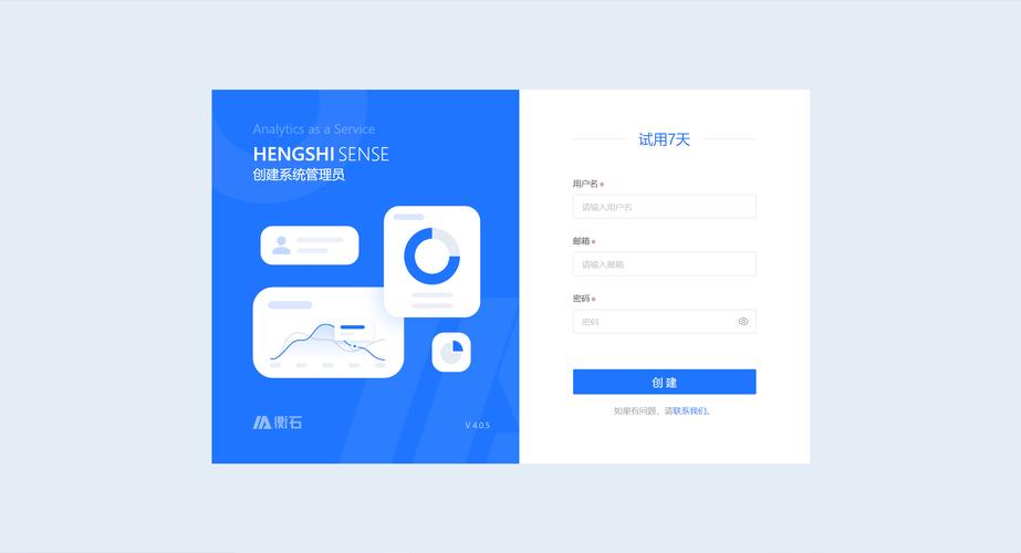
带侧边栏的现代化设计版
这个模板采用左右分栏布局,视觉效果非常现代,适合SaaS产品或企业级应用。
特点
- 左侧信息展示区
- 右侧登录表单区
- 响应式设计(移动端会变为上下布局)
- 包含社交媒体登录选项
效果预览
代码实现
<!DOCTYPE html>
<html lang="zh-CN">
<head>
    <meta charset="UTF-8">
    <meta name="viewport" content="width=device-width, initial-scale=1.0">登录 - 现代化版</title>
    <!-- 引入 Bootstrap CSS -->
    <link href="https://cdn.jsdelivr.net/npm/bootstrap@5.3.2/dist/css/bootstrap.min.css" rel="stylesheet">
    <link rel="stylesheet" href="https://cdn.jsdelivr.net/npm/bootstrap-icons@1.11.1/font/bootstrap-icons.css">
    <style>
        :root {
            --primary-color: #4361ee;
            --secondary-color: #3f37c9;
        }
        body {
            margin: 0;
            font-family: 'Helvetica Neue', Helvetica, Arial, sans-serif;
            background-color: #f4f7f6;
        }
        .login-page-wrapper {
            display: flex;
            min-height: 100vh;
        }
        .info-section {
            flex: 1;
            background: linear-gradient(135deg, var(--primary-color), var(--secondary-color));
            color: white;
            padding: 3rem;
            display: flex;
            flex-direction: column;
            justify-content: center;
            align-items: center;
            text-align: center;
        }
        .info-section h1 {
            font-size: 2.5rem;
            font-weight: 700;
            margin-bottom: 1rem;
        }
        .info-section p {
            font-size: 1.1rem;
            max-width: 500px;
            margin-bottom: 2rem;
        }
        .form-section {
            flex: 1;
            display: flex;
            justify-content: center;
            align-items: center;
            padding: 2rem;
        }
        .login-form-container {
            width: 100%;
            max-width: 400px;
            background: white;
            padding: 2.5rem;
            border-radius: 1rem;
            box-shadow: 0 10px 25px rgba(0, 0, 0, 0.1);
        }
        .login-form-container h2 {
            text-align: center;
            margin-bottom: 1.5rem;
            color: #333;
        }
        .social-login {
            display: flex;
            gap: 1rem;
            margin-bottom: 1.5rem;
        }
        .social-btn {
            flex: 1;
            display: flex;
            align-items: center;
            justify-content: center;
            gap: 0.5rem;
            padding: 0.75rem;
            border: 1px solid #ddd;
            border-radius: 0.5rem;
            background-color: white;
            text-decoration: none;
            color: #333;
            transition: all 0.3s ease;
        }
        .social-btn:hover {
            background-color: #f8f9fa;
            transform: translateY(-2px);
        }
        .divider {
            text-align: center;
            margin: 1.5rem 0;
            position: relative;
        }
        .divider::before {
            content: '';
            position: absolute;
            top: 50%;
            left: 0;
            right: 0;
            height: 1px;
            background-color: #e0e0e0;
        }
        .divider span {
            background-color: white;
            padding: 0 1rem;
            position: relative;
            color: #999;
        }
        @media (max-width: 768px) {
            .login-page-wrapper {
                flex-direction: column;
            }
            .info-section {
                padding: 2rem 1rem;
            }
            .info-section h1 {
                font-size: 2rem;
            }
        }
    </style>
</head>
<body>
    <div class="login-page-wrapper">
        <!-- 左侧信息区 -->
        <div class="info-section">
            <i class="bi bi-shield-check" style="font-size: 4rem; margin-bottom: 1rem;"></i>
            <h1>欢迎登录</h1>
            <p>这是一个安全、高效的平台,为您提供卓越的服务体验,请登录您的账户以继续。</p>
            <!-- 可以放一些额外的图片或信息 -->
        </div>
        <!-- 右侧登录表单区 -->
        <div class="form-section">
            <div class="login-form-container">
                <h2>账户登录</h2>
                <form>
                    <div class="mb-3">
                        <label for="email2" class="form-label">邮箱地址</label>
                        <input type="email" class="form-control" id="email2" placeholder="name@example.com" required>
                    </div>
                    <div class="mb-3">
                        <label for="password2" class="form-label">密码</label>
                        <input type="password" class="form-control" id="password2" placeholder="••••••••" required>
                    </div>
                    <div class="d-flex justify-content-between align-items-center mb-3">
                        <div class="form-check">
                            <input class="form-check-input" type="checkbox" id="rememberMe2">
                            <label class="form-check-label" for="rememberMe2">
                                记住我
                            </label>
                        </div>
                        <a href="#" class="text-decoration-none text-primary">忘记密码?</a>
                    </div>
                    <div class="d-grid">
                        <button type="submit" class="btn btn-primary btn-lg">登录</button>
                    </div>
                    <div class="divider">
                        <span>或</span>
                    </div>
                    <div class="social-login">
                        <a href="#" class="social-btn">
                            <i class="bi bi-google"></i>
                            <span>Google</span>
                        </a>
                        <a href="#" class="social-btn">
                            <i class="bi bi-github"></i>
                            <span>GitHub</span>
                        </a>
                    </div>
                    <div class="text-center mt-4">
                        <span>还没有账号? </span>
                        <a href="#" class="text-decoration-none fw-bold">免费注册</a>
                    </div>
                </form>
            </div>
        </div>
    </div>
    <!-- 引入 Bootstrap JS -->
    <script src="https://cdn.jsdelivr.net/npm/bootstrap@5.3.2/dist/js/bootstrap.bundle.min.js"></script>
</body>
</html>
如何选择和使用
-
选择模板:
- 如果只是需要一个快速、简单的登录框,模板一 足够。
- 如果你想让登录页面看起来更专业、有品牌感,模板二 是很好的选择。
- 如果你的产品是现代化的Web应用,希望给用户留下深刻的第一印象,模板三 是最佳实践。
-
自定义:
- Logo和品牌色: 将模板中的
bi-shield-lock图标替换成你自己的 Logo 图片,并修改 CSS 中的background-color和渐变色。 - 背景图: 在模板三中,你可以更换
info-section的背景图片。 - 表单验证: 所有模板都使用了 HTML5 的
required属性,这是最基本的客户端验证,你可以结合 Bootstrap 的验证插件(如bootstrap-validator)或使用 JavaScript 实现更复杂的验证逻辑。 - 功能链接: 将
href="#"替换为你实际的处理页面,如href="/forgot-password"或href="/register"。 - 提交处理: 在
<form>标签上添加action和method属性,<form action="/login" method="POST">,或者使用 JavaScript (如fetchAPI) 来处理表单提交,实现无刷新登录。
- Logo和品牌色: 将模板中的
希望这些模板能帮助你快速构建出漂亮的登录界面!


