- 现代化设计:采用卡片式布局,有阴影和圆角,视觉效果清爽。
- 完全响应式:在桌面、平板和手机上都有出色的显示效果。
- 表单验证:使用 HTML5 原生验证功能,确保用户输入有效信息。
- 交互反馈:包含加载状态、成功/错误提示,提升用户体验。
- 可扩展性:结构清晰,易于添加“记住我”、“忘记密码”或第三方登录(如微信、QQ)等功能。
- 无障碍性:使用了
label的for属性,方便屏幕阅读器操作。
最终效果预览
-
桌面端:
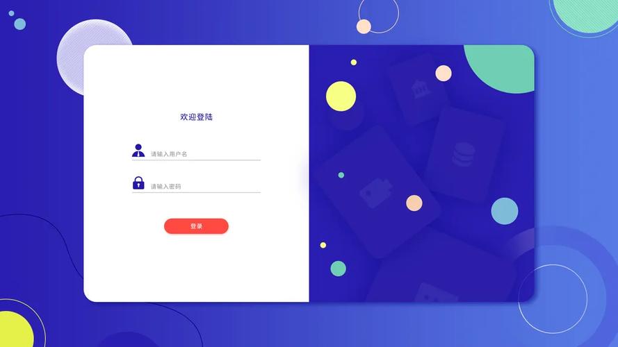 (图片来源网络,侵删)
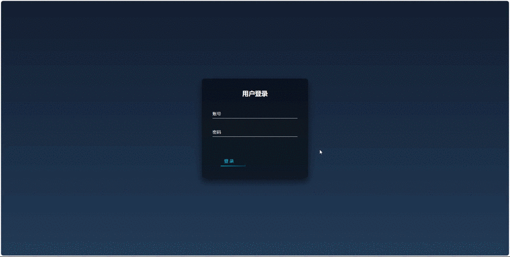
 -
移动端:
完整代码
您可以直接复制以下所有代码,保存为一个 .html 文件(login.html),然后在浏览器中打开即可看到效果。
<!DOCTYPE html>
<html lang="zh-CN">
<head>
    <meta charset="UTF-8">
    <meta name="viewport" content="width=device-width, initial-scale=1.0">登录 - 您的网站名称</title>
    <!-- 引入字体图标库 (Font Awesome) -->
    <link rel="stylesheet" href="https://cdnjs.cloudflare.com/ajax/libs/font-awesome/6.4.0/css/all.min.css">
    <style>
        /* --- 全局样式和变量 --- */
        :root {
            --primary-color: #4a90e2;
            --primary-hover-color: #357abd;
            --error-color: #e74c3c;
            --success-color: #2ecc71;
            --bg-color: #f4f7f6;
            --card-bg-color: #ffffff;
            --text-color: #333333;
            --border-color: #dddddd;
        }
        * {
            margin: 0;
            padding: 0;
            box-sizing: border-box;
        }
        body {
            font-family: 'Segoe UI', Tahoma, Geneva, Verdana, sans-serif;
            background-color: var(--bg-color);
            color: var(--text-color);
            line-height: 1.6;
            height: 100vh;
            display: flex;
            justify-content: center;
            align-items: center;
        }
        /* --- 登录容器 --- */
        .login-container {
            width: 100%;
            max-width: 420px;
            padding: 20px;
        }
        .login-card {
            background-color: var(--card-bg-color);
            padding: 40px;
            border-radius: 10px;
            box-shadow: 0 4px 20px rgba(0, 0, 0, 0.1);
            text-align: center;
        }
        .login-card h1 {
            margin-bottom: 10px;
            font-size: 28px;
            color: var(--primary-color);
        }
        .login-card p {
            margin-bottom: 30px;
            color: #777;
            font-size: 16px;
        }
        /* --- 表单元素 --- */
        .form-group {
            margin-bottom: 20px;
            text-align: left;
        }
        .form-group label {
            display: block;
            margin-bottom: 8px;
            font-weight: 500;
            font-size: 14px;
        }
        .input-wrapper {
            position: relative;
        }
        .input-wrapper i {
            position: absolute;
            left: 15px;
            top: 50%;
            transform: translateY(-50%);
            color: #aaa;
        }
        .form-control {
            width: 100%;
            padding: 12px 15px 12px 45px; /* 为图标留出空间 */
            border: 1px solid var(--border-color);
            border-radius: 5px;
            font-size: 16px;
            transition: border-color 0.3s, box-shadow 0.3s;
        }
        .form-control:focus {
            outline: none;
            border-color: var(--primary-color);
            box-shadow: 0 0 0 2px rgba(74, 144, 226, 0.2);
        }
        .form-control:invalid {
            border-color: var(--error-color);
        }
        /* --- 按钮样式 --- */
        .btn {
            display: inline-block;
            width: 100%;
            padding: 12px;
            background-color: var(--primary-color);
            color: #ffffff;
            border: none;
            border-radius: 5px;
            font-size: 16px;
            font-weight: bold;
            cursor: pointer;
            transition: background-color 0.3s, transform 0.2s;
        }
        .btn:hover {
            background-color: var(--primary-hover-color);
        }
        .btn:active {
            transform: scale(0.98);
        }
        .btn:disabled {
            background-color: #cccccc;
            cursor: not-allowed;
            transform: none;
        }
        /* --- 提示信息 --- */
        .alert {
            padding: 12px 15px;
            margin-bottom: 20px;
            border-radius: 5px;
            font-size: 14px;
            display: none; /* 默认隐藏 */
        }
        .alert-success {
            background-color: #d4edda;
            color: #155724;
            border: 1px solid #c3e6cb;
        }
        .alert-error {
            background-color: #f8d7da;
            color: #721c24;
            border: 1px solid #f5c6cb;
        }
        /* --- 加载动画 --- */
        .spinner {
            display: none;
            width: 20px;
            height: 20px;
            margin: 0 auto;
            border: 3px solid rgba(255, 255, 255, 0.3);
            border-radius: 50%;
            border-top-color: #fff;
            animation: spin 1s ease-in-out infinite;
        }
        @keyframes spin {
            to { transform: rotate(360deg); }
        }
        .btn.loading .btn-text {
            visibility: hidden;
        }
        .btn.loading .spinner {
            display: block;
            position: absolute;
            top: 50%;
            left: 50%;
            transform: translate(-50%, -50%);
        }
        /* --- 额外链接 --- */
        .form-footer {
            margin-top: 25px;
            font-size: 14px;
            color: #777;
        }
        .form-footer a {
            color: var(--primary-color);
            text-decoration: none;
            font-weight: 500;
        }
        .form-footer a:hover {
            text-decoration: underline;
        }
        /* --- 响应式设计 --- */
        @media (max-width: 480px) {
            .login-container {
                padding: 10px;
            }
            .login-card {
                padding: 30px 20px;
            }
            .login-card h1 {
                font-size: 24px;
            }
        }
    </style>
</head>
<body>
    <div class="login-container">
        <div class="login-card">
            <h1>欢迎回来</h1>
            <p>请登录您的账户以继续</p>
            <!-- 提示信息区域 -->
            <div id="alert-box" class="alert"></div>
            <form id="login-form" novalidate>
                <div class="form-group">
                    <label for="username">用户名 / 邮箱</label>
                    <div class="input-wrapper">
                        <i class="fas fa-user"></i>
                        <input
                            type="text"
                            id="username"
                            class="form-control"
                            placeholder="请输入用户名或邮箱"
                            required
                            autofocus
                        >
                    </div>
                </div>
                <div class="form-group">
                    <label for="password">密码</label>
                    <div class="input-wrapper">
                        <i class="fas fa-lock"></i>
                        <input
                            type="password"
                            id="password"
                            class="form-control"
                            placeholder="请输入您的密码"
                            required
                            minlength="6"
                        >
                    </div>
                </div>
                <button type="submit" id="login-btn" class="btn">
                    <span class="btn-text">登 录</span>
                    <div class="spinner"></div>
                </button>
            </form>
            <div class="form-footer">
                <p>还没有账户? <a href="#">立即注册</a></p>
                <p><a href="#">忘记密码?</a></p>
            </div>
        </div>
    </div>
    <script>
        document.addEventListener('DOMContentLoaded', function () {
            const loginForm = document.getElementById('login-form');
            const loginBtn = document.getElementById('login-btn');
            const alertBox = document.getElementById('alert-box');
            // 表单提交处理
            loginForm.addEventListener('submit', function (event) {
                // 阻止表单默认提交行为
                event.preventDefault();
                // 获取表单数据
                const username = document.getElementById('username').value;
                const password = document.getElementById('password').value;
                // 清除之前的提示信息
                hideAlert();
                // --- 模拟登录验证 ---
                // 在实际项目中,这里会是一个 AJAX 请求到后端服务器
                if (username === 'admin' && password === '123456') {
                    // 模拟成功
                    showAlert('登录成功!正在跳转...', 'success');
                    // 模拟加载状态
                    setLoadingState(true);
                    setTimeout(() => {
                        // 跳转到首页或其他页面
                        // window.location.href = 'dashboard.html';
                        console.log('登录成功,准备跳转...');
                        setLoadingState(false);
                    }, 1500);
                } else {
                    // 模拟失败
                    showAlert('用户名或密码错误,请重试!', 'error');
                }
            });
            // 显示提示信息
            function showAlert(message, type) {
                alertBox.textContent = message;
                alertBox.className = `alert alert-${type}`;
                alertBox.style.display = 'block';
            }
            // 隐藏提示信息
            function hideAlert() {
                alertBox.style.display = 'none';
            }
            // 设置按钮加载状态
            function setLoadingState(isLoading) {
                if (isLoading) {
                    loginBtn.disabled = true;
                    loginBtn.classList.add('loading');
                } else {
                    loginBtn.disabled = false;
                    loginBtn.classList.remove('loading');
                }
            }
        });
    </script>
</body>
</html>
代码解析
HTML 结构 (<body> 部分)
- 语义化标签:使用了
<main>(虽然这里用<div class="login-container">更常见,因为main通常用于页面主要内容区,而登录页可能是一个覆盖层) 和<form>。 - 表单元素:
input[type="text"]和input[type="password"]:用于用户输入。required属性:HTML5 原生验证,确保字段不为空。autofocus:页面加载后自动聚焦到用户名输入框。minlength="6":对密码长度进行基本限制。label的for属性:与input的id关联,点击label时可以聚焦到对应的输入框,提升了可访问性。
- 图标:使用
<i>标签和 Font Awesome 类名(如fas fa-user)来添加输入框前的图标。 - 按钮:
<button type="submit">用于触发表单提交。 - 提示区域:
<div id="alert-box">用于动态显示成功或错误信息。
CSS 样式 (<style> 部分)
- CSS 变量:在
root中定义了颜色变量,方便全局统一修改主题色。 - Flexbox 布局:
body使用display: flex,justify-content: center和align-items: center轻松实现水平和垂直居中。 - 响应式设计:
- 移动优先:
.login-container的width: 100%和max-width: 420px确保在小屏幕上宽度自适应,在大屏幕上有一个固定的最大宽度。 - 媒体查询:
@media (max-width: 480px)针对更小的屏幕(如手机)调整内边距和字体大小,优化显示效果。
- 移动优先:
- 交互效果:
focus伪类:为输入框获得焦点时添加蓝色边框和光晕效果。hover和active伪类:为按钮和链接添加悬停和点击时的视觉反馈。- 过渡效果 (
transition):让颜色、阴影等变化更平滑。
JavaScript 交互 (<script> 部分)
- DOM 加载完成:使用
DOMContentLoaded事件确保 HTML 完全解析后再执行 JS 代码。 - 表单提交监听:
addEventListener('submit', ...)监听表单的提交事件。 event.preventDefault():非常重要,阻止表单默认的刷新页面的提交行为,从而让我们可以用 JS 控制流程。- 数据获取:通过
document.getElementById().value获取用户输入的用户名和密码。 - 模拟验证:这里用一个简单的
if判断来模拟后端验证。在实际项目中,这里会替换为fetch或axios发送 AJAX 请求到服务器。 - 动态提示:
showAlert()和hideAlert()函数通过修改alertBox的className和style.display来显示不同类型(成功/错误)的消息。 - 加载状态:
setLoadingState()函数通过修改按钮的disabled状态和添加loading类,来显示一个旋转的加载动画,防止用户重复点击,并给予用户操作反馈。
如何扩展和修改
- 修改主题色:只需修改
root中的--primary-color和--primary-hover-color变量。 - 添加“记住我”功能:在表单中添加一个
<input type="checkbox">,并在提交时获取其状态,通过 AJAX 发送给后端。 - 添加第三方登录:在
.form-footer上方添加新的按钮组,<div class="social-login"> <a href="#" class="btn btn-wechat"><i class="fab fa-weixin"></i> 微信登录</a> </div> - 连接真实后端:将 JS 中的
if判断逻辑替换为fetch请求:// 替换原有的 if-else 逻辑 fetch('https://api.yourserver.com/login', { method: 'POST', headers: { 'Content-Type': 'application/json', }, body: JSON.stringify({ username, password }), }) .then(response => response.json()) .then(data => { if (data.success) { showAlert('登录成功!', 'success'); // ... } else { showAlert(data.message || '登录失败', 'error'); } }) .catch(error => { showAlert('网络错误,请稍后重试', 'error'); console.error('Error:', error); });
(图片来源网络,侵删)


