模板特点
- 完全响应式: 使用
meta viewport标签和 CSS 媒体查询,确保网站在手机、平板和桌面电脑上都能完美显示。 - 现代简洁设计: 采用卡片式布局、充足的留白和柔和的阴影,视觉效果清晰、专业。
- 移动优先: 优先为移动端进行设计和开发,然后逐步增强到大屏幕设备。
- 核心组件齐全: 包含导航栏、轮播图、服务介绍、产品展示、客户评价、联系表单和页脚等网站常见模块。
- 性能优化: 使用语义化 HTML5 标签,结构清晰,有利于 SEO 和维护。
- 平滑交互: 添加了简单的 CSS 动画,如按钮悬停效果和滚动动画,提升用户体验。
模板代码
您可以直接将以下所有代码复制到一个 .html 文件中,然后在浏览器中打开即可看到效果。
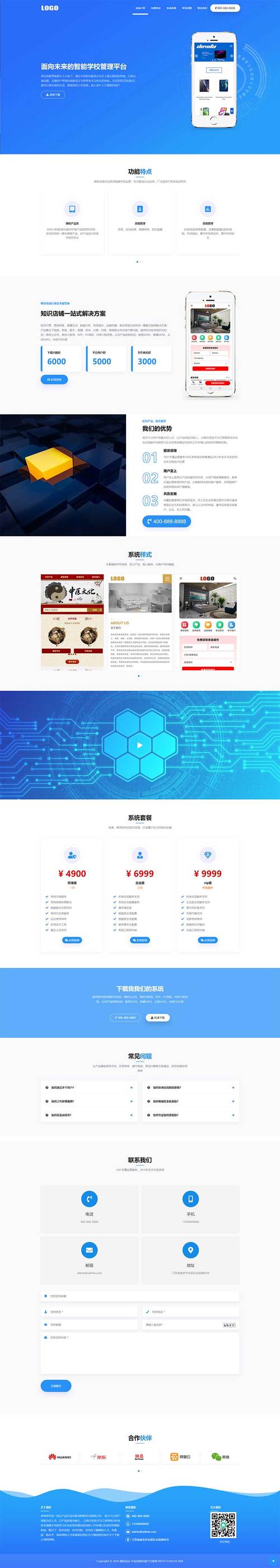
(图片来源网络,侵删)
<!DOCTYPE html>
<html lang="zh-CN">
<head>
<meta charset="UTF-8">
<meta name="viewport" content="width=device-width, initial-scale=1.0">
<meta http-equiv="X-UA-Compatible" content="ie=edge">现代企业网站 - 响应式模板</title>
<!-- 引入字体图标库 (Font Awesome) -->
<link rel="stylesheet" href="https://cdnjs.cloudflare.com/ajax/libs/font-awesome/6.4.0/css/all.min.css">
<style>
/* --- 全局样式和变量 --- */
:root {
--primary-color: #007bff;
--secondary-color: #6c757d;
--light-color: #f8f9fa;
--dark-color: #343a40;
--text-color: #333;
--box-shadow: 0 4px 6px rgba(0, 0, 0, 0.1);
}
* {
margin: 0;
padding: 0;
box-sizing: border-box;
}
body {
font-family: 'Segoe UI', Tahoma, Geneva, Verdana, sans-serif;
line-height: 1.6;
color: var(--text-color);
background-color: #fff;
}
.container {
width: 100%;
max-width: 1200px;
margin: 0 auto;
padding: 0 20px;
}
h1, h2, h3 {
margin-bottom: 1rem;
font-weight: 600;
}
a {
text-decoration: none;
color: var(--primary-color);
transition: color 0.3s ease;
}
a:hover {
color: #0056b3;
}
img {
max-width: 100%;
height: auto;
}
.btn {
display: inline-block;
background: var(--primary-color);
color: #fff;
padding: 12px 24px;
border: none;
border-radius: 5px;
cursor: pointer;
font-size: 1rem;
transition: background-color 0.3s ease, transform 0.2s ease;
}
.btn:hover {
background: #0056b3;
transform: translateY(-2px);
}
.section {
padding: 60px 0;
}
.section-title {
text-align: center;
margin-bottom: 3rem;
font-size: 2.5rem;
color: var(--dark-color);
}
/* --- 导航栏样式 --- */
.navbar {
background: #fff;
box-shadow: var(--box-shadow);
position: sticky;
top: 0;
z-index: 1000;
}
.navbar .container {
display: flex;
justify-content: space-between;
align-items: center;
padding: 1rem;
}
.navbar .logo {
font-size: 1.5rem;
font-weight: bold;
color: var(--dark-color);
}
.navbar .nav-links {
display: flex;
list-style: none;
}
.navbar .nav-links li {
margin-left: 20px;
}
.navbar .nav-links a {
color: var(--text-color);
font-weight: 500;
}
/* 移动端菜单按钮 */
.navbar .menu-toggle {
display: none;
font-size: 1.5rem;
cursor: pointer;
}
/* --- Hero 区域样式 --- */
.hero {
background: linear-gradient(rgba(0, 0, 0, 0.5), rgba(0, 0, 0, 0.5)), url('https://images.unsplash.com/photo-1557682257-2f9c37a3a5f3?ixlib=rb-4.0.3&ixid=M3wxMjA3fDB8MHxwaG90by1wYWdlfHx8fGVufDB8fHx8fA%3D%3D&auto=format&fit=crop&w=1770&q=80') no-repeat center center/cover;
color: #fff;
text-align: center;
padding: 120px 20px;
}
.hero h1 {
font-size: 3rem;
margin-bottom: 1rem;
}
.hero p {
font-size: 1.2rem;
margin-bottom: 2rem;
max-width: 600px;
margin-left: auto;
margin-right: auto;
}
/* --- 服务/特性区域 --- */
.features {
background-color: var(--light-color);
}
.features-grid {
display: grid;
grid-template-columns: repeat(auto-fit, minmax(280px, 1fr));
gap: 30px;
}
.feature-card {
background: #fff;
padding: 30px;
text-align: center;
border-radius: 8px;
box-shadow: var(--box-shadow);
transition: transform 0.3s ease;
}
.feature-card:hover {
transform: translateY(-10px);
}
.feature-card i {
font-size: 3rem;
color: var(--primary-color);
margin-bottom: 1rem;
}
.feature-card h3 {
margin-bottom: 1rem;
}
/* --- 关于我们/内容区域 --- */
.about-content {
display: grid;
grid-template-columns: 1fr 1fr;
gap: 50px;
align-items: center;
}
.about-content img {
border-radius: 8px;
}
.about-content p {
margin-bottom: 1rem;
}
/* --- 客户评价 --- */
.testimonials {
background-color: var(--light-color);
}
.testimonial-slider {
display: grid;
grid-template-columns: repeat(auto-fit, minmax(300px, 1fr));
gap: 30px;
}
.testimonial-card {
background: #fff;
padding: 30px;
border-radius: 8px;
box-shadow: var(--box-shadow);
text-align: center;
}
.testimonial-card p {
font-style: italic;
margin-bottom: 1rem;
}
.testimonial-card .client-info {
display: flex;
align-items: center;
justify-content: center;
}
.client-info img {
width: 50px;
height: 50px;
border-radius: 50%;
margin-right: 15px;
}
/* --- 联系表单 --- */
.contact-form {
max-width: 600px;
margin: 0 auto;
}
.form-group {
margin-bottom: 1.5rem;
}
.form-group label {
display: block;
margin-bottom: 0.5rem;
font-weight: 500;
}
.form-group input,
.form-group textarea {
width: 100%;
padding: 12px;
border: 1px solid #ddd;
border-radius: 5px;
font-size: 1rem;
}
.form-group textarea {
height: 150px;
resize: vertical;
}
/* --- 页脚 --- */
.footer {
background-color: var(--dark-color);
color: #fff;
text-align: center;
padding: 30px 0;
}
.footer .social-links a {
color: #fff;
margin: 0 10px;
font-size: 1.5rem;
}
.footer .social-links a:hover {
color: var(--primary-color);
}
/* --- 响应式设计 --- */
@media (max-width: 768px) {
.navbar .nav-links {
position: fixed;
left: -100%;
top: 70px;
flex-direction: column;
background-color: #fff;
width: 100%;
text-align: center;
transition: 0.3s;
box-shadow: var(--box-shadow);
padding: 2rem 0;
}
.navbar .nav-links.active {
left: 0;
}
.navbar .menu-toggle {
display: block;
}
.hero h1 {
font-size: 2rem;
}
.about-content {
grid-template-columns: 1fr;
text-align: center;
}
.section-title {
font-size: 2rem;
}
}
</style>
</head>
<body>
<!-- 导航栏 -->
<nav class="navbar">
<div class="container">
<a href="#" class="logo">我的品牌</a>
<ul class="nav-links">
<li><a href="#home">首页</a></li>
<li><a href="#features">服务</a></li>
<li><a href="#about">lt;/a></li>
<li><a href="#testimonials">评价</a></li>
<li><a href="#contact">联系</a></li>
</ul>
<div class="menu-toggle">
<i class="fas fa-bars"></i>
</div>
</div>
</nav>
<!-- Hero 区域 -->
<section id="home" class="hero">
<div class="container">
<h1>欢迎来到未来</h1>
<p>我们提供创新的技术解决方案,助力您的业务腾飞,开启成功新篇章。</p>
<a href="#contact" class="btn">立即咨询</a>
</div>
</section>
<!-- 服务特性 -->
<section id="features" class="section features">
<div class="container">
<h2 class="section-title">我们的服务</h2>
<div class="features-grid">
<div class="feature-card">
<i class="fas fa-laptop-code"></i>
<h3>网站开发</h3>
<p>从概念到上线,我们打造高性能、用户友好的定制化网站。</p>
</div>
<div class="feature-card">
<i class="fas fa-mobile-alt"></i>
<h3>移动应用</h3>
<p>开发流畅、直观的移动应用,覆盖 iOS 和 Android 平台。</p>
</div>
<div class="feature-card">
<i class="fas fa-chart-line"></i>
<h3>数字营销</h3>
<p>通过数据驱动的营销策略,提升您的品牌知名度和转化率。</p>
</div>
</div>
</div>
</section>
<!-- 关于我们 -->
<section id="about" class="section about">
<div class="container">
<h2 class="section-title">关于我们</h2>
<div class="about-content">
<img src="https://images.unsplash.com/photo-1522071820081-009f0129c71c?ixlib=rb-4.0.3&ixid=M3wxMjA3fDB8MHxwaG90by1wYWdlfHx8fGVufDB8fHx8fA%3D%3D&auto=format&fit=crop&w=1770&q=80" alt="关于我们">
<div>
<p>我们是一家充满激情的科技公司,致力于为客户提供最前沿的技术服务和创新的解决方案,自成立以来,我们已经成功为超过 500 家企业实现了数字化转型。</p>
<p>我们的团队由经验丰富的设计师、开发专家和营销策略师组成,我们相信,技术的力量在于创造价值,我们倾听您的需求,将其转化为卓越的数字产品。</p>
<a href="#" class="btn">了解更多</a>
</div>
</div>
</div>
</section>
<!-- 客户评价 -->
<section id="testimonials" class="section testimonials">
<div class="container">
<h2 class="section-title">客户评价</h2>
<div class="testimonial-slider">
<div class="testimonial-card">
<p>"这个团队非常专业,从项目规划到最终交付都超出我们的预期,网站上线后,我们的在线咨询量提升了 50%!"</p>
<div class="client-info">
<img src="https://randomuser.me/api/portraits/women/44.jpg" alt="客户头像">
<div>
<h4>张女士</h4>
<p>某科技公司 CEO</p>
</div>
</div>
</div>
<div class="testimonial-card">
<p>"他们开发的移动应用用户体验极佳,功能稳定,是我们拓展移动市场的得力助手,强烈推荐!"</p>
<div class="client-info">
<img src="https://randomuser.me/api/portraits/men/32.jpg" alt="客户头像">
<div>
<h4>李先生</h4>
<p>某电商公司创始人</p>
</div>
</div>
</div>
<div class="testimonial-card">
<p>"数字营销方案效果显著,精准定位了我们的目标客户群,投资回报率非常高。"</p>
<div class="client-info">
<img src="https://randomuser.me/api/portraits/women/68.jpg" alt="客户头像">
<div>
<h4>王女士</h4>
<p>某零售市场总监</p>
</div>
</div>
</div>
</div>
</div>
</section>
<!-- 联系我们 -->
<section id="contact" class="section contact">
<div class="container">
<h2 class="section-title">联系我们</h2>
<form class="contact-form">
<div class="form-group">
<label for="name">您的姓名</label>
<input type="text" id="name" name="name" required>
</div>
<div class="form-group">
<label for="email">电子邮箱</label>
<input type="email" id="email" name="email" required>
</div>
<div class="form-group">
<label for="message">留言内容</label>
<textarea id="message" name="message" required></textarea>
</div>
<button type="submit" class="btn">发送消息</button>
</form>
</div>
</section>
<!-- 页脚 -->
<footer class="footer">
<div class="container">
<p>© 2025 我的公司. 保留所有权利.</p>
<div class="social-links">
<a href="#"><i class="fab fa-weixin"></i></a>
<a href="#"><i class="fab fa-weibo"></i></a>
<a href="#"><i class="fab fa-github"></i></a>
<a href="#"><i class="fab fa-linkedin-in"></i></a>
</div>
</div>
</footer>
<!-- 移动端菜单的 JavaScript -->
<script>
const menuToggle = document.querySelector('.menu-toggle');
const navLinks = document.querySelector('.nav-links');
menuToggle.addEventListener('click', () => {
navLinks.classList.toggle('active');
// 汉堡菜单图标切换
const icon = menuToggle.querySelector('i');
if (icon.classList.contains('fa-bars')) {
icon.classList.remove('fa-bars');
icon.classList.add('fa-times');
} else {
icon.classList.remove('fa-times');
icon.classList.add('fa-bars');
}
});
// 点击导航链接后,关闭移动端菜单
document.querySelectorAll('.nav-links a').forEach(link => {
link.addEventListener('click', () => {
navLinks.classList.remove('active');
const icon = menuToggle.querySelector('i');
icon.classList.remove('fa-times');
icon.classList.add('fa-bars');
});
});
// 平滑滚动
document.querySelectorAll('a[href^="#"]').forEach(anchor => {
anchor.addEventListener('click', function (e) {
e.preventDefault();
const target = document.querySelector(this.getAttribute('href'));
if (target) {
target.scrollIntoView({
behavior: 'smooth',
block: 'start'
});
}
});
});
</script>
</body>
</html>
如何使用和修改这个模板
- 保存文件: 将以上所有代码复制并粘贴到一个新的文本文件中,将其命名为
index.html。 - 在浏览器中打开: 直接用 Chrome、Firefox 或 Edge 等现代浏览器打开这个
index.html文件,你就能看到一个完整的响应式网站。 - :
- Logo 和品牌名: 修改
<nav>中的<a class="logo">我的品牌</a>和<title>标签中的文字。 - Hero 区域: 修改
.hero区域内的h1,p标签内容,以及背景图片 URL。 - 服务/特性: 修改
.features-grid区域内的卡片内容。 - 关于我们: 修改
.about-content区域内的文字和图片。 - 客户评价: 修改
.testimonial-slider区域内的评价内容、客户信息和头像。 - 联系表单: 修改
.contact-form区域内的label和占位符。 - 页脚: 修改
.footer区域内的版权信息和社交媒体链接。
- Logo 和品牌名: 修改
- 自定义样式:
- 颜色: 修改
<style>标签开头的root部分可以轻松改变网站的主题色。 - 布局: 通过修改 CSS 中的
grid和flex属性,可以轻松调整各模块的布局。 - 字体: 修改
body的font-family属性来更改全局字体。
- 颜色: 修改
技术要点解析
<meta name="viewport">: 这是实现响应式设计的核心,它告诉浏览器如何控制页面的尺寸和缩放,width=device-width确保页面宽度与设备屏幕宽度一致,initial-scale=1.0禁用了默认的缩放行为。- CSS 媒体查询:
@media (max-width: 768px)是一个断点,当浏览器窗口宽度小于 768 像素(通常是平板和手机的宽度)时,该代码块内的样式才会生效,我们在这里将桌面端的水平导航栏改成了移动端的汉堡菜单。 - 移动优先: 模板首先为小屏幕设备编写了基础样式(默认样式),然后通过媒体查询为更大的屏幕添加或覆盖样式(
.nav-links在大屏幕上是flex布局,在小屏幕上则变为隐藏的垂直列表)。 - 语义化 HTML5 标签: 使用
<header>,<nav>,<section>,<footer>等标签,不仅让代码结构更清晰,也有利于搜索引擎优化。 - Flexbox 和 Grid: 这是现代 CSS 布局的两大核心技术,本模板中,导航栏使用了 Flexbox,而服务卡片、关于我们和客户评价部分则使用了 Grid,它们能非常方便地实现复杂的响应式布局。
- JavaScript 交互: 简单的 JS 代码实现了移动端菜单的开关、图标的切换以及页面内锚点的平滑滚动,提升了用户体验。
这个模板为您提供了一个坚实的基础,您可以根据自己的具体需求进行二次开发和定制。
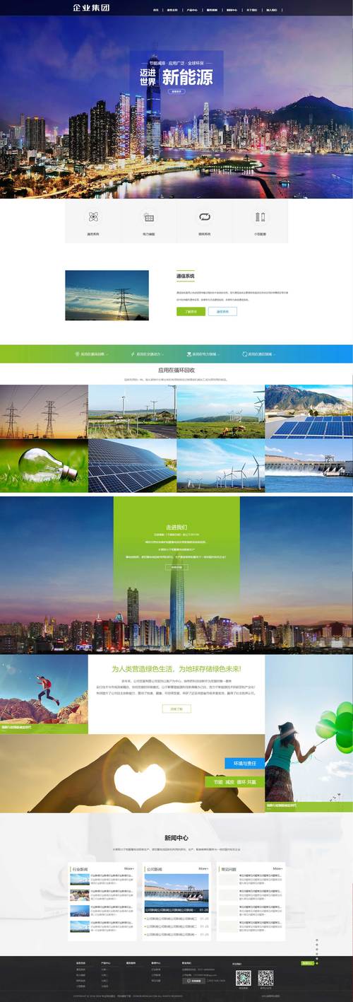
(图片来源网络,侵删)


