目录
-
入门级特效
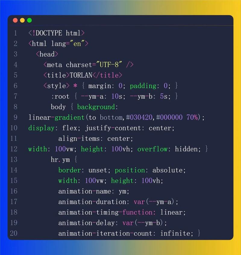 (图片来源网络,侵删)
- 1 悬停按钮放大效果
- 2 文字打字机效果
- 3 渐变背景动画
- 4 卡片悬停浮起效果
-
进阶级特效
- 1 3D 翻转卡片
- 2 加载动画
- 3 平滑滚动到顶部
- 4 图片悬停放大效果
-
高级/创意特效
- 1 鼠标跟随光标特效
- 2 粒子背景效果
- 3 文字描边/发光效果
- 4 玻璃态设计
入门级特效
这些特效简单易用,适合新手练习,能快速提升网站的交互感。
1 悬停按钮放大效果
这是最基础的交互效果,让用户在鼠标悬停时得到视觉反馈。
(图片来源网络,侵删)
代码:
<!DOCTYPE html>
<html lang="zh-CN">
<head>
    <meta charset="UTF-8">悬停放大效果</title>
    <style>
        body {
            display: flex;
            justify-content: center;
            align-items: center;
            height: 100vh;
            background-color: #f0f2f5;
            font-family: sans-serif;
        }
        .hover-button {
            padding: 15px 30px;
            font-size: 18px;
            color: white;
            background-color: #007bff;
            border: none;
            border-radius: 8px;
            cursor: pointer;
            transition: transform 0.3s ease, box-shadow 0.3s ease; /* 关键:设置过渡效果 */
        }
        .hover-button:hover {
            transform: scale(1.1); /* 放大 1.1 倍 */
            box-shadow: 0 10px 20px rgba(0, 123, 255, 0.3); /* 添加阴影 */
        }
    </style>
</head>
<body>
    <button class="hover-button">悬停我</button>
</body>
</html>
说明:
transition: 属性让transform和box-shadow的变化在 0.3 秒内平滑完成,而不是瞬间跳变。hover: CSS 伪类,用于定义鼠标悬停在元素上时的样式。transform: scale(): 用于缩放元素。
2 文字打字机效果
模拟打字机逐字输出文字的效果,常用于网站首页的标语。
代码:
<!DOCTYPE html>
<html lang="zh-CN">
<head>
    <meta charset="UTF-8">打字机效果</title>
    <style>
        body {
            display: flex;
            justify-content: center;
            align-items: center;
            height: 100vh;
            background-color: #282c34;
            color: white;
            font-family: 'Courier New', Courier, monospace;
        }
        .typewriter {
            font-size: 2rem;
            border-right: 3px solid white;
            padding-right: 5px;
            animation: blink 1s infinite;
        }
        @keyframes blink {
            0%, 50% { border-color: white; }
            51%, 100% { border-color: transparent; }
        }
    </style>
</head>
<body>
    <p class="typewriter" id="typewriter"></p>
    <script>
        const text = "欢迎来到我的网站!";
        const element = document.getElementById('typewriter');
        let index = 0;
        function type() {
            if (index < text.length) {
                element.textContent += text.charAt(index);
                index++;
                setTimeout(type, 150); // 控制打字速度
            }
        }
        type();
    </script>
</body>
</html>
说明:
@keyframes: 定义名为blink的动画,用于光标的闪烁效果。animation: 将blink动画应用到元素上,并设置无限循环。JavaScript: 通过setTimeout逐个将字符添加到p标签中,模拟打字过程。
3 渐变背景动画
让背景色平滑地过渡,创造出动态、吸引人的视觉效果。
代码:
<!DOCTYPE html>
<html lang="zh-CN">
<head>
    <meta charset="UTF-8">渐变背景动画</title>
    <style>
        body, html {
            height: 100%;
            margin: 0;
            display: flex;
            justify-content: center;
            align-items: center;
            font-family: sans-serif;
            color: white;
        }
        .animated-gradient {
            width: 100%;
            height: 100%;
            background: linear-gradient(-45deg, #ee7752, #e73c7e, #23a6d5, #23d5ab);
            background-size: 400% 400%; /* 关键:放大背景尺寸 */
            animation: gradientBG 15s ease infinite; /* 关键:应用动画 */
        }
        @keyframes gradientBG {
            0% { background-position: 0% 50%; }
            50% { background-position: 100% 50%; }
            100% { background-position: 0% 50%; }
        }
        .content {
            z-index: 10;
            text-align: center;
        }
    </style>
</head>
<body>
    <div class="animated-gradient"></div>
    <div class="content">
        <h1>动态渐变背景</h1>
        <p>这是一个非常酷炫的背景效果</p>
    </div>
</body>
</html>
说明:
background-size: 400% 400%: 将背景图片(这里是渐变)放大四倍,这样在移动背景位置时才有空间可以“滑动”。@keyframes gradientBG: 通过改变background-position的位置,让渐变背景产生流动感。animation: 将定义好的动画应用到元素上,并设置持续时间、缓动函数和循环次数。
4 卡片悬停浮起效果
让卡片在鼠标悬停时浮起并显示更多信息,是现代网页设计的常用元素。
代码:
<!DOCTYPE html>
<html lang="zh-CN">
<head>
    <meta charset="UTF-8">卡片浮起效果</title>
    <style>
        body {
            display: flex;
            justify-content: center;
            align-items: center;
            height: 100vh;
            background-color: #f0f2f5;
            font-family: sans-serif;
        }
        .card-container {
            perspective: 1000px; /* 为 3D 空间设置透视距离 */
        }
        .card {
            width: 300px;
            height: 200px;
            background-color: white;
            border-radius: 10px;
            box-shadow: 0 4px 8px rgba(0,0,0,0.1);
            display: flex;
            justify-content: center;
            align-items: center;
            transition: transform 0.6s, box-shadow 0.6s;
            transform-style: preserve-3d; /* 保持 3D 效果 */
        }
        .card:hover {
            transform: translateY(-20px) rotateX(5deg); /* 上浮并轻微前倾 */
            box-shadow: 0 15px 30px rgba(0,0,0,0.2);
        }
    </style>
</head>
<body>
    <div class="card-container">
        <div class="card">
            <h2>悬停我</h2>
        </div>
    </div>
</body>
</html>
说明:
perspective: 定义观察者与z=0平面的距离,产生 3D 感,值越大,3D 效果越不明显。transform-style: preserve-3d: 确保子元素可以在 3D 空间中变换。transform: translateY(-20px) rotateX(5deg): 同时应用向上平移和沿 X 轴的轻微旋转,增强立体感。
进阶级特效
这些特效需要更多的 CSS 知识和一些 JavaScript,能让你的网站更具专业感。
1 3D 翻转卡片
展示卡片正反两面,常用于产品展示、信息摘要等。
代码:
<!DOCTYPE html>
<html lang="zh-CN">
<head>
    <meta charset="UTF-8">3D 翻转卡片</title>
    <style>
        body { display: flex; justify-content: center; align-items: center; height: 100vh; background: #333; }
        .flip-card {
            width: 300px;
            height: 200px;
            perspective: 1000px;
        }
        .flip-card-inner {
            position: relative;
            width: 100%;
            height: 100%;
            text-align: center;
            transition: transform 0.8s;
            transform-style: preserve-3d;
        }
        .flip-card:hover .flip-card-inner {
            transform: rotateY(180deg); /* 悬停时翻转 180 度 */
        }
        .flip-card-front, .flip-card-back {
            position: absolute;
            width: 100%;
            height: 100%;
            -webkit-backface-visibility: hidden; /* 隐藏背面的元素 */
            backface-visibility: hidden;
            border-radius: 10px;
            display: flex;
            justify-content: center;
            align-items: center;
            font-size: 24px;
            color: white;
        }
        .flip-card-front { background-color: #2980b9; }
        .flip-card-back {
            background-color: #e74c3c;
            transform: rotateY(180deg); /* 初始状态就是背面朝外 */
        }
    </style>
</head>
<body>
    <div class="flip-card">
        <div class="flip-card-inner">
            <div class="flip-card-front">
                <p>正面</p>
            </div>
            <div class="flip-card-back">
                <p>背面</p>
            </div>
        </div>
    </div>
</body>
</html>
说明:
transform-style: preserve-3d和perspective是实现 3D 效果的基础。-webkit-backface-visibility: hidden;是关键,它让元素的背面在旋转后不可见,否则翻转后你会看到两个面的内容叠加在一起。- 背面元素
.flip-card-back需要预先rotateY(180deg),这样它在初始状态下就是“背对着”用户的,当父容器整体翻转 180 度后,它就正对着用户了。
2 加载动画
加载时显示,提升用户体验。
代码:
<!DOCTYPE html>
<html lang="zh-CN">
<head>
    <meta charset="UTF-8">加载动画</title>
    <style>
        body { display: flex; justify-content: center; align-items: center; height: 100vh; background: #f0f0f0; }
        .loader {
            width: 50px;
            height: 50px;
            border: 5px solid #f3f3f3;
            border-top: 5px solid #3498db;
            border-radius: 50%;
            animation: spin 1s linear infinite;
        }
        @keyframes spin {
            0% { transform: rotate(0deg); }
            100% { transform: rotate(360deg); }
        }
    </style>
</head>
<body>
    <div class="loader"></div>
</body>
</html>
说明:
- 这是一个经典的旋转加载器。
border-radius: 50%将一个正方形元素变成圆形。border-top属性设置了顶边的颜色,其他边为灰色,这样旋转时就只看到一个彩色边框在动。@keyframes spin定义了从 0 度到 360 度的无限旋转动画。
3 平滑滚动到顶部
当页面很长时,这个按钮能让用户快速返回顶部,体验更流畅。
代码:
<!DOCTYPE html>
<html lang="zh-CN">
<head>
    <meta charset="UTF-8">平滑滚动</title>
    <style>
        html { scroll-behavior: smooth; } /* CSS 方式,最简单 */
        body { height: 2000px; font-family: sans-serif; text-align: center; }
        #back-to-top {
            position: fixed;
            bottom: 20px;
            right: 20px;
            padding: 10px 20px;
            background-color: #007bff;
            color: white;
            border: none;
            border-radius: 5px;
            cursor: pointer;
            display: none; /* 默认隐藏 */
        }
        #back-to-top:hover { background-color: #0056b3; }
    </style>
</head>
<body>
    <h1>向下滚动页面</h1>
    <p>...</p>
    <button id="back-to-top">回到顶部</button>
    <script>
        // JS 方式,更灵活,可以控制显示/隐藏
        const mybutton = document.getElementById("back-to-top");
        // 当用户向下滚动 20px 时,显示按钮
        window.onscroll = function() {
            if (document.body.scrollTop > 20 || document.documentElement.scrollTop > 20) {
                mybutton.style.display = "block";
            } else {
                mybutton.style.display = "none";
            }
        };
        // 点击按钮时,平滑滚动到顶部
        mybutton.addEventListener("click", function() {
            // window.scrollTo({top: 0, behavior: 'smooth'}); // 现代浏览器支持
            // 兼容旧浏览器的写法
            document.body.scrollTop = 0; // For Safari
            document.documentElement.scrollTop = 0; // For Chrome, Firefox, IE and Opera
        });
    </script>
</body>
</html>
说明:
- CSS 方式: 在
html元素上设置scroll-behavior: smooth;,所有锚点链接都会平滑滚动,这是最简单的方法。 - JS 方式: 通过监听
window.onscroll事件,判断滚动位置来控制按钮的显示和隐藏,点击按钮时,使用window.scrollTo({top: 0, behavior: 'smooth'})实现平滑滚动。
4 图片悬停放大效果
鼠标悬停在图片上时,图片会平滑地放大并居中显示。
代码:
<!DOCTYPE html>
<html lang="zh-CN">
<head>
    <meta charset="UTF-8">图片悬停放大</title>
    <style>
        body { display: flex; justify-content: center; align-items: center; height: 100vh; background: #222; }
        .zoom-container {
            width: 300px;
            height: 200px;
            overflow: hidden; /* 关键:隐藏放大的部分 */
            border-radius: 8px;
        }
        .zoom-container img {
            width: 100%;
            height: 100%;
            object-fit: cover; /* 关键:确保图片填充容器 */
            transition: transform 0.5s ease-in-out; /* 关键:设置 transform 的过渡 */
        }
        .zoom-container:hover img {
            transform: scale(1.2); /* 放大 1.2 倍 */
        }
    </style>
</head>
<body>
    <div class="zoom-container">
        <img src="https://via.placeholder.com/300x200" alt="示例图片">
    </div>
</body>
</html>
说明:
overflow: hidden: 这是实现放大效果的核心,它将图片容器.zoom-container的尺寸固定,并隐藏掉超出容器的部分。object-fit: cover: 确保图片在保持其宽高比的同时,完全覆盖其容器,避免图片被拉伸或压缩。transition: transform: 只对transform属性应用过渡效果,性能更好,更流畅。
高级/创意特效
这些特效更具视觉冲击力,能显著提升网站的独特性和高级感。
1 鼠标跟随光标特效
创建一个或多个元素,让它们跟随鼠标移动,产生酷炫的视觉效果。
代码:
<!DOCTYPE html>
<html lang="zh-CN">
<head>
    <meta charset="UTF-8">鼠标跟随光标</title>
    <style>
        body {
            height: 100vh;
            background: #111;
            cursor: none; /* 隐藏默认光标 */
            overflow: hidden;
        }
        .cursor {
            width: 20px;
            height: 20px;
            border: 2px solid #fff;
            border-radius: 50%;
            position: fixed;
            pointer-events: none; /* 鼠标事件可以穿透 */
            transition: transform 0.1s ease-out;
            z-index: 9999;
        }
        .cursor-follower {
            width: 40px;
            height: 40px;
            background: rgba(255, 255, 255, 0.1);
            border-radius: 50%;
            position: fixed;
            pointer-events: none;
            transition: transform 0.3s ease-out;
            z-index: 9998;
        }
    </style>
</head>
<body>
    <div class="cursor"></div>
    <div class="cursor-follower"></div>
    <script>
        const cursor = document.querySelector('.cursor');
        const follower = document.querySelector('.cursor-follower');
        document.addEventListener('mousemove', (e) => {
            // 光标直接跟随鼠标
            cursor.style.left = e.clientX - 10 + 'px';
            cursor.style.top = e.clientY - 10 + 'px';
            // 延迟跟随,产生拖尾效果
            setTimeout(() => {
                follower.style.left = e.clientX - 20 + 'px';
                follower.style.top = e.clientY - 20 + 'px';
            }, 100);
        });
    </script>
</body>
</html>
说明:
cursor: none;: 隐藏浏览器默认的鼠标光标。position: fixed;: 让元素相对于视口定位,这样它们会跟随页面滚动。pointer-events: none;: 非常重要,它让这些自定义光标元素不拦截鼠标事件,这样页面上的按钮和链接仍然可以被点击。JavaScript: 通过mousemove事件监听器获取鼠标坐标,并实时更新自定义光标的位置。setTimeout用于创建延迟跟随的“拖尾”效果。
2 粒子背景效果
使用 Canvas 绘制的动态粒子背景,科技感十足。
代码:
<!DOCTYPE html>
<html lang="zh-CN">
<head>
    <meta charset="UTF-8">粒子背景</title>
    <style>
        body, html { margin: 0; padding: 0; height: 100%; overflow: hidden; background: #000; }
        canvas { display: block; }
    </style>
</head>
<body>
    <canvas id="particleCanvas"></canvas>
    <script>
        const canvas = document.getElementById('particleCanvas');
        const ctx = canvas.getContext('2d');
        canvas.width = window.innerWidth;
        canvas.height = window.innerHeight;
        const particles = [];
        const particleCount = 100;
        class Particle {
            constructor() {
                this.x = Math.random() * canvas.width;
                this.y = Math.random() * canvas.height;
                this.size = Math.random() * 5 + 1;
                this.speedX = Math.random() * 3 - 1.5;
                this.speedY = Math.random() * 3 - 1.5;
            }
            update() {
                this.x += this.speedX;
                this.y += this.speedY;
                if (this.x > canvas.width || this.x < 0) this.speedX = -this.speedX;
                if (this.y > canvas.height || this.y < 0) this.speedY = -this.speedY;
            }
            draw() {
                ctx.fillStyle = 'rgba(255, 255, 255, 0.8)';
                ctx.beginPath();
                ctx.arc(this.x, this.y, this.size, 0, Math.PI * 2);
                ctx.fill();
            }
        }
        function init() {
            for (let i = 0; i < particleCount; i++) {
                particles.push(new Particle());
            }
        }
        function connectParticles() {
            for (let i = 0; i < particles.length; i++) {
                for (let j = i; j < particles.length; j++) {
                    const dx = particles[i].x - particles[j].x;
                    const dy = particles[i].y - particles[j].y;
                    const distance = Math.sqrt(dx * dx + dy * dy);
                    if (distance < 100) {
                        ctx.strokeStyle = `rgba(255, 255, 255, ${1 - distance / 100})`;
                        ctx.lineWidth = 0.5;
                        ctx.beginPath();
                        ctx.moveTo(particles[i].x, particles[i].y);
                        ctx.lineTo(particles[j].x, particles[j].y);
                        ctx.stroke();
                    }
                }
            }
        }
        function animate() {
            ctx.clearRect(0, 0, canvas.width, canvas.height);
            for (let i = 0; i < particles.length; i++) {
                particles[i].update();
                particles[i].draw();
            }
            connectParticles();
            requestAnimationFrame(animate);
        }
        window.addEventListener('resize', () => {
            canvas.width = window.innerWidth;
            canvas.height = window.innerHeight;
        });
        init();
        animate();
    </script>
</body>
</html>
说明:
- Canvas API: 这是实现粒子效果的核心。
<canvas>是一个 HTML5 元素,可以通过 JavaScript 在其上绘制图形。 - 面向对象: 使用
class来创建Particle对象,每个粒子都有自己的位置、大小和速度,便于管理。 - 动画循环:
requestAnimationFrame(animate)是创建流畅动画的标准方法,它会告诉浏览器在下次重绘之前调用指定的函数。 - 连线逻辑: 在
connectParticles函数中,遍历所有粒子,计算它们之间的距离,如果距离小于某个值(如100像素),就在它们之间画一条线,线的透明度随距离增加而降低。
3 文字描边/发光效果
让文字有轮廓或发光效果,使其在复杂背景下依然清晰可见。
代码:
<!DOCTYPE html>
<html lang="zh-CN">
<head>
    <meta charset="UTF-8">文字描边/发光</title>
    <style>
        body { display: flex; justify-content: center; align-items: center; height: 100vh; background: #222; font-family: sans-serif; }
        h1 {
            font-size: 4rem;
            color: #fff;
            /* 文字描边效果 */
            /* -webkit-text-stroke: 2px #ff00ff; */
            /* text-stroke: 2px #ff00ff; */
            /* 文字发光效果 */
            text-shadow:
                0 0 5px #fff,
                0 0 10px #fff,
                0 0 15px #fff,
                0 0 20px #ff00de,
                0 0 35px #ff00de,
                0 0 40px #ff00de;
        }
    </style>
</head>
<body>
    <h1>酷炫的文字</h1>
</body>
</html>
说明:
- 文字描边:
-webkit-text-stroke: 一个非标准的 CSS 属性,但得到了广泛支持(包括 Chrome, Safari, Edge),它可以为文字添加描边。text-stroke: 标准属性,但目前浏览器支持度不高,通常需要加-webkit-前缀。
- 文字发光:
text-shadow: 为文字添加阴影,通过叠加多个阴影,并让它们颜色相同、模糊半径递增,就可以创造出发光效果。
4 玻璃态设计
模糊背景,创造出半透明、磨砂玻璃质感的效果,现代感极强。
代码:
<!DOCTYPE html>
<html lang="zh-CN">
<head>
    <meta charset="UTF-8">玻璃态设计</title>
    <style>
        body {
            height: 100vh;
            display: flex;
            justify-content: center;
            align-items: center;
            background: linear-gradient(135deg, #1e3c72, #2a5298);
            font-family: sans-serif;
        }
        .glass-card {
            width: 350px;
            padding: 40px;
            background: rgba(255, 255, 255, 0.1);
            backdrop-filter: blur(10px); /* 关键:实现模糊效果 */
            -webkit-backdrop-filter: blur(10px); /* Safari 兼容 */
            border-radius: 20px;
            border: 1px solid rgba(255, 255, 255, 0.2);
            box-shadow: 0 8px 32px 0 rgba(31, 38, 135, 0.37);
            color: white;
            text-align: center;
        }
        h2 { margin-top: 0; }
    </style>
</head>
<body>
    <div class="glass-card">
        <h2>玻璃态卡片</h2>
        <p>这个卡片具有半透明和模糊背景的效果,看起来非常现代。</p>
    </div>
</body>
</html>
说明:
backdrop-filter: blur(10px);: 这是实现玻璃态效果的核心属性,它会对元素进行模糊处理,而不是元素本身。background: rgba(255, 255, 255, 0.1);: 设置一个低透明度的背景色,这样模糊后的背景才能被看到。-webkit-backdrop-filter: 为了兼容 Safari 浏览器,需要加上这个前缀。border: 1px solid rgba(255, 255, 255, 0.2);: 添加一个同样半透明的边框,可以增强玻璃的质感。
希望这些代码和解释能帮助你创造出令人惊艳的网页!你可以直接复制这些代码到 .html 文件中,然后在浏览器中打开查看效果。


