您可以直接复制下面的所有代码,保存为一个 .html 文件(index.html),然后用浏览器打开即可看到效果。
(图片来源网络,侵删)
模板特点
- 简洁现代:使用了流行的卡片式布局和清爽的配色。
- 响应式:自动适应不同屏幕尺寸。
- 易于修改:使用注释清晰地标明了需要修改的部分,您只需修改文字和图片链接即可。
- 无需后端:纯前端技术,无需服务器即可运行。
完整代码
<!DOCTYPE html>
<html lang="zh-CN">
<head>
<meta charset="UTF-8">
<meta name="viewport" content="width=device-width, initial-scale=1.0">我的个人网站</title>
<!-- 引入 Google Fonts 字体 (可选) -->
<link rel="preconnect" href="https://fonts.googleapis.com">
<link rel="preconnect" href="https://fonts.gstatic.com" crossorigin>
<link href="https://fonts.googleapis.com/css2?family=Poppins:wght@400;600;700&display=swap" rel="stylesheet">
<!-- 引入 Font Awesome 图标库 (可选) -->
<link rel="stylesheet" href="https://cdnjs.cloudflare.com/ajax/libs/font-awesome/6.4.0/css/all.min.css">
<style>
/* --- 全局样式重置和基础设置 --- */
* {
margin: 0;
padding: 0;
box-sizing: border-box;
font-family: 'Poppins', sans-serif; /* 使用引入的Google字体 */
}
body {
background-color: #f4f7f6; /* 浅灰色背景 */
color: #333; /* 深灰色文字 */
line-height: 1.6;
}
.container {
width: 90%;
max-width: 1200px; /* 内容最大宽度,避免在大屏幕上过宽 */
margin: 0 auto; /* 水平居中 */
padding: 20px 0; /* 上下内边距 */
}
/* --- 导航栏样式 --- */
nav {
display: flex;
justify-content: space-between;
align-items: center;
padding: 20px 0;
border-bottom: 1px solid #e0e0e0;
margin-bottom: 40px;
}
.logo {
font-size: 1.8rem;
font-weight: 700;
color: #007BFF; /* 蓝色Logo */
}
.nav-links {
display: flex;
list-style: none;
}
.nav-links li {
margin-left: 30px;
}
.nav-links a {
text-decoration: none;
color: #333;
font-weight: 600;
transition: color 0.3s ease;
}
.nav-links a:hover {
color: #007BFF; /* 鼠标悬停时变蓝 */
}
/* --- 区域通用样式 --- */
section {
margin-bottom: 60px;
}
h1, h2 {
text-align: center;
margin-bottom: 20px;
}
h1 {
font-size: 2.5rem;
color: #333;
}
h2 {
font-size: 2rem;
color: #444;
}
/* --- 关于我部分 --- */
.about-content {
display: flex;
align-items: center;
justify-content: space-between;
flex-wrap: wrap; /* 允许在小屏幕上换行 */
}
.about-text {
flex: 1;
padding-right: 40px;
}
.about-image {
flex: 1;
text-align: center;
}
.about-image img {
max-width: 100%;
height: auto;
border-radius: 10px; /* 圆角图片 */
box-shadow: 0 10px 20px rgba(0,0,0,0.1); /* 阴影效果 */
}
/* --- 技能部分 --- */
.skills-grid {
display: grid;
grid-template-columns: repeat(auto-fit, minmax(250px, 1fr)); /* 自适应网格 */
gap: 20px;
}
.skill-card {
background-color: #fff;
padding: 25px;
border-radius: 10px;
box-shadow: 0 5px 15px rgba(0,0,0,0.05);
text-align: center;
transition: transform 0.3s ease, box-shadow 0.3s ease;
}
.skill-card:hover {
transform: translateY(-10px);
box-shadow: 0 15px 30px rgba(0,0,0,0.1);
}
.skill-card i {
font-size: 3rem;
color: #007BFF;
margin-bottom: 15px;
}
.skill-card h3 {
margin-bottom: 10px;
}
/* --- 联系部分 --- */
.contact-content {
text-align: center;
}
.contact-info {
display: flex;
justify-content: center;
gap: 40px;
margin-top: 30px;
flex-wrap: wrap; /* 允许在小屏幕上换行 */
}
.contact-item {
display: flex;
align-items: center;
gap: 10px;
}
.contact-item i {
font-size: 1.5rem;
color: #007BFF;
}
/* --- 页脚 --- */
footer {
text-align: center;
padding: 20px;
margin-top: 40px;
border-top: 1px solid #e0e0e0;
font-size: 0.9rem;
color: #777;
}
/* --- 响应式设计 --- */
@media (max-width: 768px) {
.about-content {
flex-direction: column;
}
.about-text {
padding-right: 0;
margin-bottom: 20px;
}
.nav-links {
margin-left: 0;
}
.nav-links li {
margin-left: 15px;
}
}
</style>
</head>
<body>
<!-- 导航栏 -->
<header>
<nav class="container">
<div class="logo">我的Logo</div>
<ul class="nav-links">
<li><a href="#about">关于我</a></li>
<li><a href="#skills">技能</a></li>
<li><a href="#contact">联系我</a></li>
</ul>
</nav>
</header>
<main class="container">
<!-- 关于我部分 -->
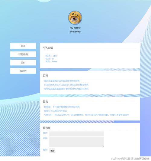
<section id="about">
<h1>关于我</h1>
<div class="about-content">
<div class="about-text">
<p>你好!我是一名充满热情的前端开发者,我热爱将复杂的问题转化为简单、优雅、直观的用户界面。</p>
<p>我相信,好的设计不仅要美观,更要能提供流畅的用户体验,在我的职业生涯中,我不断学习新技术,致力于打造高质量的网页应用。</p>
<p>除了编程,我还喜欢摄影、旅行和阅读,这些爱好让我保持好奇心和创造力,并将这些灵感融入到我的工作中。</p>
</div>
<div class="about-image">
<!-- 请替换成你自己的图片链接 -->
<img src="https://via.placeholder.com/400x500" alt="我的照片">
</div>
</div>
</section>
<!-- 技能部分 -->
<section id="skills">
<h2>我的技能</h2>
<div class="skills-grid">
<div class="skill-card">
<!-- Font Awesome 图标,可以替换成你想要的 -->
<i class="fab fa-html5"></i>
<h3>HTML5</h3>
<p>精通语义化标签,构建坚实网页结构。</p>
</div>
<div class="skill-card">
<i class="fab fa-css3-alt"></i>
<h3>CSS3</h3>
<p>熟练使用Flexbox, Grid,以及响应式设计。</p>
</div>
<div class="skill-card">
<i class="fab fa-js-square"></i>
<h3>JavaScript</h3>
<p>掌握ES6+语法,能够开发动态交互功能。</p>
</div>
<div class="skill-card">
<i class="fab fa-react"></i>
<h3>React</h3>
<p>熟悉React生态系统,能够构建单页应用。</p>
</div>
</div>
</section>
<!-- 联系我部分 -->
<section id="contact">
<h2>联系我</h2>
<div class="contact-content">
<p>如果你对我的工作感兴趣,或者有任何问题,欢迎随时与我联系!</p>
<div class="contact-info">
<div class="contact-item">
<i class="fas fa-envelope"></i>
<span>your.email@example.com</span>
</div>
<div class="contact-item">
<i class="fab fa-github"></i>
<span>github.com/yourusername</span>
</div>
<div class="contact-item">
<i class="fab fa-linkedin"></i>
<span>linkedin.com/in/yourprofile</span>
</div>
</div>
</div>
</section>
</main>
<!-- 页脚 -->
<footer>
<p>© 2025 我的名字. 保留所有权利.</p>
</footer>
</body>
</html>
如何使用和修改这个模板
-
保存文件:将上面的全部代码复制,粘贴到一个新的文本文件中,将其命名为
index.html并保存。 -
用浏览器打开:找到你保存的
index.html文件,用 Chrome、Firefox、Edge 等任何现代浏览器打开它,你就能看到一个完整的单页网站。 -
开始修改:
- 和Logo:修改
<title>我的个人网站</title>和<div class="logo">我的Logo</div>中的文字。 - 关于我部分:在
<section id="about">中,修改<p>标签里的文字内容,介绍你自己,最重要的是,将<img src="https://via.placeholder.com/400x500" alt="我的照片">中的src属性值替换为你自己照片的网络链接或本地路径(images/my-photo.jpg),请确保你的图片和index.html文件在同一个文件夹下,或者提供正确的网络地址。 - 技能部分:在
<section id="skills">中,修改<h3>和<p>标签里的文字,描述你的技能,如果你想更换图标,可以访问 Font Awesome 网站,找到你喜欢的图标,然后替换<i>标签中的类名,<i class="fab fa-python"></i>代表Python图标。 - 联系我部分:在
<section id="contact">中,修改邮箱、GitHub、LinkedIn等联系方式,将your.email@example.com等替换成你自己的信息。 - 页脚版权信息:修改
<footer>中的年份和名字。
- 和Logo:修改
下一步可以做什么?
这个模板是一个很好的起点,当你熟悉了之后,可以尝试:
(图片来源网络,侵删)
- 添加更多部分:项目展示”或“工作经历”。
- 更换配色:修改 CSS 中的颜色值(如
#007BFF,#f4f7f6)来改变网站的整体风格。 - 添加动画效果:学习使用 CSS
@keyframes或 JavaScript (如 AOS.js 库) 为元素添加滚动显示等动画。 - 部署到线上:将你的网站部署到 GitHub Pages、Netlify 或 Vercel 等免费平台上,让任何人都能通过互联网访问。
(图片来源网络,侵删)


