从零开始创建一个自定义 jQuery 插件
这种方法的好处是完全可控,可以根据你的具体需求定制样式和功能。
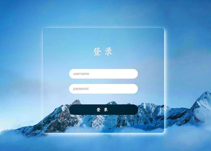
(图片来源网络,侵删)
第 1 步:规划插件功能
我们的插件需要具备以下功能:
- 触发条件:只在用户“首次”登录时显示,我们将使用
localStorage来记录用户是否已经看过提示。 - UI 元素:一个覆盖在页面上的半透明遮罩层,中间有一个提示框。
- :包含欢迎语、核心功能介绍、关闭按钮。
- 交互:用户点击关闭按钮或遮罩层后,提示消失,并记录“已看过”的状态,下次不再显示。
第 2 步:创建插件文件结构
创建一个简单的 HTML 文件来测试我们的插件。
project-folder/
├── index.html          # 主页面
├── css/
│   └── style.css       # 页面和插件的样式
└── js/
    ├── jquery.min.js    # jQuery 库
    └── first-login-tip.js # 我们自己编写的插件
第 3 步:编写插件代码 (js/first-login-tip.js)
这是插件的核心,我们将使用 jQuery 的 $.fn 来扩展其功能。
// 遵循 jQuery 插件编写规范,避免污染全局命名空间
(function ($) {
    // 定义插件默认配置
    const defaults = {
        // 提示框标题
        title: '欢迎新用户!',
        // 提示内容,支持 HTML
        content: '<p>感谢您首次登录!我们为您准备了以下核心功能:</p><ul><li>✨ 快速发布内容</li><li>🔍 强大的搜索功能</li><li>👥 与其他用户互动</li></ul>',
        // 关闭按钮文本
        buttonText: '我知道了',
        // 提示框的 CSS 类名,方便自定义样式
        modalClass: 'my-first-login-modal',
        // 是否允许点击遮罩层关闭
        allowBackdropClose: true
    };
    // 插件主函数
    $.fn.firstLoginTip = function (options) {
        // 将用户传入的选项与默认选项合并
        const settings = $.extend({}, defaults, options);
        // 遍历每个被选中的元素(虽然这里我们通常只用在 body 上)
        return this.each(function () {
            const $body = $(this);
            // 核心逻辑:检查 localStorage
            const hasSeenTip = localStorage.getItem('hasSeenFirstLoginTip');
            // 如果已经看过,则直接返回,不执行任何操作
            if (hasSeenTip) {
                return;
            }
            // 如果没有看过,则创建并显示提示框
            createAndShowModal($body, settings);
        });
    };
    // 创建和显示模态框的辅助函数
    function createAndShowModal($body, settings) {
        // 1. 创建遮罩层
        const $backdrop = $('<div class="modal-backdrop"></div>');
        // 2. 创建提示框容器
        const $modal = $('<div class="' + settings.modalClass + '"></div>');
        // 3. 构建提示框内部 HTML
        $modal.html(`
            <div class="modal-dialog">
                <div class="modal-content">
                    <h2 class="modal-title">${settings.title}</h2>
                    <div class="modal-body">
                        ${settings.content}
                    </div>
                    <div class="modal-footer">
                        <button class="modal-close-btn">${settings.buttonText}</button>
                    </div>
                </div>
            </div>
        `);
        // 4. 将元素添加到 body 中
        $body.append($backdrop);
        $body.append($modal);
        // 5. 添加关闭事件
        const closeModal = function () {
            // 添加淡出动画
            $backdrop.fadeOut(300);
            $modal.fadeOut(300, function() {
                // 动画结束后,移除 DOM 元素
                $(this).remove();
                $backdrop.remove();
            });
            // 在 localStorage 中标记为“已看过”
            localStorage.setItem('hasSeenFirstLoginTip', 'true');
        };
        // 关闭按钮点击事件
        $modal.on('click', '.modal-close-btn', closeModal);
        // 点击遮罩层关闭(如果允许)
        if (settings.allowBackdropClose) {
            $backdrop.on('click', closeModal);
        }
        // 添加显示动画
        setTimeout(() => {
            $backdrop.addClass('show');
            $modal.addClass('show');
        }, 10); // 使用 setTimeout 确保 CSS transition 生效
    }
})(jQuery); // 传入 jQuery 对象
第 4 歒:编写 CSS 样式 (css/style.css)
为了让我们的提示框看起来更美观,添加一些样式。

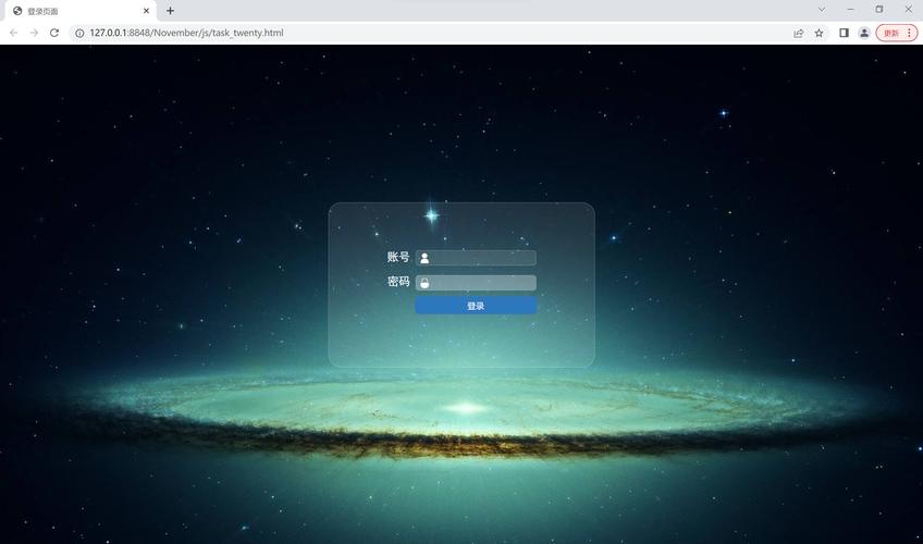
(图片来源网络,侵删)
/* 基础页面样式,让内容居中以便观察 */
body {
    font-family: -apple-system, BlinkMacSystemFont, "Segoe UI", Roboto, "Helvetica Neue", Arial, sans-serif;
    background-color: #f4f7f6;
    color: #333;
    padding: 50px;
}
/* 遮罩层样式 */
.modal-backdrop {
    position: fixed;
    top: 0;
    left: 0;
    width: 100%;
    height: 100%;
    background-color: rgba(0, 0, 0, 0.5);
    z-index: 1040;
    opacity: 0;
    transition: opacity 0.3s ease;
}
.modal-backdrop.show {
    opacity: 1;
}
/* 提示框容器样式 */
.my-first-login-modal {
    position: fixed;
    top: 50%;
    left: 50%;
    transform: translate(-50%, -50%) scale(0.9);
    z-index: 1050;
    opacity: 0;
    transition: opacity 0.3s ease, transform 0.3s ease;
}
.my-first-login-modal.show {
    opacity: 1;
    transform: translate(-50%, -50%) scale(1);
}
.my-first-login-modal .modal-dialog {
    width: 90%;
    max-width: 500px;
    background-color: #fff;
    border-radius: 8px;
    box-shadow: 0 5px 15px rgba(0,0,0,0.3);
    overflow: hidden;
}
.my-first-login-modal .modal-content {
    padding: 20px;
}
.my-first-login-modal .modal-title {
    margin-top: 0;
    margin-bottom: 15px;
    color: #2c3e50;
    border-bottom: 1px solid #eee;
    padding-bottom: 10px;
}
.my-first-login-modal .modal-body {
    margin-bottom: 20px;
    line-height: 1.6;
}
.my-first-login-modal .modal-body ul {
    padding-left: 20px;
}
.my-first-login-modal .modal-footer {
    text-align: right;
    border-top: 1px solid #eee;
    padding-top: 15px;
}
.my-first-login-modal .modal-close-btn {
    background-color: #007bff;
    color: white;
    border: none;
    padding: 8px 20px;
    border-radius: 4px;
    cursor: pointer;
    font-size: 16px;
    transition: background-color 0.2s;
}
.my-first-login-modal .modal-close-btn:hover {
    background-color: #0056b3;
}
第 5 步:在 HTML 中调用插件 (index.html)
<!DOCTYPE html>
<html lang="zh-CN">
<head>
    <meta charset="UTF-8">
    <meta name="viewport" content="width=device-width, initial-scale=1.0">首次登录提示示例</title>
    <!-- 引入 CSS -->
    <link rel="stylesheet" href="css/style.css">
</head>
<body>
    <h1>欢迎来到我们的网站</h1>
    <p>这里是一些网站的主要内容...</p>
    <p>刷新页面或关闭浏览器后重新打开,提示框将不再显示。</p>
    <p><strong>提示:</strong>要重置提示状态,请在浏览器开发者工具的 "Application" -> "Local Storage" 中删除 `hasSeenFirstLoginTip` 这一项。</p>
    <!-- 1. 引入 jQuery 库 -->
    <script src="https://code.jquery.com/jquery-3.6.0.min.js"></script>
    <!-- 2. 引入我们自己的插件 -->
    <script src="js/first-login-tip.js"></script>
    <!-- 3. 调用插件 -->
    <script>
    $(document).ready(function() {
        // 在 body 上调用我们的插件
        $('body').firstLoginTip({
            title: '🎉 欢迎新朋友!',
            content: '<p>恭喜您成功登录!为了让您更好地体验,请花一分钟了解我们的核心功能:</p><ul><li>✨ <strong>快速发布</strong>:分享您的想法和动态。</li><li>🔍 <strong>智能搜索</strong>:快速找到您感兴趣的内容。</li><li>👥 <strong>社区互动</strong>:关注和评论其他用户。</li></ul>',
            buttonText: '开始探索',
            modalClass: 'my-first-login-modal',
            allowBackdropClose: true
        });
    });
    </script>
</body>
</html>
使用成熟的第三方 jQuery 插件
如果你不想自己编写,或者需要一个功能更强大的模态框(如图集、视频支持等),可以使用现成的插件,一个非常流行的选择是 Bootstrap Modal,它本身就带有 jQuery 适配器。
使用 Bootstrap Modal 实现首次登录提示
这个方案的前提是你的项目已经或可以引入 Bootstrap 框架。
第 1 步:引入 Bootstrap 资源
在你的 HTML 文件中引入 Bootstrap 的 CSS 和 JS(包括 jQuery)。
<!-- Bootstrap CSS -->
<link href="https://cdn.jsdelivr.net/npm/bootstrap@5.3.2/dist/css/bootstrap.min.css" rel="stylesheet">
<!-- jQuery (Bootstrap 的 JS 依赖它) -->
<script src="https://code.jquery.com/jquery-3.6.0.min.js"></script>
<!-- Bootstrap JS Bundle with Popper -->
<script src="https://cdn.jsdelivr.net/npm/bootstrap@5.3.2/dist/js/bootstrap.bundle.min.js"></script>
第 2 步:编写 HTML 结构
在 body 的末尾,添加一个隐藏的模态框结构。
(图片来源网络,侵删)
<!-- 隐藏的模态框,用于首次登录提示 -->
<div class="modal fade" id="firstLoginModal" tabindex="-1" aria-labelledby="firstLoginModalLabel" aria-hidden="true">
  <div class="modal-dialog">
    <div class="modal-content">
      <div class="modal-header">
        <h5 class="modal-title" id="firstLoginModalLabel">欢迎!</h5>
        <button type="button" class="btn-close" data-bs-dismiss="modal" aria-label="Close"></button>
      </div>
      <div class="modal-body">
        <p>这是您第一次登录,感谢您的光临!</p>
        <p>这里是一些引导性的文字...</p>
      </div>
      <div class="modal-footer">
        <button type="button" class="btn btn-primary" data-bs-dismiss="modal">知道了</button>
      </div>
    </div>
  </div>
</div>
第 3 步:编写 jQuery 逻辑来控制显示
$(document).ready(function() {
    // 检查 localStorage
    if (!localStorage.getItem('hasSeenBootstrapFirstLoginTip')) {
        // 获取模态框实例
        const myModal = new bootstrap.Modal(document.getElementById('firstLoginModal'));
        // 显示模态框
        myModal.show();
        // 当模态框被完全关闭后
        $('#firstLoginModal').on('hidden.bs.modal', function () {
            // 标记为已看过
            localStorage.setItem('hasSeenBootstrapFirstLoginTip', 'true');
        });
    }
});
总结与对比
| 特性 | 自定义插件 | Bootstrap Modal |
|---|---|---|
| 优点 | 轻量级,无外部依赖(除 jQuery)。 代码完全可控,高度定制。 学习 jQuery 插件开发的好机会。 |
功能强大,开箱即用(动画、可访问性等)。 设计美观,符合现代 Web 标准。 如果项目已用 Bootstrap,集成成本低。 |
| 缺点 | 需要自己编写 HTML、CSS 和 JS,工作量稍大。 需要自己处理细节(如动画、可访问性)。 |
引入了整个 Bootstrap 框架,可能增加项目体积。 样式受限于 Bootstrap,深度定制需要覆盖其 CSS。 |
| 适用场景 | 对项目体积敏感、需要高度定制化、或作为学习练习。 | 项目已经或计划使用 Bootstrap,需要一个快速、可靠、美观的模态解决方案。 |
推荐:
- 如果你的项目很简单,或者你希望对提示框有完全的控制权,方案一 是一个很好的选择。
- 如果你的项目已经使用了 Bootstrap,或者你不想在 UI 上花费太多时间,直接使用 方案二 会更高效。


