最基础版(纯静态)
这个模板是最简单的,只包含基本的 HTML 结构和 Bootstrap 样式,没有任何交互功能。
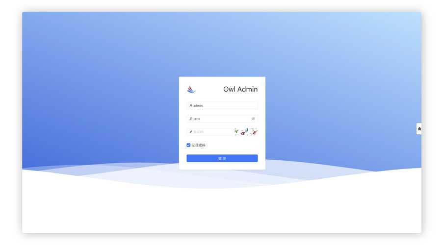
(图片来源网络,侵删)
特点:
- 简洁、快速实现。
- 适合作为静态页面展示或快速原型。
代码:
<!DOCTYPE html>
<html lang="zh-CN">
<head>
    <meta charset="UTF-8">
    <meta name="viewport" content="width=device-width, initial-scale=1.0">基础登录框</title>
    <!-- Bootstrap 5 CSS -->
    <link href="https://cdn.jsdelivr.net/npm/bootstrap@5.3.2/dist/css/bootstrap.min.css" rel="stylesheet">
    <style>
        body {
            background-color: #f8f9fa;
        }
        .login-container {
            max-width: 400px;
            margin: 100px auto;
            padding: 20px;
            background-color: #fff;
            border-radius: 10px;
            box-shadow: 0 4px 12px rgba(0, 0, 0, 0.1);
        }
    </style>
</head>
<body>
    <div class="container">
        <div class="login-container">
            <h2 class="text-center mb-4">用户登录</h2>
            <form>
                <div class="mb-3">
                    <label for="username" class="form-label">用户名</label>
                    <input type="text" class="form-control" id="username" placeholder="请输入用户名">
                </div>
                <div class="mb-3">
                    <label for="password" class="form-label">密码</label>
                    <input type="password" class="form-control" id="password" placeholder="请输入密码">
                </div>
                <div class="mb-3 form-check">
                    <input type="checkbox" class="form-check-input" id="rememberMe">
                    <label class="form-check-label" for="rememberMe">记住我</label>
                </div>
                <button type="submit" class="btn btn-primary w-100">登录</button>
            </form>
        </div>
    </div>
    <!-- Bootstrap 5 JS Bundle with Popper -->
    <script src="https://cdn.jsdelivr.net/npm/bootstrap@5.3.2/dist/js/bootstrap.bundle.min.js"></script>
</body>
</html>
带图标和验证反馈版(推荐)
这个版本在基础版上增加了:
- 输入框图标:使用 Bootstrap Icons,让界面更直观。
- 表单验证:利用 Bootstrap 的表单验证功能,提供即时反馈。
- “忘记密码”链接:增加了常见的功能入口。
特点:
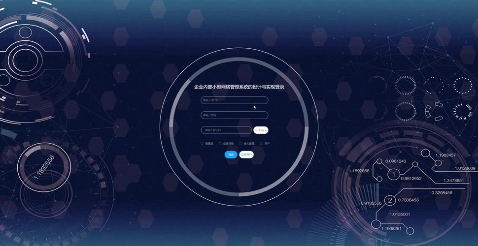
(图片来源网络,侵删)
- 用户体验更好,有视觉引导和错误提示。
- 功能更完整,是实际项目中常用的样式。
代码:
<!DOCTYPE html>
<html lang="zh-CN">
<head>
    <meta charset="UTF-8">
    <meta name="viewport" content="width=device-width, initial-scale=1.0">带图标的登录框</title>
    <!-- Bootstrap 5 CSS -->
    <link href="https://cdn.jsdelivr.net/npm/bootstrap@5.3.2/dist/css/bootstrap.min.css" rel="stylesheet">
    <!-- Bootstrap Icons -->
    <link rel="stylesheet" href="https://cdn.jsdelivr.net/npm/bootstrap-icons@1.11.2/font/bootstrap-icons.min.css">
    <style>
        body {
            height: 100vh;
            display: flex;
            align-items: center;
            background-color: #f5f5f5;
        }
        .form-signin {
            max-width: 400px;
            padding: 15px;
        }
        .form-signin .form-floating:focus-within {
            z-index: 2;
        }
        .form-signin input[type="text"] {
            margin-bottom: -1px;
            border-bottom-right-radius: 0;
            border-bottom-left-radius: 0;
        }
        .form-signin input[type="password"] {
            margin-bottom: 10px;
            border-top-left-radius: 0;
            border-top-right-radius: 0;
        }
    </style>
</head>
<body>
<main class="form-signin w-100 m-auto">
    <form class="needs-validation" novalidate>
        <h1 class="h3 mb-3 fw-normal text-center">请登录</h1>
        <div class="form-floating">
            <!-- input-group 用于包裹输入框和图标 -->
            <div class="input-group has-validation">
                <span class="input-group-text"><i class="bi bi-person"></i></span>
                <input type="text" class="form-control" id="username" placeholder="用户名" required>
                <div class="invalid-feedback">
                    请输入用户名。
                </div>
            </div>
        </div>
        <div class="form-floating">
            <div class="input-group has-validation">
                <span class="input-group-text"><i class="bi bi-lock"></i></span>
                <input type="password" class="form-control" id="password" placeholder="密码" required>
                <div class="invalid-feedback">
                    请输入密码。
                </div>
            </div>
        </div>
        <div class="form-check mb-3">
            <input class="form-check-input" type="checkbox" value="remember-me" id="rememberMe">
            <label class="form-check-label" for="rememberMe">
                记住我
            </label>
        </div>
        <div class="d-grid gap-2">
            <button class="btn btn-primary" type="submit">登录</button>
        </div>
        <hr class="my-4">
        <div class="text-center">
            <a href="#">忘记密码?</a>
        </div>
    </form>
</main>
<script>
// 示例:简单的表单前端验证
(function () {
    'use strict'
    var forms = document.querySelectorAll('.needs-validation')
    Array.prototype.slice.call(forms).forEach(function (form) {
        form.addEventListener('submit', function (event) {
            if (!form.checkValidity()) {
                event.preventDefault()
                event.stopPropagation()
            }
            form.classList.add('was-validated')
        }, false)
    })
})()
</script>
</body>
</html>
带背景图片版
这个版本设计感更强,使用全屏背景图片,登录框浮动在中央。
特点:
- 视觉效果突出,适合网站首页或登录页面。
- 需要一张合适的背景图片。
代码:
<!DOCTYPE html>
<html lang="zh-CN">
<head>
    <meta charset="UTF-8">
    <meta name="viewport" content="width=device-width, initial-scale=1.0">背景图片登录框</title>
    <!-- Bootstrap 5 CSS -->
    <link href="https://cdn.jsdelivr.net/npm/bootstrap@5.3.2/dist/css/bootstrap.min.css" rel="stylesheet">
    <!-- Bootstrap Icons -->
    <link rel="stylesheet" href="https://cdn.jsdelivr.net/npm/bootstrap-icons@1.11.2/font/bootstrap-icons.min.css">
    <style>
        body {
            /* 使用一张你喜欢的背景图,这里用unsplash的示例图 */
            background-image: url('https://images.unsplash.com/photo-1557682257-2f9c37a3a5f2?q=80&w=1974&auto=format&fit=crop');
            background-size: cover;
            background-position: center;
            height: 100vh;
            display: flex;
            align-items: center;
            justify-content: center;
        }
        .login-box {
            background-color: rgba(255, 255, 255, 0.9); /* 半透明白色背景 */
            padding: 2rem;
            border-radius: 10px;
            width: 100%;
            max-width: 400px;
            box-shadow: 0 8px 32px rgba(0, 0, 0, 0.1);
        }
        .login-box h2 {
            text-align: center;
            margin-bottom: 1.5rem;
            color: #333;
        }
        .form-floating .form-control {
            height: auto;
            padding: 1rem;
        }
        .form-floating > label {
            padding: 1rem;
        }
        .btn-login {
            width: 100%;
            padding: 0.75rem;
            font-size: 1.1rem;
        }
    </style>
</head>
<body>
<div class="login-box">
    <h2><i class="bi bi-shield-lock"></i> 安全登录</h2>
    <form>
        <div class="form-floating mb-3">
            <input type="text" class="form-control" id="username" placeholder="用户名" required>
            <label for="username">用户名</label>
        </div>
        <div class="form-floating mb-3">
            <input type="password" class="form-control" id="password" placeholder="密码" required>
            <label for="password">密码</label>
        </div>
        <div class="form-check mb-3">
            <input class="form-check-input" type="checkbox" id="rememberMe">
            <label class="form-check-label" for="rememberMe">
                记住我
            </label>
        </div>
        <button type="submit" class="btn btn-primary btn-login">登录</button>
    </form>
</div>
</body>
</html>
如何选择和使用这些模板?
- 复制代码:选择你喜欢的模板,将全部代码复制到一个新的
.html文件中。 - 引入依赖:确保你的 HTML 文件头部正确引入了 Bootstrap CSS 和 Bootstrap JS,对于带图标的模板,还需要额外引入 Bootstrap Icons。
- :
- 文本、按钮文字、标签等。
- 链接:将 替换为实际的登录处理页面(如
login.php)和“忘记密码”页面。 - 样式:通过修改
<style>标签里的 CSS 来自定义颜色、大小、间距等。 - 背景图:在使用背景图模板时,将
url('...')中的链接替换为你自己的图片地址。
- 后端集成:这些模板只负责前端展示,你需要编写后端代码(如 PHP, Node.js, Python, Java 等)来处理
form的submit事件,验证用户名和密码,并管理登录状态(如使用 Session 或 Cookie)。
希望这些模板能帮助你快速构建出漂亮的登录界面!


