极简现代风格
这种风格干净、直观,适合各种类型的网站,尤其是追求简洁设计的项目。
(图片来源网络,侵删)
特点:
- 极简设计,突出核心功能
- 使用现代 CSS(如 Flexbox)进行布局
- 响应式设计,适配手机和桌面
在线演示与下载
您可以直接访问下面的链接查看效果,并下载完整的 HTML 文件。
- 在线演示: 点击这里查看极简风格登录页面
- 下载链接: 点击下载
minimal-login.zip(这是一个 CodePen 项目的 zip 包)
核心代码示例 (HTML + CSS)
您可以将以下代码保存为 login.html 文件,用浏览器打开即可看到效果。
<!DOCTYPE html>
<html lang="zh-CN">
<head>
    <meta charset="UTF-8">
    <meta name="viewport" content="width=device-width, initial-scale=1.0">极简登录</title>
    <style>
        * {
            box-sizing: border-box;
            margin: 0;
            padding: 0;
        }
        body {
            font-family: 'Segoe UI', Tahoma, Geneva, Verdana, sans-serif;
            background: linear-gradient(135deg, #6a11cb 0%, #2575fc 100%);
            height: 100vh;
            display: flex;
            justify-content: center;
            align-items: center;
        }
        .login-container {
            background-color: white;
            padding: 40px;
            border-radius: 10px;
            box-shadow: 0 14px 28px rgba(0,0,0,0.25), 0 10px 10px rgba(0,0,0,0.22);
            width: 400px;
        }
        .login-container h2 {
            text-align: center;
            margin-bottom: 30px;
            color: #333;
        }
        .input-group {
            margin-bottom: 20px;
        }
        .input-group input {
            width: 100%;
            padding: 12px;
            border: 1px solid #ddd;
            border-radius: 5px;
            font-size: 16px;
            transition: border-color 0.3s;
        }
        .input-group input:focus {
            border-color: #2575fc;
            outline: none;
        }
        .login-btn {
            width: 100%;
            padding: 12px;
            background-color: #2575fc;
            border: none;
            border-radius: 5px;
            color: white;
            font-size: 16px;
            cursor: pointer;
            transition: background-color 0.3s;
        }
        .login-btn:hover {
            background-color: #1a5bbd;
        }
        .register-link {
            text-align: center;
            margin-top: 20px;
        }
        .register-link a {
            color: #2575fc;
            text-decoration: none;
        }
        .register-link a:hover {
            text-decoration: underline;
        }
    </style>
</head>
<body>
    <div class="login-container">
        <h2>欢迎登录</h2>
        <form action="#" method="post">
            <div class="input-group">
                <input type="text" placeholder="用户名 / 邮箱" required>
            </div>
            <div class="input-group">
                <input type="password" placeholder="密码" required>
            </div>
            <button type="submit" class="login-btn">登录</button>
        </form>
        <div class="register-link">
            <p>还没有账号? <a href="#">立即注册</a></p>
        </div>
    </div>
</body>
</html>
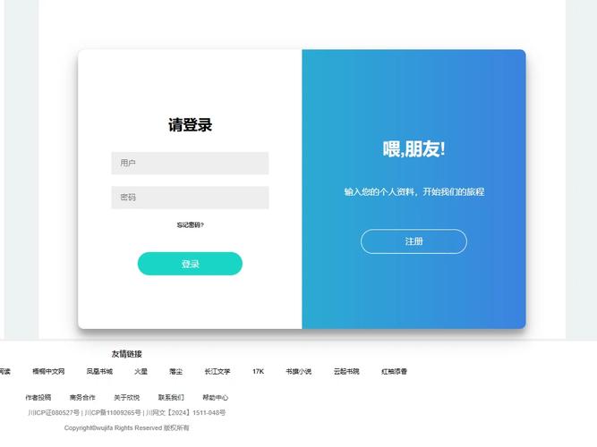
带背景图片的登录界面
这种风格非常流行,通过高质量的背景图片吸引用户,品牌感更强。
特点:
- 全屏背景图片
- 半透明或毛玻璃效果的登录框
- 视觉冲击力强
在线演示与下载
- 在线演示: 点击这里查看带背景图片的登录页面
- 下载链接: 点击下载
bg-image-login.zip
核心代码示例 (HTML + CSS)
<!DOCTYPE html>
<html lang="zh-CN">
<head>
    <meta charset="UTF-8">
    <meta name="viewport" content="width=device-width, initial-scale=1.0">背景图片登录</title>
    <style>
        * {
            margin: 0;
            padding: 0;
            box-sizing: border-box;
        }
        body {
            font-family: 'Arial', sans-serif;
            height: 100vh;
            display: flex;
            justify-content: center;
            align-items: center;
            background-image: url('https://images.unsplash.com/photo-1557682257-2f9c37a3a5f3?ixlib=rb-4.0.3'); /* 替换为你自己的图片 */
            background-size: cover;
            background-position: center;
        }
        .login-box {
            background-color: rgba(255, 255, 255, 0.9); /* 半透明白色背景 */
            padding: 40px;
            border-radius: 10px;
            width: 350px;
            box-shadow: 0 8px 32px rgba(0, 0, 0, 0.1);
            backdrop-filter: blur(10px); /* 毛玻璃效果 */
        }
        .login-box h2 {
            text-align: center;
            margin-bottom: 25px;
            color: #333;
        }
        .input-field {
            position: relative;
            margin-bottom: 20px;
        }
        .input-field input {
            width: 100%;
            padding: 10px 15px;
            border: 1px solid #ccc;
            border-radius: 5px;
            font-size: 14px;
        }
        .login-btn {
            width: 100%;
            padding: 12px;
            background-color: #4CAF50;
            border: none;
            border-radius: 5px;
            color: white;
            font-size: 16px;
            cursor: pointer;
        }
        .login-btn:hover {
            background-color: #45a049;
        }
    </style>
</head>
<body>
    <div class="login-box">
        <h2>用户登录</h2>
        <form action="#" method="post">
            <div class="input-field">
                <input type="text" placeholder="请输入用户名" required>
            </div>
            <div class="input-field">
                <input type="password" placeholder="请输入密码" required>
            </div>
            <button type="submit" class="login-btn">登录</button>
        </form>
    </div>
</body>
</html>
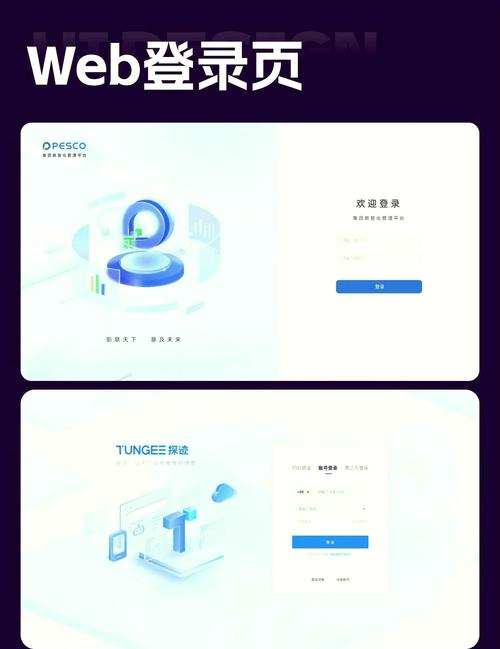
带社交账号登录的界面
对于 Web 2.0 应用或社区类网站,提供微信、QQ、GitHub 等第三方登录能极大降低用户注册门槛。
(图片来源网络,侵删)
特点:
- 主账号密码登录
- 第三方社交账号快速登录
- 通常带有对应的图标
在线演示与下载
- 在线演示: 点击这里查看带社交登录的登录页面
- 下载链接: 点击下载
social-login.zip
核心代码示例 (HTML + CSS)
<!DOCTYPE html>
<html lang="zh-CN">
<head>
    <meta charset="UTF-8">
    <meta name="viewport" content="width=device-width, initial-scale=1.0">社交账号登录</title>
    <link rel="stylesheet" href="https://cdnjs.cloudflare.com/ajax/libs/font-awesome/6.0.0/css/all.min.css">
    <style>
        * {
            box-sizing: border-box;
            margin: 0;
            padding: 0;
        }
        body {
            font-family: 'Arial', sans-serif;
            background: linear-gradient(120deg, #2980b9, #8e44ad);
            height: 100vh;
            display: flex;
            justify-content: center;
            align-items: center;
        }
        .login-form {
            background: white;
            padding: 40px;
            border-radius: 10px;
            box-shadow: 0 15px 35px rgba(0, 0, 0, 0.2);
            width: 400px;
        }
        .login-form h2 {
            text-align: center;
            margin-bottom: 30px;
            color: #333;
        }
        .social-login {
            display: flex;
            justify-content: center;
            gap: 15px;
            margin-bottom: 25px;
        }
        .social-btn {
            width: 50px;
            height: 50px;
            border-radius: 50%;
            display: flex;
            justify-content: center;
            align-items: center;
            cursor: pointer;
            transition: transform 0.2s;
            border: 1px solid #ddd;
        }
        .social-btn:hover {
            transform: scale(1.1);
        }
        .social-btn.wechat { background-color: #07C160; color: white; }
        .social-btn.qq { background-color: #12B7F5; color: white; }
        .social-btn.github { background-color: #333; color: white; }
        .divider {
            text-align: center;
            margin: 25px 0;
            position: relative;
            color: #999;
        }
        .divider::before {
            content: '';
            position: absolute;
            top: 50%;
            left: 0;
            right: 0;
            height: 1px;
            background: #eee;
            z-index: 1;
        }
        .divider span {
            background: white;
            padding: 0 15px;
            position: relative;
            z-index: 2;
        }
        .input-group {
            margin-bottom: 20px;
        }
        .input-group input {
            width: 100%;
            padding: 12px;
            border: 1px solid #ddd;
            border-radius: 5px;
            font-size: 16px;
        }
        .login-btn {
            width: 100%;
            padding: 12px;
            background-color: #8e44ad;
            border: none;
            border-radius: 5px;
            color: white;
            font-size: 16px;
            cursor: pointer;
        }
        .login-btn:hover {
            background-color: #732d91;
        }
    </style>
</head>
<body>
    <div class="login-form">
        <h2>欢迎回来</h2>
        <div class="social-login">
            <div class="social-btn wechat"><i class="fab fa-weixin"></i></div>
            <div class="social-btn qq"><i class="fab fa-qq"></i></div>
            <div class="social-btn github"><i class="fab fa-github"></i></div>
        </div>
        <div class="divider">
            <span>或</span>
        </div>
        <form action="#" method="post">
            <div class="input-group">
                <input type="text" placeholder="用户名 / 邮箱" required>
            </div>
            <div class="input-group">
                <input type="password" placeholder="密码" required>
            </div>
            <button type="submit" class="login-btn">登录</button>
        </form>
    </div>
</body>
</html>
使用 Bootstrap 框架的登录界面
如果您熟悉 Bootstrap 或希望快速构建一个符合规范的界面,使用 Bootstrap 是最佳选择。
特点:
- 基于 Bootstrap 5 框架
- 组件化,易于扩展和修改
- 自带响应式布局,无需额外编写 CSS
- 美观的表单和按钮样式
在线演示与下载
- 在线演示: 点击这里查看 Bootstrap 登录页面
- 官方文档: Bootstrap Sign-in Form 官方示例
- 下载链接: Bootstrap 官方源码下载 (下载后找到
examples/signin/index.html文件)
核心代码示例 (需要引入 Bootstrap CSS)
<!DOCTYPE html>
<html lang="zh-CN">
<head>
<meta charset="UTF-8">
<meta name="viewport" content="width=device-width, initial-scale=1.0">Bootstrap 登录</title>
<!-- 引入 Bootstrap CSS -->
<link href="https://cdn.jsdelivr.net/npm/bootstrap@5.3.0/dist/css/bootstrap.min.css" rel="stylesheet">
<style>
.bd-placeholder-img {
font-size: 1.125rem;
text-anchor: middle;
-webkit-user-select: none;
-moz-user-select: none;
user-select: none;
}
@media (min-width: 768px) {
.bd-placeholder-img-lg {
font-size: 3.5rem;
}
}
.form-signin {
width: 100%;
max-width: 330px;
padding: 15px;
margin: auto;
}
.form-signin .form-floating {
margin-bottom: 10px;
}
</style>
</head>
<body class="text-center">
<main class="form-signin">
<form>
<img class="mb-4" src="https://getbootstrap.com/docs/5.3/assets/brand/bootstrap-logo.svg" alt="" width="72" height="57">
<h1 class="h3 mb-3 fw-normal">请登录</h1>
<div class="form-floating">
<input type="email" class="form-control" id="floatingInput" placeholder="name@example.com">
<label for="floatingInput">邮箱地址</label>
</div>
<div class="form-floating">
<input type="password" class="form-control" id="floatingPassword" placeholder="Password">
<label for="floatingPassword">密码</label>
</div>
<div class="form-check text-start my-3">
<input class="form-check-input" type="checkbox" value="remember-me" id="flexCheckDefault">
<label class="form-check-label" for="flexCheckDefault">
记住我
</label>
</div>
<button class="w-100 btn btn-lg btn-primary" type="submit">登录</button>
<p class="mt-5 mb-3 text-muted">© 2025–2025</p>
</form>
</main>
</body>
</html>
如何选择和使用?
-
选择模板:
- 如果你的项目追求简洁、现代,选 模板 1。
- 如果你的网站是内容展示型(如博客、作品集),希望视觉效果突出,选 模板 2。
- 如果你的应用是社区、论坛或工具类,希望降低用户注册门槛,选 模板 3。
- 如果你熟悉 Bootstrap 或需要快速开发,并且希望界面专业、规范,选 模板 4。
-
使用方法:
- 直接下载:点击对应的下载链接,将
zip文件解压,找到index.html或login.html文件,用浏览器打开即可。 - 复制代码:将上面的代码块完整复制,粘贴到一个新的文本文件中,将其命名为
login.html,然后用浏览器打开。
- 直接下载:点击对应的下载链接,将
-
自定义修改:
 (图片来源网络,侵删)
- 修改文字:直接在 HTML 文件中修改
<h2>、<input placeholder>、<button>等标签内的文字。 - 修改颜色:在
<style>标签中找到background-color,color等属性,修改为你喜欢的颜色值。 - 修改图片:在模板 2 中,将
background-image: url('...')里的图片地址替换成你自己的图片链接。 - 添加功能:这些模板目前只有前端样式,要实现真正的登录功能,你需要后端技术(如 Node.js, PHP, Python 等)来处理表单提交、验证用户名和密码。
- 修改文字:直接在 HTML 文件中修改
希望这些模板能帮到你!


