这个例子将涵盖现代网页开发中的许多重要特性,包括:
(图片来源网络,侵删)
- HTML5 语义化标签:如
<header>,<nav>,<main>,<section>,<footer>等,让页面结构更清晰。 - CSS3 新特性:如 Flexbox 布局、Grid 布局、过渡效果、阴影、渐变等。
- 响应式设计:使用媒体查询,让网页在不同设备(桌面、平板、手机)上都有良好的显示效果。
- 交互效果:鼠标悬停效果、平滑滚动等。
最终效果预览
-
桌面端:
-
移动端:
第 1 步:文件结构
创建一个项目文件夹,并在其中创建以下三个文件:
my-portfolio/
├── index.html
├── style.css
└── script.js
第 2 步:HTML5 代码 (index.html)
这是网页的骨架,我们使用了 HTML5 的语义化标签来组织内容,并为各个部分添加了 id 以便 CSS 和 JavaScript 进行定位和操作。
(图片来源网络,侵删)
<!DOCTYPE html>
<html lang="zh-CN">
<head>
<meta charset="UTF-8">
<meta name="viewport" content="width=device-width, initial-scale=1.0">我的个人作品集</title>
<link rel="stylesheet" href="style.css">
<!-- 引入一个字体图标库,这里使用 Font Awesome -->
<link rel="stylesheet" href="https://cdnjs.cloudflare.com/ajax/libs/font-awesome/6.0.0-beta3/css/all.min.css">
</head>
<body>
<header>
<div class="container">
<a href="#" class="logo">MyPortfolio</a>
<nav>
<ul>
<li><a href="#home">首页</a></li>
<li><a href="#about">关于我</a></li>
<li><a href="#services">服务</a></li>
<li><a href="#portfolio">作品</a></li>
<li><a href="#contact">联系</a></li>
</ul>
</nav>
</div>
</header>
<main>
<section id="home">
<div class="container">
<h1>你好,我是 <span class="highlight">张三</span></h1>
<p>一名充满激情的前端开发工程师</p>
<a href="#portfolio" class="cta-button">查看我的作品</a>
</div>
</section>
<section id="about">
<div class="container">
<h2>关于我</h2>
<p>我热爱创造美观、实用且用户友好的网站,拥有 5 年的前端开发经验,精通 HTML5, CSS3 和 JavaScript,我致力于将设计转化为高质量的代码。</p>
</div>
</section>
<section id="services">
<div class="container">
<h2>我的服务</h2>
<div class="services-grid">
<div class="service-item">
<i class="fas fa-code"></i>
<h3>网页开发</h3>
<p>使用最新的 Web 技术栈,构建响应式、高性能的网站。</p>
</div>
<div class="service-item">
<i class="fas fa-mobile-alt"></i>
<h3>UI/UX 设计</h3>
<p>专注于用户体验,设计直观且吸引人的界面。</p>
</div>
<div class="service-item">
<i class="fas fa-paint-brush"></i>
<h3>前端优化</h3>
<p>优化网站速度和性能,确保最佳的用户体验。</p>
</div>
</div>
</div>
</section>
<section id="portfolio">
<div class="container">
<h2>我的作品</h2>
<div class="portfolio-grid">
<div class="portfolio-item">
<img src="https://via.placeholder.com/400x300.png?text=项目+1" alt="项目1">
<div class="overlay">
<h3>项目名称 1</h3>
<p>项目描述</p>
</div>
</div>
<div class="portfolio-item">
<img src="https://via.placeholder.com/400x300.png?text=项目+2" alt="项目2">
<div class="overlay">
<h3>项目名称 2</h3>
<p>项目描述</p>
</div>
</div>
<div class="portfolio-item">
<img src="https://via.placeholder.com/400x300.png?text=项目+3" alt="项目3">
<div class="overlay">
<h3>项目名称 3</h3>
<p>项目描述</p>
</div>
</div>
</div>
</div>
</section>
<section id="contact">
<div class="container">
<h2>联系我</h2>
<p>有项目想合作?或者只是想打个招呼?随时联系我!</p>
<a href="mailto:your.email@example.com" class="cta-button">发送邮件</a>
</div>
</section>
</main>
<footer>
<div class="container">
<p>© 2025 我的个人作品集. 保留所有权利.</p>
<div class="social-links">
<a href="#"><i class="fab fa-github"></i></a>
<a href="#"><i class="fab fa-linkedin"></i></a>
<a href="#"><i class="fab fa-twitter"></i></a>
</div>
</div>
</footer>
<script src="script.js"></script>
</body>
</html>
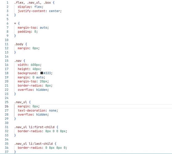
第 3 步:CSS3 代码 (style.css)
这是网页的样式表,这里我们大量使用了 CSS3 的特性来美化页面和实现布局。
/* --- 全局样式和变量 --- */
:root {
    --primary-color: #007bff;
    --secondary-color: #343a40;
    --text-color: #333;
    --light-bg: #f8f9fa;
    --white: #ffffff;
    --shadow: 0 2px 10px rgba(0, 0, 0, 0.1);
}
* {
    margin: 0;
    padding: 0;
    box-sizing: border-box;
}
body {
    font-family: 'Segoe UI', Tahoma, Geneva, Verdana, sans-serif;
    line-height: 1.6;
    color: var(--text-color);
}
.container {
    max-width: 1100px;
    margin: 0 auto;
    padding: 0 20px;
}
h1, h2, h3 {
    margin-bottom: 20px;
    line-height: 1.2;
}
h1 { font-size: 2.5rem; }
h2 { font-size: 2rem; text-align: center; }
h3 { font-size: 1.5rem; }
p { margin-bottom: 15px; }
a {
    text-decoration: none;
    color: var(--primary-color);
    transition: color 0.3s ease;
}
a:hover {
    color: #0056b3;
}
.cta-button {
    display: inline-block;
    background-color: var(--primary-color);
    color: var(--white);
    padding: 12px 25px;
    border-radius: 5px;
    font-weight: bold;
    transition: background-color 0.3s ease, transform 0.3s ease;
}
.cta-button:hover {
    background-color: #0056b3;
    transform: translateY(-2px);
}
/* --- 头部导航 --- */
header {
    background-color: var(--white);
    box-shadow: var(--shadow);
    position: sticky;
    top: 0;
    z-index: 1000;
}
header .container {
    display: flex;
    justify-content: space-between;
    align-items: center;
    padding: 15px 20px;
}
.logo {
    font-size: 1.5rem;
    font-weight: bold;
    color: var(--secondary-color);
}
nav ul {
    list-style: none;
    display: flex;
}
nav ul li {
    margin-left: 25px;
}
nav ul li a {
    color: var(--secondary-color);
    font-weight: 500;
}
nav ul li a:hover {
    color: var(--primary-color);
}
/* --- 主要内容区域 --- */
main section {
    padding: 80px 0;
}
#home {
    background: linear-gradient(rgba(0, 0, 0, 0.7), rgba(0, 0, 0, 0.7)), url('https://images.unsplash.com/photo-1555066931-4365d14bab8c?ixlib=rb-4.0.3&ixid=M3wxMjA3fDB8MHxwaG90by1wYWdlfHx8fGVufDB8fHx8fA%3D%3D&auto=format&fit=crop&w=1770&q=80') no-repeat center center/cover;
    color: var(--white);
    height: 100vh;
    display: flex;
    align-items: center;
    text-align: center;
}
#home h1 {
    font-size: 3.5rem;
    margin-bottom: 10px;
}
.highlight {
    color: var(--primary-color);
}
/* --- 服务部分 --- */
#services {
    background-color: var(--light-bg);
}
.services-grid {
    display: grid;
    grid-template-columns: repeat(auto-fit, minmax(300px, 1fr));
    gap: 30px;
    text-align: center;
}
.service-item {
    background-color: var(--white);
    padding: 30px;
    border-radius: 8px;
    box-shadow: var(--shadow);
    transition: transform 0.3s ease;
}
.service-item:hover {
    transform: translateY(-10px);
}
.service-item i {
    font-size: 3rem;
    color: var(--primary-color);
    margin-bottom: 20px;
}
/* --- 作品集部分 --- */
.portfolio-grid {
    display: grid;
    grid-template-columns: repeat(auto-fit, minmax(300px, 1fr));
    gap: 30px;
}
.portfolio-item {
    position: relative;
    overflow: hidden;
    border-radius: 8px;
    box-shadow: var(--shadow);
}
.portfolio-item img {
    width: 100%;
    height: 300px;
    object-fit: cover;
    display: block;
    transition: transform 0.5s ease;
}
.portfolio-item:hover img {
    transform: scale(1.1);
}
.overlay {
    position: absolute;
    top: 0;
    left: 0;
    width: 100%;
    height: 100%;
    background: rgba(0, 123, 255, 0.8);
    color: var(--white);
    display: flex;
    flex-direction: column;
    justify-content: center;
    align-items: center;
    opacity: 0;
    transition: opacity 0.5s ease;
}
.portfolio-item:hover .overlay {
    opacity: 1;
}
.overlay h3, .overlay p {
    text-align: center;
    padding: 0 20px;
}
/* --- 页脚 --- */
footer {
    background-color: var(--secondary-color);
    color: var(--white);
    text-align: center;
    padding: 30px 0;
}
.social-links a {
    color: var(--white);
    margin: 0 10px;
    font-size: 1.5rem;
    transition: color 0.3s ease;
}
.social-links a:hover {
    color: var(--primary-color);
}
/* --- 响应式设计 --- */
@media (max-width: 768px) {
    header .container {
        flex-direction: column;
        text-align: center;
    }
    nav ul {
        margin-top: 15px;
    }
    nav ul li {
        margin: 0 15px;
    }
    #home h1 {
        font-size: 2.5rem;
    }
    main section {
        padding: 60px 0;
    }
}
第 4 步:JavaScript 代码 (script.js)
这个脚本文件添加了一些简单的交互功能,比如点击导航链接后平滑滚动到对应部分,以及一个简单的移动端菜单切换按钮。
// 等待整个文档加载完成
document.addEventListener('DOMContentLoaded', function () {
    // --- 平滑滚动 ---
    // 获取所有导航链接
    const navLinks = document.querySelectorAll('nav a[href^="#"]');
    navLinks.forEach(link => {
        link.addEventListener('click', function (e) {
            e.preventDefault(); // 阻止默认的跳转行为
            const targetId = this.getAttribute('href');
            const targetSection = document.querySelector(targetId);
            if (targetSection) {
                // 使用 scrollIntoView 实现平滑滚动
                targetSection.scrollIntoView({
                    behavior: 'smooth',
                    block: 'start'
                });
            }
        });
    });
    // --- 移动端菜单切换 ---
    // (这个功能需要你在 HTML 中添加一个汉堡菜单图标和相应的菜单结构)
    // 这里提供一个示例代码,你需要根据需要调整 HTML 和 CSS
    // const menuToggle = document.querySelector('.menu-toggle');
    // const nav = document.querySelector('nav ul');
    // if (menuToggle) {
    //     menuToggle.addEventListener('click', () => {
    //         nav.classList.toggle('active');
    //     });
    // }
    // --- 滚动时添加/移除导航栏阴影 ---
    const header = document.querySelector('header');
    window.addEventListener('scroll', () => {
        if (window.scrollY > 0) {
            header.style.boxShadow = '0 2px 10px rgba(0, 0, 0, 0.1)';
        } else {
            header.style.boxShadow = 'none';
        }
    });
});
如何运行
-
将上述代码分别复制到
index.html,style.css, 和script.js文件中。 -
确保这三个文件都在同一个
my-portfolio文件夹内。 (图片来源网络,侵删)
 -
重要:由于使用了
script.js中的平滑滚动功能,你需要在 HTML 的<head>部分添加以下<script>标签,以兼容旧版浏览器(虽然现代浏览器大多已内置)。<!-- 在 <head> 内部添加 --> <script src="https://polyfill.io/v3/polyfill.min.js?features=es6"></script> <script id="MathJax-script" async src="https://cdn.jsdelivr.net/npm/mathjax@3/es5/tex-mml-chtml.js"></script>
注意:上面的 polyfill 主要是为了兼容
scroll-behavior: smooth的旧浏览器,如果不需要支持非常旧的浏览器,可以不加。 -
用浏览器(如 Chrome, Firefox, Edge)打开
index.html文件,你就可以看到效果了。
这个例子为你提供了一个功能完整、设计现代的网页基础,你可以根据自己的需求进行修改和扩展,比如更换图片、修改文字内容、添加更多动画效果等。


