模板特点
- 响应式设计: 完美适配桌面、平板和手机等不同屏幕尺寸。
- 现代美观: 使用了柔和的配色、清晰的排版和微交互效果。
- 模块化结构: 代码组织清晰,每个部分都是独立的,方便您根据企业需求进行修改。
- 语义化 HTML5: 使用
<header>,<nav>,<main>,<section>,<footer>等标签,有助于 SEO 和可访问性。 - 使用 CDN: 引入 Bootstrap 5 和 Font Awesome 图标库,无需下载,开箱即用。
最终效果预览
这是一个单文件模板,您可以直接复制所有代码,保存为 index.html 文件,然后用浏览器打开即可看到效果。
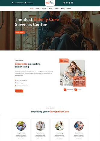
(图片来源网络,侵删)
完整代码
<!DOCTYPE html>
<html lang="zh-CN">
<head>
<meta charset="UTF-8">
<meta name="viewport" content="width=device-width, initial-scale=1.0">智慧科技 - 引领未来,创造价值</title>
<!-- Bootstrap 5 CSS -->
<link href="https://cdn.jsdelivr.net/npm/bootstrap@5.3.2/dist/css/bootstrap.min.css" rel="stylesheet">
<!-- Font Awesome 图标库 -->
<link rel="stylesheet" href="https://cdnjs.cloudflare.com/ajax/libs/font-awesome/6.4.2/css/all.min.css">
<style>
/* 全局样式 */
:root {
--primary-color: #0056b3;
--secondary-color: #6c757d;
--light-bg: #f8f9fa;
--dark-text: #343a40;
}
body {
font-family: 'Segoe UI', Tahoma, Geneva, Verdana, sans-serif;
color: var(--dark-text);
}
/* 导航栏样式 */
.navbar {
background-color: #fff;
box-shadow: 0 2px 4px rgba(0,0,0,.08);
}
.navbar-brand {
font-weight: bold;
font-size: 1.5rem;
}
.nav-link {
font-weight: 500;
margin: 0 10px;
transition: color 0.3s ease;
}
.nav-link:hover {
color: var(--primary-color) !important;
}
/* Hero 区域样式 */
.hero-section {
background: linear-gradient(rgba(0, 0, 0, 0.5), rgba(0, 0, 0, 0.5)), url('https://images.unsplash.com/photo-1550745165-9bc0b252726f?q=80&w=2070&auto=format&fit=crop') no-repeat center center/cover;
color: white;
padding: 100px 0;
text-align: center;
}
.hero-section h1 {
font-size: 3.5rem;
font-weight: bold;
margin-bottom: 20px;
}
.hero-section p {
font-size: 1.2rem;
margin-bottom: 30px;
}
.btn-primary-custom {
background-color: var(--primary-color);
border: none;
padding: 12px 30px;
font-size: 1.1rem;
border-radius: 50px;
transition: transform 0.3s ease, box-shadow 0.3s ease;
}
.btn-primary-custom:hover {
background-color: #004494;
transform: translateY(-3px);
box-shadow: 0 10px 20px rgba(0, 86, 179, 0.3);
}
/* 特色服务样式 */
.feature-box {
text-align: center;
padding: 30px;
border-radius: 10px;
transition: transform 0.3s ease, box-shadow 0.3s ease;
height: 100%;
}
.feature-box:hover {
transform: translateY(-10px);
box-shadow: 0 15px 30px rgba(0,0,0,0.1);
}
.feature-icon {
font-size: 3rem;
color: var(--primary-color);
margin-bottom: 20px;
}
/* 关于我们样式 */
.about-section {
padding: 80px 0;
background-color: var(--light-bg);
}
.about-img {
border-radius: 10px;
overflow: hidden;
box-shadow: 0 10px 30px rgba(0,0,0,0.1);
}
.about-img img {
width: 100%;
height: auto;
transition: transform 0.5s ease;
}
.about-img:hover img {
transform: scale(1.05);
}
/* 数据统计样式 */
.stats-section {
background-color: var(--primary-color);
color: white;
padding: 60px 0;
text-align: center;
}
.stat-item h3 {
font-size: 3rem;
font-weight: bold;
}
/* 联系我们样式 */
.contact-section {
padding: 80px 0;
}
.contact-info {
padding: 20px;
border-radius: 10px;
background-color: var(--light-bg);
height: 100%;
transition: transform 0.3s ease;
}
.contact-info:hover {
transform: translateY(-5px);
}
.contact-info i {
font-size: 2rem;
color: var(--primary-color);
margin-bottom: 15px;
}
/* 页脚样式 */
footer {
background-color: #343a40;
color: #adb5bd;
padding: 40px 0 20px;
}
.footer-links a {
color: #adb5bd;
text-decoration: none;
margin-right: 15px;
transition: color 0.3s ease;
}
.footer-links a:hover {
color: #fff;
}
.social-icons a {
color: #adb5bd;
font-size: 1.5rem;
margin-right: 15px;
transition: color 0.3s ease;
}
.social-icons a:hover {
color: var(--primary-color);
}
</style>
</head>
<body>
<!-- 导航栏 -->
<nav class="navbar navbar-expand-lg navbar-light sticky-top">
<div class="container">
<a class="navbar-brand" href="#"><i class="fas fa-cube"></i> 智慧科技</a>
<button class="navbar-toggler" type="button" data-bs-toggle="collapse" data-bs-target="#navbarNav">
<span class="navbar-toggler-icon"></span>
</button>
<div class="collapse navbar-collapse justify-content-end" id="navbarNav">
<ul class="navbar-nav">
<li class="nav-item"><a class="nav-link active" href="#home">首页</a></li>
<li class="nav-item"><a class="nav-link" href="#services">服务</a></li>
<li class="nav-item"><a class="nav-link" href="#about">关于我们</a></li>
<li class="nav-item"><a class="nav-link" href="#contact">联系我们</a></li>
</ul>
</div>
</div>
</nav>
<!-- Hero 区域 (首页横幅) -->
<header id="home" class="hero-section">
<div class="container">
<h1>引领未来,创造价值</h1>
<p>我们致力于通过创新技术,为您的企业提供全方位的数字化解决方案</p>
<a href="#services" class="btn btn-primary btn-primary-custom">了解更多</a>
</div>
</header>
<main>
<!-- 特色服务 -->
<section id="services" class="py-5">
<div class="container">
<div class="text-center mb-5">
<h2>我们的服务</h2>
<p class="text-muted">为您提供一站式技术服务,助力业务增长</p>
</div>
<div class="row g-4">
<div class="col-md-4">
<div class="feature-box">
<i class="fas fa-laptop-code feature-icon"></i>
<h4>网站开发</h4>
<p>从企业官网到电商平台,我们提供定制化的网站设计与开发服务,打造专业、高效的线上形象。</p>
</div>
</div>
<div class="col-md-4">
<div class="feature-box">
<i class="fas fa-mobile-alt feature-icon"></i>
<h4>移动应用</h4>
<p>专注于 iOS 和 Android 平台的原生及混合应用开发,为您的品牌打造流畅、易用的移动体验。</p>
</div>
</div>
<div class="col-md-4">
<div class="feature-box">
<i class="fas fa-chart-line feature-icon"></i>
<h4>数字营销</h4>
<p>通过 SEO、SEM、社交媒体营销等策略,提升您的品牌知名度,吸引更多潜在客户,实现业务增长。</p>
</div>
</div>
</div>
</div>
</section>
<!-- 关于我们 -->
<section id="about" class="about-section">
<div class="container">
<div class="row align-items-center">
<div class="col-lg-6">
<div class="about-img">
<img src="https://images.unsplash.com/photo-1552664730-d307ca884978?q=80&w=2070&auto=format&fit=crop" alt="关于我们">
</div>
</div>
<div class="col-lg-6">
<h2 class="mb-4">关于智慧科技</h2>
<p class="lead">成立于2025年,我们是一家充满活力的技术公司,始终坚持以客户为中心,以技术为驱动。</p>
<p>我们拥有一支经验丰富的专业团队,深谙行业趋势,能够准确把握客户需求,提供最前沿、最可靠的解决方案,我们相信,优秀的技术不仅能解决问题,更能创造新的商业价值。</p>
<p>多年来,我们已经成功为超过500家企业提供了技术服务,帮助他们实现了数字化转型,并在激烈的市场竞争中脱颖而出。</p>
</div>
</div>
</div>
</section>
<!-- 数据统计 -->
<section class="stats-section">
<div class="container">
<div class="row">
<div class="col-md-3">
<div class="stat-item">
<h3>500+</h3>
<p>服务客户</p>
</div>
</div>
<div class="col-md-3">
<div class="stat-item">
<h3>150+</h3>
<p>完成项目</p>
</div>
</div>
<div class="col-md-3">
<div class="stat-item">
<h3>20+</h3>
<p>团队成员</p>
</div>
</div>
<div class="col-md-3">
<div class="stat-item">
<h3>8</h3>
<p>年行业经验</p>
</div>
</div>
</div>
</div>
</section>
<!-- 联系我们 -->
<section id="contact" class="contact-section">
<div class="container">
<div class="text-center mb-5">
<h2>联系我们</h2>
<p class="text-muted">有任何问题或需求?请随时与我们联系</p>
</div>
<div class="row">
<div class="col-md-4 mb-4">
<div class="contact-info">
<i class="fas fa-map-marker-alt"></i>
<h4>地址</h4>
<p>北京市朝阳区建国路88号<br>SOHO现代城A座2801</p>
</div>
</div>
<div class="col-md-4 mb-4">
<div class="contact-info">
<i class="fas fa-phone-alt"></i>
<h4>电话</h4>
<p>400-888-9999<br>010-12345678</p>
</div>
</div>
<div class="col-md-4 mb-4">
<div class="contact-info">
<i class="fas fa-envelope"></i>
<h4>邮箱</h4>
<p>contact@smartech.com<br>hr@smartech.com</p>
</div>
</div>
</div>
</div>
</section>
</main>
<!-- 页脚 -->
<footer>
<div class="container">
<div class="row">
<div class="col-md-6">
<p>© 2025 智慧科技有限公司. All rights reserved.</p>
</div>
<div class="col-md-6 text-md-end">
<div class="footer-links">
<a href="#">隐私政策</a>
<a href="#">使用条款</a>
</div>
<div class="social-icons mt-3">
<a href="#"><i class="fab fa-weixin"></i></a>
<a href="#"><i class="fab fa-weibo"></i></a>
<a href="#"><i class="fab fa-linkedin-in"></i></a>
</div>
</div>
</div>
</div>
</footer>
<!-- Bootstrap 5 JS Bundle with Popper -->
<script src="https://cdn.jsdelivr.net/npm/bootstrap@5.3.2/dist/js/bootstrap.bundle.min.js"></script>
<!-- 自定义 JavaScript -->
<script>
// 平滑滚动
document.querySelectorAll('a[href^="#"]').forEach(anchor => {
anchor.addEventListener('click', function (e) {
e.preventDefault();
const target = document.querySelector(this.getAttribute('href'));
if (target) {
target.scrollIntoView({
behavior: 'smooth',
block: 'start'
});
}
});
});
// 导航栏滚动时添加阴影
window.addEventListener('scroll', function() {
const navbar = document.querySelector('.navbar');
if (window.scrollY > 50) {
navbar.style.boxShadow = '0 2px 10px rgba(0,0,0,0.1)';
} else {
navbar.style.boxShadow = '0 2px 4px rgba(0,0,0,.08)';
}
});
// 数据统计动画 (简单示例)
function animateValue(id, start, end, duration) {
const obj = document.getElementById(id);
if (!obj) return;
let startTimestamp = null;
const step = (timestamp) => {
if (!startTimestamp) startTimestamp = timestamp;
const progress = Math.min((timestamp - startTimestamp) / duration, 1);
obj.innerHTML = Math.floor(progress * (end - start) + start) + (obj.innerHTML.includes('+') ? '+' : '');
if (progress < 1) {
window.requestAnimationFrame(step);
}
};
window.requestAnimationFrame(step);
}
// 当统计区域进入视口时触发动画
const observerOptions = {
threshold: 0.5
};
const observer = new IntersectionObserver((entries) => {
entries.forEach(entry => {
if (entry.isIntersecting) {
// 查找所有 stat-item 下的 h3 元素
const statNumbers = entry.target.querySelectorAll('.stat-item h3');
statNumbers.forEach(el => {
const text = el.innerText;
const num = parseInt(text);
if (!isNaN(num)) {
el.innerText = '0';
animateValue(el.id, 0, num, 2000);
}
});
observer.unobserve(entry.target); // 触发一次后停止观察
}
});
}, observerOptions);
// 为统计区域添加观察
const statsSection = document.querySelector('.stats-section');
if (statsSection) {
observer.observe(statsSection);
}
</script>
</body>
</html>
如何使用和自定义
- 保存文件: 将以上所有代码复制并粘贴到一个新的文本文件中,将其命名为
index.html。 - 打开预览: 使用 Chrome、Firefox 或 Edge 等现代浏览器打开
index.html文件,即可看到网页效果。 - :
- 公司名称: 修改
<title>标签和导航栏中的智慧科技。 - : 修改
<p>、<h1>、<h2>等标签内的文字,替换为您公司的介绍、服务描述等。 - 图片: 替换
src属性中的图片链接,您可以将图片放在与index.html同一个文件夹下,然后使用相对路径,src="images/hero-bg.jpg"。 - 颜色: 在
<style>标签的开头,root选择器中定义了主色等变量,您可以修改这些值来改变整个网站的配色方案。 - 链接: 修改页脚的社交媒体图标链接、导航栏的锚点链接等。
- 公司名称: 修改
- 添加页面:
- 如果需要增加新页面(如“产品中心”、“团队介绍”),可以创建新的 HTML 文件(如
products.html)。 - 在新页面中,可以复用
<head>中的样式和<nav>导航栏部分,但<main>和<footer>的内容需要根据新页面的内容进行修改。 - 导航栏中的链接需要从
href="#"修改为指向新文件的路径,如href="products.html"。
- 如果需要增加新页面(如“产品中心”、“团队介绍”),可以创建新的 HTML 文件(如
这个模板为您提供了一个坚实的基础,您可以根据自己企业的具体情况进行深度定制,打造出独一无二的专业网站。
(图片来源网络,侵删)


