模板特点
- 响应式设计: 适配桌面、平板和手机等各种屏幕尺寸。
- 现代美观: 使用 CSS3 和 Flexbox 布局,视觉效果简洁大方。
- 用户友好: 提供清晰的指引,帮助用户快速回到正轨。
- 动画效果: 添加了轻微的动画,增加趣味性,缓解用户焦虑。
- 可定制化: 代码结构清晰,您可以根据自己的品牌风格轻松修改颜色、文字和图片。
完整代码 (HTML + CSS)
您可以直接复制以下所有代码,保存为一个 .html 文件(html),然后在您的服务器上配置,当用户访问不存在的页面时重定向到这个文件即可。
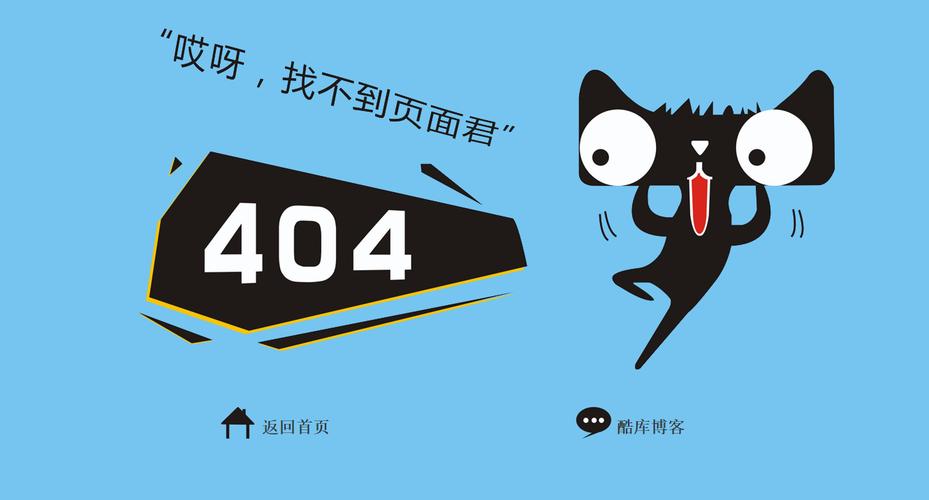
(图片来源网络,侵删)
<!DOCTYPE html>
<html lang="zh-CN">
<head>
    <meta charset="UTF-8">
    <meta name="viewport" content="width=device-width, initial-scale=1.0">404 - 页面未找到</title>
    <style>
        /* --- 全局样式和变量 --- */
        :root {
            --primary-color: #3498db; /* 主色调,可以换成你的品牌色 */
            --text-color: #333;
            --light-text-color: #666;
            --bg-color: #f4f7f6;
            --card-bg-color: #ffffff;
            --shadow: 0 4px 15px rgba(0, 0, 0, 0.1);
        }
        * {
            margin: 0;
            padding: 0;
            box-sizing: border-box;
        }
        body {
            font-family: -apple-system, BlinkMacSystemFont, 'Segoe UI', Roboto, 'Helvetica Neue', Arial, sans-serif;
            background-color: var(--bg-color);
            color: var(--text-color);
            line-height: 1.6;
            display: flex;
            justify-content: center;
            align-items: center;
            min-height: 100vh;
            padding: 20px;
        }
        .container {
            text-align: center;
            max-width: 600px;
            width: 100%;
        }
        /* --- 404 错误代码样式 --- */
        .error-code {
            font-size: 120px;
            font-weight: 900;
            color: var(--primary-color);
            line-height: 1;
            margin-bottom: 20px;
            text-shadow: 5px 5px 0px rgba(0, 0, 0, 0.05);
            animation: float 3s ease-in-out infinite;
        }
        @keyframes float {
            0% { transform: translateY(0px); }
            50% { transform: translateY(-10px); }
            100% { transform: translateY(0px); }
        }
        /* --- 标题和描述 --- */
        h1 {
            font-size: 28px;
            font-weight: 700;
            margin-bottom: 15px;
        }
        .error-description {
            font-size: 18px;
            color: var(--light-text-color);
            margin-bottom: 30px;
        }
        /* --- 图片/插画 (可选) --- */
        .error-image {
            margin-bottom: 30px;
        }
        .error-image img {
            max-width: 100%;
            height: auto;
            border-radius: 8px;
        }
        /* --- 按钮和搜索框 --- */
        .actions {
            display: flex;
            flex-direction: column;
            gap: 15px;
            align-items: center;
        }
        .btn {
            display: inline-block;
            padding: 12px 25px;
            background-color: var(--primary-color);
            color: #fff;
            text-decoration: none;
            border-radius: 50px;
            font-weight: 600;
            transition: all 0.3s ease;
            border: none;
            cursor: pointer;
            font-size: 16px;
        }
        .btn:hover {
            background-color: #2980b9;
            transform: translateY(-2px);
            box-shadow: 0 6px 20px rgba(52, 152, 219, 0.3);
        }
        .search-box {
            display: flex;
            width: 100%;
            max-width: 400px;
            margin: 0 auto;
        }
        .search-box input[type="text"] {
            flex-grow: 1;
            padding: 12px 20px;
            border: 2px solid #e0e0e0;
            border-radius: 50px 0 0 50px;
            font-size: 16px;
            outline: none;
            transition: border-color 0.3s ease;
        }
        .search-box input[type="text"]:focus {
            border-color: var(--primary-color);
        }
        .search-box button {
            padding: 12px 20px;
            background-color: var(--primary-color);
            color: #fff;
            border: none;
            border-radius: 0 50px 50px 0;
            cursor: pointer;
            transition: background-color 0.3s ease;
        }
        .search-box button:hover {
            background-color: #2980b9;
        }
        /* --- 响应式设计 --- */
        @media (max-width: 600px) {
            .error-code {
                font-size: 80px;
            }
            h1 {
                font-size: 24px;
            }
            .error-description {
                font-size: 16px;
            }
            .search-box {
                flex-direction: column;
                width: 100%;
            }
            .search-box input[type="text"] {
                border-radius: 50px;
                margin-bottom: -2px; /* 移除重叠边框 */
            }
            .search-box button {
                border-radius: 50px;
            }
        }
    </style>
</head>
<body>
    <div class="container">
        <!-- 错误代码 -->
        <div class="error-code">404</div>
        <!-- 标题 -->
        <h1>哎呀,页面跑丢了!</h1>
        <!-- 描述 -->
        <p class="error-description">
            抱歉,您访问的页面不存在或已被移走。<br>
            别担心,让我们帮您回到正轨。
        </p>
        <!-- 可选:图片或插画 -->
        <div class="error-image">
            <!-- 你可以在这里放一张有趣的 SVG 或 PNG 图片 -->
            <!-- 示例 SVG: 一个简单的问号图标 -->
            <svg width="120" height="120" viewBox="0 0 24 24" fill="none" xmlns="http://www.w3.org/2000/svg">
                <path d="M9.09 9C9.3251 8.33167 9.78915 7.76811 10.4 7.40913C11.0109 7.05016 11.7289 6.9189 12.4272 7.03871C13.1254 7.15853 13.7588 7.52152 14.2151 8.06353C14.6714 8.60553 14.924 9.29152 14.92 10C14.92 12 11.92 13 11.92 13" stroke="var(--primary-color)" stroke-width="2" stroke-linecap="round" stroke-linejoin="round"/>
                <path d="M12 17H12.01" stroke="var(--primary-color)" stroke-width="2" stroke-linecap="round" stroke-linejoin="round"/>
            </svg>
        </div>
        <!-- 操作按钮和搜索框 -->
        <div class="actions">
            <!-- 返回首页按钮 -->
            <a href="/" class="btn">返回首页</a>
            <!-- 搜索框 -->
            <div class="search-box">
                <input type="text" id="searchInput" placeholder="搜索您想要的内容...">
                <button onclick="performSearch()">搜索</button>
            </div>
        </div>
    </div>
    <script>
        // 简单的搜索功能,将搜索词带到网站的主搜索页
        function performSearch() {
            const searchInput = document.getElementById('searchInput');
            const searchTerm = searchInput.value.trim();
            if (searchTerm) {
                // 假设你的网站搜索页是 /search?q=关键词
                // 请根据你的实际情况修改这个URL
                window.location.href = '/search?q=' + encodeURIComponent(searchTerm);
            }
        }
        // 按下回车键也可以触发搜索
        document.getElementById('searchInput').addEventListener('keypress', function(event) {
            if (event.key === 'Enter') {
                performSearch();
            }
        });
    </script>
</body>
</html>
如何使用和自定义
- 保存文件: 将以上代码保存为
html文件。 - 服务器配置: 您需要在您的服务器(如 Nginx, Apache)上配置,当发生 404 错误时,自动显示这个页面。
- Nginx 示例:
error_page 404 /404.html;
- Apache 示例 (在
.htaccess文件中):ErrorDocument 404 /404.html
- Nginx 示例:
- :
- 颜色: 修改
root中的--primary-color变量来改变主色调。 - 文字: 修改
<h1>和<p class="error-description">中的文字内容,使其更符合您的品牌语气。 - 图片: 在
<div class="error-image">中替换<svg>标签为您自己的图片链接或代码。 - 链接: 确保返回首页的按钮
<a href="/">指向您网站的实际首页。 - 搜索功能: 修改
performSearch函数中的window.location.href,使其指向您网站的实际搜索URL。
- 颜色: 修改
设计思路解析
- 视觉冲击: 巨大的 "404" 数字是页面的核心,能立即让用户明白发生了什么。
- 共情文案: "哎呀,页面跑丢了!" 这种拟人化的语言比冰冷的 "Not Found" 更能安抚用户情绪。
- 提供解决方案: 仅仅告诉用户错误是不够的,必须提供出路。
- 返回首页: 最直接的解决方案。
- 搜索框: 如果用户是想找某个特定内容,搜索框是最高效的帮助。
- 动画与交互:
float动画让页面不那么沉闷,按钮的悬停效果提供了良好的视觉反馈,提升了整体的用户体验。 - 移动优先: 使用
flexbox和媒体查询,确保在手机等小屏幕上也有良好的显示效果,搜索框在小屏幕上会垂直排列,以适应更窄的输入框。
(图片来源网络,侵删)


