基础平滑滚动
这是最常见、最基础的滚动效果,可以让页面滚动更加丝滑,避免默认的“卡顿感”。
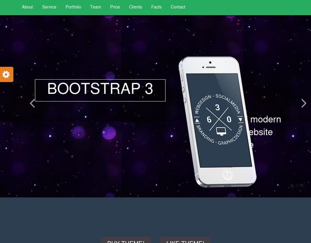
(图片来源网络,侵删)
效果描述
当用户点击页面内的锚点链接时,页面会平滑地滚动到目标位置,而不是瞬间跳转。
代码实现
HTML (index.html)
<!DOCTYPE html>
<html lang="zh-CN">
<head>
    <meta charset="UTF-8">
    <meta name="viewport" content="width=device-width, initial-scale=1.0">平滑滚动模板</title>
    <link rel="stylesheet" href="style.css">
</head>
<body>
    <nav class="navbar">
        <a href="#section1">第一部分</a>
        <a href="#section2">第二部分</a>
        <a href="#section3">第三部分</a>
    </nav>
    <section id="section1" class="content">
        <h2>第一部分</h2>
        <p>滚动到下方,或点击导航栏链接体验平滑滚动效果。</p>
    </section>
    <section id="section2" class="content">
        <h2>第二部分</h2>
        <p>Lorem ipsum dolor sit amet, consectetur adipiscing elit. Sed do eiusmod tempor incididunt ut labore et dolore magna aliqua.</p>
    </section>
    <section id="section3" class="content">
        <h2>第三部分</h2>
        <p>Ut enim ad minim veniam, quis nostrud exercitation ullamco laboris nisi ut aliquip ex ea commodo consequat.</p>
    </section>
    <script src="script.js"></script>
</body>
</html>
CSS (style.css)
body {
    font-family: Arial, sans-serif;
    margin: 0;
    padding: 0;
    scroll-behavior: smooth; /* 核心:启用平滑滚动 */
}
.navbar {
    position: fixed;
    top: 0;
    width: 100%;
    background-color: #333;
    padding: 15px;
    text-align: center;
    z-index: 1000;
}
.navbar a {
    color: white;
    text-decoration: none;
    margin: 0 15px;
    font-size: 18px;
}
.content {
    height: 100vh; /* 每个部分占满一屏 */
    display: flex;
    justify-content: center;
    align-items: center;
    font-size: 2em;
    color: #333;
}
#section1 { background-color: #f1f1f1; }
#section2 { background-color: #e1e1e1; }
#section3 { background-color: #d1d1d1; }
JavaScript (script.js)
注意:对于现代浏览器,scroll-behavior: smooth; CSS属性已经足够,如果需要兼容旧浏览器或更复杂的控制,可以使用JS。
(图片来源网络,侵删)
// 这是一个使用JS实现平滑滚动的备选方案,如果上面的CSS不生效,可以取消注释下面的代码。
/*
document.querySelectorAll('a[href^="#"]').forEach(anchor => {
    anchor.addEventListener('click', function (e) {
        e.preventDefault();
        const target = document.querySelector(this.getAttribute('href'));
        if (target) {
            target.scrollIntoView({
                behavior: 'smooth'
            });
        }
    });
});
*/
视差滚动
视差滚动是一种非常流行的网页设计技术,通过让背景和前景以不同速度滚动,创造出深度感和动态效果。
效果描述
滚动页面时,背景图片移动速度比内容文字慢,形成立体、引人入胜的视觉效果。
代码实现
HTML (index.html)
<!DOCTYPE html>
<html lang="zh-CN">
<head>
    <meta charset="UTF-8">
    <meta name="viewport" content="width=device-width, initial-scale=1.0">视差滚动模板</title>
    <link rel="stylesheet" href="style.css">
</head>
<body>
    <div class="parallax-container">
        <div class="parallax-layer parallax-back">
            <img src="https://images.unsplash.com/photo-1506905925346-21bda4d32df4?q=80&w=2070&auto=format&fit=crop" alt="背景">
        </div>
        <div class="parallax-layer content-layer">
            <h1>欢迎来到视差世界</h1>
            <p>向下滚动,感受魔法</p>
        </div>
    </div>
    <div class="section">
        <h2>关于我们</h2>
        <p>这里是常规内容区域,滚动速度正常,视差效果只发生在上面的部分。</p>
    </div>
    <div class="parallax-container">
        <div class="parallax-layer parallax-back">
            <img src="https://images.unsplash.com/photo-1547036967-23d11aacaee0?q=80&w=2070&auto=format&fit=crop" alt="背景2">
        </div>
        <div class="parallax-layer content-layer">
            <h2>探索更多</h2>
            <p>继续滚动,发现更多惊喜。</p>
        </div>
    </div>
    <div class="section">
        <h2>联系方式</h2>
        <p>这里是另一个常规内容区域。</p>
    </div>
    <script src="https://code.jquery.com/jquery-3.6.0.min.js"></script>
    <script src="script.js"></script>
</body>
</html>
CSS (style.css)
* {
    margin: 0;
    padding: 0;
    box-sizing: border-box;
}
body {
    font-family: 'Helvetica Neue', Arial, sans-serif;
    overflow-x: hidden;
}
.parallax-container {
    height: 100vh;
    position: relative;
    overflow: hidden;
}
.parallax-layer {
    position: absolute;
    top: 0;
    left: 0;
    right: 0;
    bottom: 0;
}
.parallax-back {
    will-change: transform; /* 优化性能 */
}
.parallax-back img {
    width: 110%; /* 稍微放大图片,防止出现白边 */
    height: 110%;
    object-fit: cover;
}
.content-layer {
    display: flex;
    flex-direction: column;
    justify-content: center;
    align-items: center;
    text-align: center;
    color: white;
    z-index: 2;
    padding: 20px;
}
.content-layer h1 {
    font-size: 4em;
    text-shadow: 2px 2px 8px rgba(0,0,0,0.5);
}
.content-layer p {
    font-size: 1.5em;
    text-shadow: 1px 1px 4px rgba(0,0,0,0.5);
}
.section {
    height: 100vh;
    display: flex;
    justify-content: center;
    align-items: center;
    font-size: 2em;
    background-color: #f4f4f4;
}
JavaScript (script.js)
这里使用jQuery简化操作,纯JS也可以实现。
$(window).on('scroll', function() {
    // 获取滚动位置
    const scrolled = $(window).scrollTop();
    // 为每个视差容器设置背景位置
    $('.parallax-container').each(function() {
        // 根据滚动位置计算背景的移动速度(这里是0.5倍速)
        const speed = 0.5;
        const yPos = -(scrolled * speed);
        // 将背景图片向上移动
        $(this).find('.parallax-back').css('background-position', 'center ' + yPos + 'px');
    });
});
注意:上面的JS代码是背景定位的方式,如果你更喜欢使用transform: translateY,可以修改CSS和JS如下:
CSS修改:
.parallax-back {
    will-change: transform;
    /* 移除 background 相关样式 */
}
JS修改:
$(window).on('scroll', function() {
    const scrolled = $(window).scrollTop();
    $('.parallax-container').each(function() {
        const speed = 0.5;
        const yPos = scrolled * speed;
        $(this).find('.parallax-back').css('transform', `translateY(${yPos}px)`);
    });
});
滚动触发动画
这种效果让页面元素在滚动到视口时才“登场”,非常适合展示内容,能提升用户体验和页面的吸引力。
效果描述
页面初始时,某些内容是隐藏的(例如透明度为0或向上偏移),当用户滚动到这些元素进入可视区域时,它们会平滑地显示并移动到正常位置。
代码实现
HTML (index.html)
<!DOCTYPE html>
<html lang="zh-CN">
<head>
    <meta charset="UTF-8">
    <meta name="viewport" content="width=device-width, initial-scale=1.0">滚动触发动画模板</title>
    <link rel="stylesheet" href="https://cdnjs.cloudflare.com/ajax/libs/font-awesome/6.0.0-beta3/css/all.min.css">
    <link rel="stylesheet" href="style.css">
</head>
<body>
    <div class="spacer"></div> <!-- 占位空间,用于演示滚动 -->
    <h2 class="animate-on-scroll">从下方滑入的标题</h2>
    <p class="animate-on-scroll fade-in">这段文字会淡入显示。</p>
    <div class="card animate-on-scroll slide-in-left">
        <i class="fab fa-html5"></i>
        <h3>HTML5</h3>
        <p>语义化标签,构建网页结构。</p>
    </div>
    <div class="card animate-on-scroll slide-in-right">
        <i class="fab fa-css3-alt"></i>
        <h3>CSS3</h3>
        <p>样式设计,美化网页外观。</p>
    </div>
    <div class="spacer"></div>
    <script src="https://code.jquery.com/jquery-3.6.0.min.js"></script>
    <script src="script.js"></script>
</body>
</html>
CSS (style.css)
body {
    font-family: 'Arial', sans-serif;
    background-color: #f0f2f5;
    color: #333;
    line-height: 1.6;
}
.spacer {
    height: 100vh;
    text-align: center;
    font-size: 2em;
}
/* 初始状态:元素不可见 */
.animate-on-scroll {
    opacity: 0;
    transform: translateY(30px); /* 从下方开始 */
    transition: opacity 0.8s ease-out, transform 0.8s ease-out;
}
/* 淡入效果 */
.fade-in {
    transform: translateY(0); /* 淡入不移动位置 */
}
/* 从左侧滑入 */
.slide-in-left {
    transform: translateX(-100px);
}
/* 从右侧滑入 */
.slide-in-right {
    transform: translateX(100px);
}
/* 当元素被触发时,添加这个类 */
.is-visible {
    opacity: 1;
    transform: translateY(0) translateX(0);
}
.card {
    background: white;
    border-radius: 8px;
    padding: 30px;
    margin: 20px auto;
    max-width: 300px;
    text-align: center;
    box-shadow: 0 4px 8px rgba(0,0,0,0.1);
}
.card i {
    font-size: 3em;
    color: #007bff;
    margin-bottom: 15px;
}
JavaScript (script.js)
$(document).ready(function() {
    // 为所有需要动画的元素添加一个函数
    function isElementInViewport(el) {
        // 获取元素及其位置
        const rect = el.getBoundingClientRect();
        // 检查元素是否在视口内
        return (
            rect.top <= (window.innerHeight || document.documentElement.clientHeight) &&
            rect.bottom >= 0
        );
    }
    function handleScrollAnimation() {
        // 遍历所有带有 .animate-on-scroll 类的元素
        $('.animate-on-scroll').each(function() {
            // 如果元素已经在视口中,并且还没有添加 'is-visible' 类
            if (isElementInViewport(this) && !$(this).hasClass('is-visible')) {
                // 添加 'is-visible' 类来触发CSS动画
                $(this).addClass('is-visible');
            }
        });
    }
    // 页面加载时执行一次
    handleScrollAnimation();
    // 滚动时执行
    $(window).on('scroll', handleScrollAnimation);
});
如何选择和使用
- 平滑滚动:几乎所有网站都应该使用,只需在CSS中添加一行
scroll-behavior: smooth;即可,简单有效。 - 视差滚动:适合用在首页、产品介绍页、故事叙述等需要营造氛围和视觉冲击力的地方,注意不要过度使用,以免影响阅读速度和SEO。
- 滚动触发动画:非常适合用于展示作品集、服务列表、团队成员介绍等模块化内容,它能引导用户视线,让页面看起来更生动。
你可以直接复制这些模板的代码,将它们保存在index.html、style.css和script.js三个文件中,然后在浏览器中打开index.html即可看到效果,记得根据你的项目需求修改图片、文字和样式。


