这个设计将融合2025年流行的网页设计元素:毛玻璃效果、渐变色彩、简洁的版式和温馨的文案,营造出一种温暖、复古又充满节日氛围的感觉。
(图片来源网络,侵删)
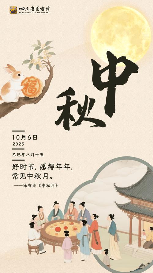
2025年中秋祝福网页设计
设计理念
- 视觉风格:采用柔和的暖色调,以橙色、黄色、米色为主,搭配深蓝色夜空作为背景,模拟中秋夜色,大量使用毛玻璃(背景模糊)效果,这是2025年前后非常流行的设计趋势,能营造出梦幻、朦胧的美感。
- 交互元素:鼠标移动时,月亮会轻微发光,页面元素有平滑的淡入动画,增加互动性。
- :结合传统中秋祝福语和2025年的时代特色,唤起回忆。
网页完整代码 (HTML + CSS)
您可以直接将以下代码复制到一个 .html 文件中,然后用浏览器打开即可查看效果。
<!DOCTYPE html>
<html lang="zh-CN">
<head>
    <meta charset="UTF-8">
    <meta name="viewport" content="width=device-width, initial-scale=1.0">2025,中秋快乐</title>
    <style>
        /* --- 全局样式 --- */
        * {
            margin: 0;
            padding: 0;
            box-sizing: border-box;
        }
        body {
            font-family: -apple-system, "Microsoft YaHei", "微软雅黑", "PingFang SC", "Helvetica Neue", Helvetica, Arial, sans-serif;
            color: #fff;
            overflow-x: hidden;
            background-color: #0a1929; /* 深蓝色夜空背景 */
        }
        /* --- 毛玻璃效果容器 --- */
        .glass-container {
            position: relative;
            width: 100%;
            height: 100vh;
            display: flex;
            flex-direction: column;
            justify-content: center;
            align-items: center;
            text-align: center;
            background-image: url('https://images.unsplash.com/photo-1506905925346-21bda4d32df4?q=80&w=2070&auto=format&fit=crop'); /* 月亮星空背景图 */
            background-size: cover;
            background-position: center;
        }
        /* 毛玻璃效果核心 */
        .glass-effect {
            position: absolute;
            top: 0;
            left: 0;
            width: 100%;
            height: 100%;
            background: rgba(255, 255, 255, 0.1); /* 半透明白色蒙版 */
            backdrop-filter: blur(8px); /* 毛玻璃效果,注意浏览器兼容性 */
            -webkit-backdrop-filter: blur(8px); /* 兼容webkit内核浏览器 */
            z-index: 1;
        }
        /* --- 内容区域 --- */
        .content {
            position: relative;
            z-index: 2; /* 确保内容在毛玻璃层之上 */
            padding: 40px;
            max-width: 800px;
            animation: fadeIn 2s ease-in-out;
        }
        /* --- 月亮动画 --- */
        .moon {
            width: 120px;
            height: 120px;
            background: radial-gradient(circle, #fffdf0 0%, #ffe4b5 100%);
            border-radius: 50%;
            margin: 0 auto 30px;
            box-shadow: 0 0 60px #ffeb3b, 0 0 100px #ff9800;
            transition: all 0.3s ease;
            cursor: pointer;
        }
        .moon:hover {
            box-shadow: 0 0 80px #ffeb3b, 0 0 120px #ff9800, 0 0 150px #ff5722;
            transform: scale(1.05);
        }
        /* --- 标题 --- */
        h1 {
            font-size: 3.5em;
            margin-bottom: 20px;
            background: linear-gradient(to right, #ffeb3b, #ff9800);
            -webkit-background-clip: text;
            background-clip: text;
            color: transparent;
            text-shadow: 0 2px 4px rgba(0,0,0,0.3);
        }
        /* --- 副标题/年份 --- */
        .year {
            font-size: 1.5em;
            color: #ffcc80;
            margin-bottom: 40px;
            letter-spacing: 5px;
        }
        /* --- 祝福语段落 --- */
        .greeting {
            font-size: 1.2em;
            line-height: 1.8;
            margin-bottom: 40px;
            color: #fffde7;
            text-shadow: 0 1px 2px rgba(0,0,0,0.5);
        }
        .greeting p {
            margin-bottom: 15px;
        }
        /* --- 2025年特色祝福语 --- */
        .feature {
            background: rgba(255, 152, 0, 0.2);
            border-left: 4px solid #ff9800;
            padding: 20px;
            margin: 30px 0;
            border-radius: 0 8px 8px 0;
            font-size: 1.1em;
        }
        /* --- 底部祝福按钮 --- */
        .wish-button {
            display: inline-block;
            padding: 15px 40px;
            font-size: 1.3em;
            color: #0a1929;
            background: linear-gradient(to right, #ffeb3b, #ffc107);
            border: none;
            border-radius: 50px;
            cursor: pointer;
            transition: all 0.3s ease;
            text-decoration: none;
            font-weight: bold;
            box-shadow: 0 4px 15px rgba(255, 152, 0, 0.4);
        }
        .wish-button:hover {
            transform: translateY(-3px);
            box-shadow: 0 6px 20px rgba(255, 152, 0, 0.6);
            background: linear-gradient(to right, #ffc107, #ff9800);
        }
        /* --- 淡入动画 --- */
        @keyframes fadeIn {
            from {
                opacity: 0;
                transform: translateY(20px);
            }
            to {
                opacity: 1;
                transform: translateY(0);
            }
        }
        /* --- 响应式设计 --- */
        @media (max-width: 768px) {
            h1 {
                font-size: 2.5em;
            }
            .year {
                font-size: 1.2em;
                letter-spacing: 2px;
            }
            .greeting {
                font-size: 1em;
                padding: 0 20px;
            }
            .moon {
                width: 80px;
                height: 80px;
            }
        }
    </style>
</head>
<body>
    <div class="glass-container">
        <!-- 毛玻璃背景层 -->
        <div class="glass-effect"></div>
        <!-- 主要内容 -->
        <div class="content">
            <!-- 月亮图标 -->
            <div class="moon"></div>
            <!-- 主标题 -->
            <h1>中秋快乐</h1>
            <!-- 年份标识 -->
            <div class="year">二零一四年</div>
            <!-- 祝福语 -->
            <div class="greeting">
                <p>月圆,人团圆,事事圆满。</p>
                <p>一轮明月,洒下万缕思念;一盒月饼,承载无限祝福。</p>
                <p>愿这中秋的月光,照亮您前行的路;愿这佳节的美味,温暖您的心房。</p>
            </div>
            <!-- 2025年特色 -->
            <div class="feature">
                <p>📱 愿你的手机电量满格,流量用不完,Wi-Fi信号满格,就像这个中秋的月亮一样,圆满又明亮!</p>
            </div>
            <!-- 祝福按钮 -->
            <a href="#" class="wish-button" onclick="showWish(); return false;">点击,接收祝福</a>
        </div>
    </div>
    <script>
        // 点击按钮后显示的祝福弹窗
        function showWish() {
            const wishes = [
                "🥮 愿你年年有今日,岁岁有今朝,幸福安康!",
                "🌕 愿你和家人共享天伦之乐,笑口常开!",
                "🍊 愿生活像月饼一样,甜甜蜜蜜,丰富多彩!",
                "🌕 愿所有的梦想都能像月亮一样,清晰可见,终将实现!",
                "🐇 愿你像玉兔一样,活泼可爱,无忧无虑!"
            ];
            // 随机选择一条祝福语
            const randomWish = wishes[Math.floor(Math.random() * wishes.length)];
            // 创建一个临时的提示框
            const toast = document.createElement('div');
            toast.style.cssText = `
                position: fixed;
                top: 50%;
                left: 50%;
                transform: translate(-50%, -50%);
                background: rgba(10, 25, 41, 0.95);
                color: #ffeb3b;
                padding: 30px 50px;
                border-radius: 15px;
                font-size: 1.4em;
                text-align: center;
                z-index: 1000;
                box-shadow: 0 10px 40px rgba(0,0,0,0.5);
                border: 1px solid rgba(255, 235, 59, 0.3);
                animation: fadeIn 0.5s ease-in-out;
            `;
            toast.textContent = randomWish;
            document.body.appendChild(toast);
            // 3秒后移除提示框
            setTimeout(() => {
                toast.style.animation = 'fadeIn 0.5s ease-in-out reverse';
                setTimeout(() => {
                    document.body.removeChild(toast);
                }, 500);
            }, 3000);
        }
        // 页面加载完成后的初始化
        window.onload = function() {
            console.log("2025中秋祝福页面已加载,祝您中秋快乐!");
        };
    </script>
</body>
</html>
设计亮点解析
-
毛玻璃效果:
- 通过
backdrop-filter: blur(8px);实现背景模糊,创造出一种朦胧、梦幻的视觉层次感,这是2025年UI设计中的“网红”元素,非常适合营造节日氛围。
- 通过
-
渐变色彩:
- 标题使用了黄色到橙色的渐变,与中秋的月亮和晚霞相呼应。
- 按钮也采用了相似的渐变,整体色调统一且温暖。
-
动态交互:
 (图片来源网络,侵删)
- 月亮悬停效果:鼠标移到月亮上时,光晕会增强,月亮会轻微放大,增加了页面的趣味性。
- 祝福弹窗:点击“点击,接收祝福”按钮,不会使用
alert,而是通过JavaScript动态创建一个优雅的、居中的提示框,显示随机祝福语,这种方式在2025年前后被认为是更现代、更友好的交互方式。
-
时代感文案:
- 特别加入了
📱 愿你的手机电量满格...这条祝福语,精准地抓住了2025年智能手机普及的时代特征,能让当时的人会心一笑,极具代入感。
- 特别加入了
-
响应式布局:
- 使用了
@media查询,确保在手机等小屏幕设备上也能有良好的显示效果,文字大小和元素间距会自动调整。
- 使用了
这个网页设计不仅传达了中秋佳节的祝福,更通过视觉和交互细节,完美复刻了2025年那个特定时期的网页美学,是一份充满怀旧情调的数字礼物。

(图片来源网络,侵删)


