核心设计原则 (移动端优先)
在开始设计之前,请牢记移动端404页面的几个关键点:
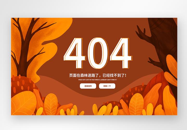
(图片来源网络,侵删)
- 简洁明了:手机屏幕小,信息必须一目了然,核心信息只有三点:“您迷路了”、“为什么会出现这个页面”、“您可以做什么”。
- 视觉友好:使用大字体、高对比度的颜色,确保在各种光线和屏幕下都清晰可读。
- 操作便捷:所有按钮都要足够大,易于点击,提供最直接的导航选项,如“返回首页”、“返回上一步”。
- 加载快速:404页面本身资源要少,不能因为加载一个错误页面而让用户失去耐心。
极简友好型
这种模板最简单,但非常有效,适合所有类型的网站。
结构:
- 一个大大的、友好的404图标或数字。
- 一句简短的、有同理心的标题。
- 一句解释性的描述。
- 两个主要操作按钮:“返回首页”和“返回上一步”。
代码示例 (HTML + Tailwind CSS)
您可以直接复制这段代码,并引入 Tailwind CSS 的 CDN 即可使用。
<!DOCTYPE html>
<html lang="zh-CN">
<head>
    <meta charset="UTF-8">
    <meta name="viewport" content="width=device-width, initial-scale=1.0, maximum-scale=1.0, user-scalable=no">404 - 页面未找到</title>
    <!-- Tailwind CSS CDN -->
    <script src="https://cdn.tailwindcss.com"></script>
    <style>
        /* 自定义字体和动画 */
        @import url('https://fonts.googleapis.com/css2?family=Noto+Sans+SC:wght@400;500;700&display=swap');
        body {
            font-family: 'Noto Sans SC', sans-serif;
        }
        .bounce-in {
            animation: bounceIn 0.8s ease-out;
        }
        @keyframes bounceIn {
            0% { transform: scale(0.3); opacity: 0; }
            50% { transform: scale(1.05); }
            70% { transform: scale(0.9); }
            100% { transform: scale(1); opacity: 1; }
        }
    </style>
</head>
<body class="bg-gray-50 flex items-center justify-center min-h-screen p-4">
    <div class="text-center max-w-md w-full bounce-in">
        <!-- 404 图标或数字 -->
        <div class="text-indigo-600 text-9xl font-bold mb-6">404</div>
        <!-- 标题 -->
        <h1 class="text-2xl font-bold text-gray-800 mb-2">哎呀,页面迷路了!</h1>
        <!-- 描述 -->
        <p class="text-gray-600 mb-8 leading-relaxed">
            抱歉,您访问的页面不存在或已被移除。
            <br>别担心,让我们带您回到安全地带。
        </p>
        <!-- 操作按钮 -->
        <div class="space-y-3">
            <a href="/" class="block w-full bg-indigo-600 hover:bg-indigo-700 text-white font-medium py-3 px-4 rounded-lg transition duration-200 text-center">
                返回首页
            </a>
            <button onclick="history.back()" class="block w-full bg-white border border-gray-300 hover:bg-gray-50 text-gray-700 font-medium py-3 px-4 rounded-lg transition duration-200 text-center">
                返回上一步
            </button>
        </div>
    </div>
    <script>
        // 可选:添加一些趣味性,比如点击404数字有惊喜
        document.querySelector('.text-indigo-600').addEventListener('click', function() {
            this.textContent = Math.random() > 0.5 ? '✨' : '🚀';
            setTimeout(() => {
                this.textContent = '404';
            }, 1000);
        });
    </script>
</body>
</html>
插画/动画趣味型
这种模板通过生动的插画或微动画来缓解用户的焦虑情绪,让404页面也变得有趣。
结构:
- 一个引人注目的插画(可以是自定义的,也可以使用图标库)。
- 一个带有幽默感或故事性的标题和描述。
- 清晰的导航按钮。
- (可选)一个搜索框,方便用户直接查找内容。
代码示例 (HTML + Tailwind CSS + Feather Icons)
<!DOCTYPE html>
<html lang="zh-CN">
<head>
    <meta charset="UTF-8">
    <meta name="viewport" content="width=device-width, initial-scale=1.0, maximum-scale=1.0, user-scalable=no">404 - 页面飞走了</title>
    <script src="https://cdn.tailwindcss.com"></script>
    <script src="https://unpkg.com/feather-icons"></script>
    <style>
        body { font-family: 'Noto Sans SC', sans-serif; }
        .float-animation {
            animation: float 3s ease-in-out infinite;
        }
        @keyframes float {
            0% { transform: translateY(0px); }
            50% { transform: translateY(-10px); }
            100% { transform: translateY(0px); }
        }
    </style>
</head>
<body class="bg-gradient-to-br from-blue-50 to-indigo-100 flex items-center justify-center min-h-screen p-4">
    <div class="text-center max-w-md w-full">
        <!-- 有趣的插画/图标 -->
        <div class="mb-8 float-animation">
            <!-- 使用 Feather 图标,你可以替换成自己的 SVG 图片 -->
            <i data-feather="navigation" class="w-24 h-24 mx-auto text-indigo-500"></i>
        </div>
        <!-- 标题 -->
        <h1 class="text-3xl font-bold text-gray-800 mb-3">这个页面去旅行了</h1>
        <!-- 描述 -->
        <p class="text-gray-600 mb-8">
            看起来它打包好行李,飞向了远方。
            <br>或者,它只是被我们不小心删除了。
        </p>
        <!-- 搜索框 (可选) -->
        <div class="mb-6">
            <form action="/search" method="get" class="relative">
                <input type="text" name="q" placeholder="搜索一下试试?"
                       class="w-full py-3 px-4 pr-10 rounded-lg border border-gray-300 focus:outline-none focus:ring-2 focus:ring-indigo-500 focus:border-transparent">
                <button type="submit" class="absolute right-2 top-1/2 transform -translate-y-1/2 text-gray-500 hover:text-indigo-600">
                    <i data-feather="search" class="w-5 h-5"></i>
                </button>
            </form>
        </div>
        <!-- 操作按钮 -->
        <div class="flex flex-col sm:flex-row gap-3 justify-center">
            <a href="/" class="flex-1 bg-indigo-600 hover:bg-indigo-700 text-white font-medium py-3 px-4 rounded-lg transition duration-200 flex items-center justify-center gap-2">
                <i data-feather="home" class="w-4 h-4"></i>
                回到首页
            </a>
            <button onclick="history.back()" class="flex-1 bg-white border border-gray-300 hover:bg-gray-50 text-gray-700 font-medium py-3 px-4 rounded-lg transition duration-200 flex items-center justify-center gap-2">
                <i data-feather="arrow-left" class="w-4 h-4"></i>
                返回上页
            </button>
        </div>
    </div>
    <script>
        // 初始化 Feather 图标
        feather.replace();
    </script>
</body>
</html>
功能导向型
这种模板不仅提供安慰,还主动帮助用户解决问题,适合内容或电商类网站。
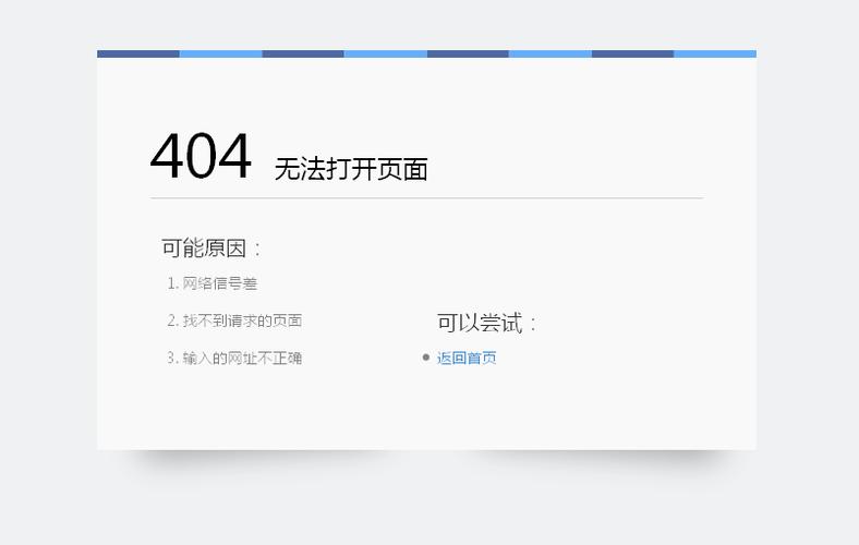
(图片来源网络,侵删)
结构:
- 清晰的错误提示。
- 一个功能强大的搜索框。
- 热门链接或猜你喜欢的推荐区域。
- 基础的导航按钮。
代码示例 (HTML + Tailwind CSS)
<!DOCTYPE html>
<html lang="zh-CN">
<head>
    <meta charset="UTF-8">
    <meta name="viewport" content="width=device-width, initial-scale=1.0, maximum-scale=1.0, user-scalable=no">404 - 页面未找到</title>
    <script src="https://cdn.tailwindcss.com"></script>
    <style>
        body { font-family: 'Noto Sans SC', sans-serif; }
    </style>
</head>
<body class="bg-gray-50 flex items-center justify-center min-h-screen p-4">
    <div class="w-full max-w-md">
        <div class="bg-white rounded-xl shadow-lg p-6 text-center">
            <!-- 错误图标 -->
            <div class="mx-auto flex items-center justify-center h-16 w-16 rounded-full bg-red-100 mb-4">
                <svg class="h-8 w-8 text-red-600" fill="none" viewBox="0 0 24 24" stroke="currentColor">
                    <path stroke-linecap="round" stroke-linejoin="round" stroke-width="2" d="M12 9v2m0 4h.01m-6.938 4h13.856c1.54 0 2.502-1.667 1.732-3L13.732 4c-.77-1.333-2.694-1.333-3.464 0L3.34 16c-.77 1.333.192 3 1.732 3z" />
                </svg>
            </div>
            <h1 class="text-2xl font-bold text-gray-900 mb-2">页面不存在</h1>
            <p class="text-gray-500 mb-6">找不到您要访问的页面,但我们可以帮您找到其他精彩内容。</p>
            <!-- 搜索框 -->
            <div class="mb-6">
                <form action="/search" method="get" class="relative">
                    <input type="text" name="q" placeholder="搜索您想要的..."
                           class="w-full py-3 px-4 pr-10 rounded-lg border border-gray-300 focus:outline-none focus:ring-2 focus:ring-indigo-500 focus:border-transparent">
                    <button type="submit" class="absolute right-2 top-1/2 transform -translate-y-1/2 text-gray-500 hover:text-indigo-600">
                        <svg class="w-5 h-5" fill="none" stroke="currentColor" viewBox="0 0 24 24">
                            <path stroke-linecap="round" stroke-linejoin="round" stroke-width="2" d="M21 21l-6-6m2-5a7 7 0 11-14 0 7 7 0 0114 0z"></path>
                        </svg>
                    </button>
                </form>
            </div>
            <!-- 热门链接 -->
            <div class="mb-6">
                <h3 class="text-sm font-medium text-gray-900 mb-3">热门页面</h3>
                <ul class="space-y-2">
                    <li><a href="/products" class="block text-indigo-600 hover:text-indigo-800 text-sm">全部商品</a></li>
                    <li><a href="/about" class="block text-indigo-600 hover:text-indigo-800 text-sm">关于我们</a></li>
                    <li><a href="/contact" class="block text-indigo-600 hover:text-indigo-800 text-sm">联系我们</a></li>
                </ul>
            </div>
            <!-- 按钮组 -->
            <div class="flex flex-col gap-3">
                <a href="/" class="w-full bg-indigo-600 hover:bg-indigo-700 text-white font-medium py-3 px-4 rounded-lg transition duration-200">
                    前往首页
                </a>
                <button onclick="history.back()" class="w-full bg-gray-100 hover:bg-gray-200 text-gray-700 font-medium py-3 px-4 rounded-lg transition duration-200">
                    返回上一步
                </button>
            </div>
        </div>
    </div>
</body>
</html>
如何部署 404 页面?
部署方法因您的服务器和网站类型而异。
对于静态网站托管 (如 Netlify, Vercel, GitHub Pages)
这是最简单的方式,您只需要将您的404页面文件命名为 html,然后和您的其他网站文件一起上传即可,这些平台会自动识别这个文件作为自定义的404页面。
对于 Nginx 服务器
在您的 Nginx 配置文件中,添加或修改以下内容:
error_page 404 /404.html;
location = /404.html {
    internal; # 防止用户直接访问 /404.html
    # 将您的404.html文件路径放在这里
    root   /usr/share/nginx/html;
}
对于 Apache 服务器
在您的 .htaccess 文件中添加以下代码:
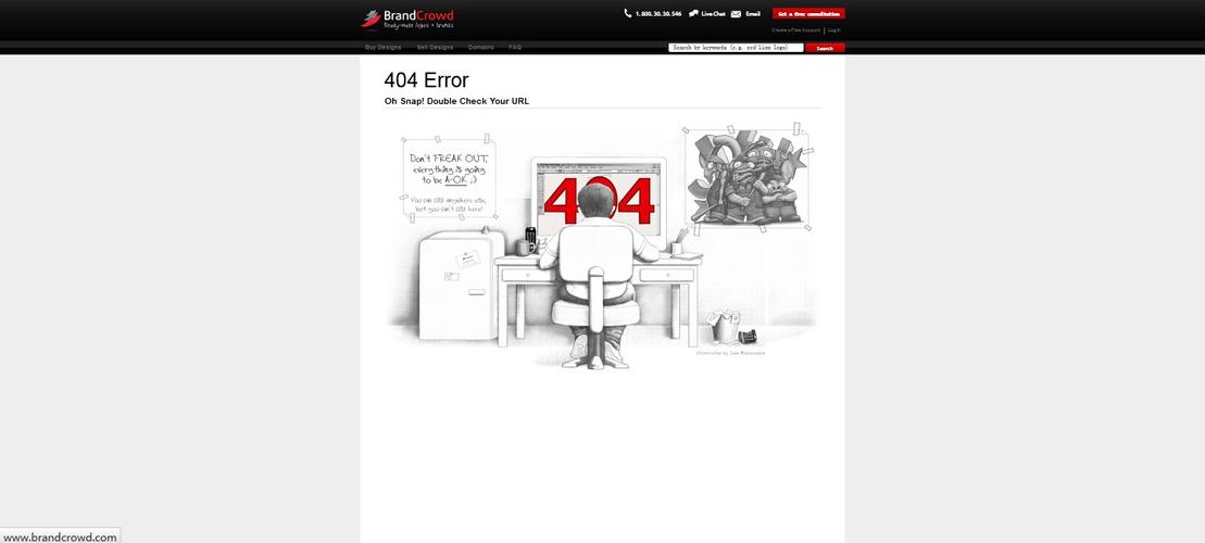
(图片来源网络,侵删)
ErrorDocument 404 /404.html
请确保 /404.html 是相对于您网站根目录的正确路径。
总结与建议
- 首选模板一:如果您的网站风格简约,或者您想快速上线一个标准的404页面,模板一是最安全、最通用的选择。
- 考虑模板二:如果您的品牌形象比较活泼、年轻,或者想给用户留下深刻印象,模板二的趣味性会非常加分。
- 选择模板三:如果您的网站内容丰富,用户可能是在寻找特定商品或文章,模板三的搜索和推荐功能能极大地提升用户体验,将潜在的用户流失降到最低。
请务必在本地和测试环境中测试您的404页面,确保它能正常显示,并且链接和按钮都能正常工作。


