模板特点
- HTML5 语义化标签:使用
<header>,<nav>,<main>,<section>,<footer>等标签,使代码结构清晰,有利于 SEO 和可访问性。 - 移动优先响应式设计:使用 CSS3 的媒体查询,确保在手机、平板和桌面电脑上都有良好的显示效果。
- 现代简洁的布局:采用 Flexbox 和 Grid 布局,灵活且强大。
- 完整的中文内容:所有文本均为中文,您可以直接替换成自己的内容。
- 易于定制:代码结构清晰,注释详细,方便您进行修改和扩展。
完整代码
您可以直接将以下所有代码复制到一个 .html 文件中,然后用浏览器打开即可看到效果。
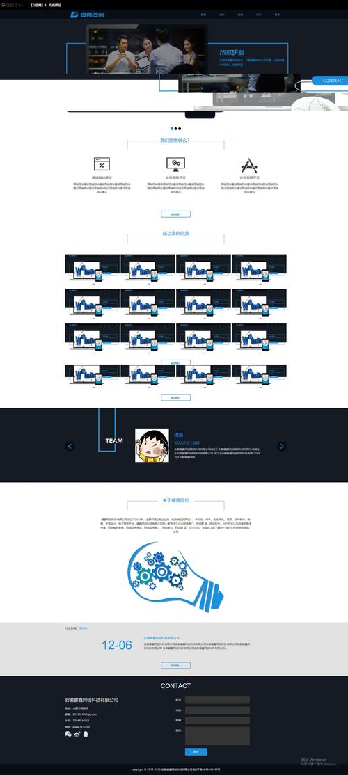
(图片来源网络,侵删)
<!DOCTYPE html>
<html lang="zh-CN">
<head>
<meta charset="UTF-8">
<meta name="viewport" content="width=device-width, initial-scale=1.0">您的网站名称 - 专业、创新、可靠</title>
<!-- 引入 Google Fonts (可选) -->
<link rel="preconnect" href="https://fonts.googleapis.com">
<link rel="preconnect" href="https://fonts.gstatic.com" crossorigin>
<link href="https://fonts.googleapis.com/css2?family=Noto+Sans+SC:wght@400;500;700&display=swap" rel="stylesheet">
<style>
/* --- 全局样式和变量 --- */
:root {
--primary-color: #007bff;
--secondary-color: #6c757d;
--text-color: #333;
--light-bg-color: #f8f9fa;
--white-color: #ffffff;
--max-width: 1200px;
}
* {
margin: 0;
padding: 0;
box-sizing: border-box;
}
body {
font-family: 'Noto Sans SC', -apple-system, BlinkMacSystemFont, 'Segoe UI', 'PingFang SC', 'Hiragino Sans GB', 'Microsoft YaHei', sans-serif;
line-height: 1.6;
color: var(--text-color);
background-color: var(--white-color);
}
.container {
max-width: var(--max-width);
margin: 0 auto;
padding: 0 20px;
}
h1, h2, h3 {
margin-bottom: 1rem;
font-weight: 700;
}
a {
text-decoration: none;
color: var(--primary-color);
}
img {
max-width: 100%;
height: auto;
}
section {
padding: 60px 0;
}
.section-title {
text-align: center;
font-size: 2.5rem;
margin-bottom: 3rem;
color: var(--text-color);
}
/* --- 导航栏样式 --- */
header {
background-color: var(--white-color);
box-shadow: 0 2px 5px rgba(0,0,0,0.1);
position: sticky;
top: 0;
z-index: 1000;
}
nav {
display: flex;
justify-content: space-between;
align-items: center;
padding: 1rem 0;
}
.logo {
font-size: 1.5rem;
font-weight: 700;
color: var(--text-color);
}
.nav-links {
display: flex;
list-style: none;
gap: 2rem;
}
.nav-links a {
color: var(--text-color);
font-weight: 500;
transition: color 0.3s ease;
}
.nav-links a:hover {
color: var(--primary-color);
}
.hamburger {
display: none;
flex-direction: column;
cursor: pointer;
}
.hamburger span {
width: 25px;
height: 3px;
background-color: var(--text-color);
margin: 3px 0;
transition: 0.3s;
}
/* --- 英雄区块样式 --- */
.hero {
background: linear-gradient(rgba(0, 0, 0, 0.5), rgba(0, 0, 0, 0.5)), url('https://images.unsplash.com/photo-1557687280-bb4a8ca6b863?q=80&w=1974&auto=format&fit=crop') no-repeat center center/cover;
color: var(--white-color);
text-align: center;
padding: 120px 0;
}
.hero h1 {
font-size: 3.5rem;
margin-bottom: 1rem;
}
.hero p {
font-size: 1.25rem;
margin-bottom: 2rem;
max-width: 600px;
margin-left: auto;
margin-right: auto;
}
.btn {
display: inline-block;
padding: 12px 30px;
background-color: var(--primary-color);
color: var(--white-color);
border-radius: 5px;
font-weight: 500;
transition: background-color 0.3s ease, transform 0.2s ease;
}
.btn:hover {
background-color: #0056b3;
transform: translateY(-2px);
}
/* --- 特性介绍样式 --- */
.features {
background-color: var(--light-bg-color);
}
.features-grid {
display: grid;
grid-template-columns: repeat(auto-fit, minmax(300px, 1fr));
gap: 2rem;
}
.feature-card {
background-color: var(--white-color);
padding: 2rem;
border-radius: 8px;
text-align: center;
box-shadow: 0 4px 6px rgba(0,0,0,0.1);
transition: transform 0.3s ease;
}
.feature-card:hover {
transform: translateY(-10px);
}
.feature-icon {
font-size: 3rem;
margin-bottom: 1rem;
}
/* --- 内容展示样式 --- */
.content-list {
display: grid;
grid-template-columns: repeat(auto-fit, minmax(300px, 1fr));
gap: 2rem;
}
.content-item {
border: 1px solid #ddd;
border-radius: 8px;
overflow: hidden;
transition: box-shadow 0.3s ease;
}
.content-item:hover {
box-shadow: 0 8px 16px rgba(0,0,0,0.1);
}
.content-item img {
width: 100%;
height: 200px;
object-fit: cover;
}
.content-item-body {
padding: 1.5rem;
}
.content-item h3 {
margin-bottom: 0.5rem;
}
/* --- 联系表单样式 --- */
.contact-form .form-group {
margin-bottom: 1.5rem;
}
.contact-form label {
display: block;
margin-bottom: 0.5rem;
font-weight: 500;
}
.contact-form input,
.contact-form textarea {
width: 100%;
padding: 12px;
border: 1px solid #ccc;
border-radius: 5px;
font-family: inherit;
font-size: 1rem;
}
.contact-form textarea {
resize: vertical;
min-height: 150px;
}
/* --- 页脚样式 --- */
footer {
background-color: #343a40;
color: var(--white-color);
text-align: center;
padding: 2rem 0;
}
.footer-content p {
margin-bottom: 0.5rem;
}
.footer-links {
list-style: none;
display: flex;
justify-content: center;
gap: 2rem;
margin-top: 1rem;
}
.footer-links a {
color: #adb5bd;
transition: color 0.3s ease;
}
.footer-links a:hover {
color: var(--white-color);
}
/* --- 响应式设计 --- */
@media (max-width: 768px) {
.nav-links {
position: fixed;
left: -100%;
top: 70px;
flex-direction: column;
background-color: var(--white-color);
width: 100%;
text-align: center;
transition: 0.3s;
box-shadow: 0 10px 27px rgba(0,0,0,0.05);
padding: 2rem 0;
}
.nav-links.active {
left: 0;
}
.hamburger {
display: flex;
}
.hero h1 {
font-size: 2.5rem;
}
.hero p {
font-size: 1rem;
}
.section-title {
font-size: 2rem;
}
}
</style>
</head>
<body>
<!-- 导航栏 -->
<header>
<nav class="container">
<a href="#" class="logo">您的网站名称</a>
<ul class="nav-links">
<li><a href="#home">首页</a></li>
<li><a href="#features">特性</a></li>
<li><a href="#about">关于我们</a></li>
<li><a href="#contact">联系我们</a></li>
</ul>
<div class="hamburger">
<span></span>
<span></span>
<span></span>
</div>
</nav>
</header>
<main>
<!-- 英雄区块 -->
<section id="home" class="hero">
<div class="container">
<h1>欢迎来到我们的网站</h1>
<p>我们致力于为您提供最优质的产品和服务,让您的想法变为现实。</p>
<a href="#features" class="btn">了解更多</a>
</div>
</section>
<!-- 特性介绍 -->
<section id="features" class="features">
<div class="container">
<h2 class="section-title">我们的核心特性</h2>
<div class="features-grid">
<div class="feature-card">
<div class="feature-icon">🚀</div>
<h3>高性能</h3>
<p>采用最新的技术栈,确保网站加载迅速,运行流畅,为用户提供极致的浏览体验。</p>
</div>
<div class="feature-card">
<div class="feature-icon">📱</div>
<h3>全响应式</h3>
<p>完美适配各种尺寸的设备,从桌面电脑到手机,无论用户在哪里,都能获得一致的视觉体验。</p>
</div>
<div class="feature-card">
<div class="feature-icon">🔒</div>
<h3>安全可靠</h3>
<p>我们高度重视数据安全,采用行业领先的加密技术和安全协议,保护您的隐私和信息安全。</p>
</div>
</div>
</div>
</section>
<!-- 内容展示 -->
<section id="about">
<div class="container">
<h2 class="section-title">了解更多</h2>
<div class="content-list">
<article class="content-item">
<img src="https://via.placeholder.com/400x200" alt="文章配图">
<div class="content-item-body">
<h3>最新动态:我们发布了全新版本</h3>
<p>经过团队数月的努力,我们很高兴地宣布全新版本的正式发布,这次更新带来了许多激动人心的新功能和性能优化。</p>
<a href="#" class="btn">阅读更多</a>
</div>
</article>
<article class="content-item">
<img src="https://via.placeholder.com/400x200" alt="文章配图">
<div class="content-item-body">
<h3>客户案例:如何提升效率200%</h3>
<p>了解我们的客户如何通过使用我们的产品,成功将团队的工作效率提升了200%,实现了业务上的巨大突破。</p>
<a href="#" class="btn">阅读更多</a>
</div>
</article>
<article class="content-item">
<img src="https://via.placeholder.com/400x200" alt="文章配图">
<div class="content-item-body">
<h3>技术博客:深入解析前端框架</h3>
<p>本文将深入探讨当前最流行的前端框架,分析它们的优缺点,并为您提供选择最适合您项目的建议。</p>
<a href="#" class="btn">阅读更多</a>
</div>
</article>
</div>
</div>
</section>
<!-- 联系我们 -->
<section id="contact" class="features">
<div class="container">
<h2 class="section-title">联系我们</h2>
<form class="contact-form">
<div class="form-group">
<label for="name">您的姓名</label>
<input type="text" id="name" name="name" required>
</div>
<div class="form-group">
<label for="email">电子邮箱</label>
<input type="email" id="email" name="email" required>
</div>
<div class="form-group">
<label for="message">留言内容</label>
<textarea id="message" name="message" required></textarea>
</div>
<button type="submit" class="btn">发送消息</button>
</form>
</div>
</section>
</main>
<!-- 页脚 -->
<footer>
<div class="container">
<div class="footer-content">
<p>© 2025 您的网站名称. 保留所有权利.</p>
<ul class="footer-links">
<li><a href="#">隐私政策</a></li>
<li><a href="#">使用条款</a></li>
<li><a href="#">网站地图</a></li>
</ul>
</div>
</div>
</footer>
<script>
// 移动端导航菜单切换
const hamburger = document.querySelector('.hamburger');
const navLinks = document.querySelector('.nav-links');
hamburger.addEventListener('click', () => {
navLinks.classList.toggle('active');
});
// 点击导航链接后关闭菜单
document.querySelectorAll('.nav-links a').forEach(link => {
link.addEventListener('click', () => {
navLinks.classList.remove('active');
});
});
// 平滑滚动
document.querySelectorAll('a[href^="#"]').forEach(anchor => {
anchor.addEventListener('click', function (e) {
e.preventDefault();
const target = document.querySelector(this.getAttribute('href'));
if (target) {
target.scrollIntoView({
behavior: 'smooth',
block: 'start'
});
}
});
});
// 联系表单提交处理
document.querySelector('.contact-form').addEventListener('submit', function(e) {
e.preventDefault();
// 这里可以添加表单提交的逻辑,例如发送数据到服务器
alert('感谢您的留言!我们会尽快与您联系。');
this.reset(); // 重置表单
});
</script>
</body>
</html>
如何使用和修改
- 保存文件:将上面的所有代码复制到一个文本编辑器中(如 VS Code, Sublime Text, 或记事本),然后将其另存为
index.html文件。 - 修改网站名称和标题:
- 在
<title>标签中修改网页标题。 - 修改
.logo和<footer>中的“您的网站名称”。
- 在
- 修改导航链接:
- 修改
.nav-links<li>中的链接文字和href值,使其指向您网站的不同部分。
- 修改
- 修改英雄区块:
- 修改
<h1>和<p>中的欢迎语和描述文字。 - 如果想更换背景图,找到
background-image: url(...)部分,替换为您自己的图片链接。
- 修改
- 修改特性介绍:
- 修改
.feature-card中的标题、图标(🚀, 📱, 🔒)和描述文字。
- 修改
- 展示:
- 修改
.content-item中的文章标题、图片和摘要。 - 图片链接使用的是占位图服务,您需要替换成自己的真实图片。
- 修改
- 修改联系表单:
- 修改
<label>中的文字。 - 表单提交目前只是一个前端提示(
alert),在实际应用中,您需要后端技术(如 PHP, Node.js, Python)来处理表单数据。
- 修改
- 修改页脚:
修改版权信息和页脚链接。
- 调整样式:
- 在
<style>标签的root部分,您可以轻松修改颜色变量(如--primary-color)来改变整个网站的主题色。 - 修改
padding,margin,font-size等值可以调整布局和间距。
- 在
这个模板为您提供了一个坚实的基础,您可以根据自己的需求进行扩展和美化,例如添加动画效果、集成后端服务等。
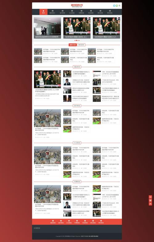
(图片来源网络,侵删)


