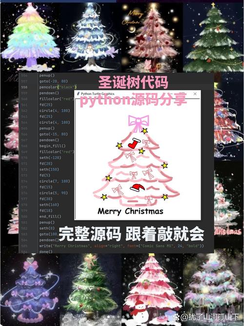
简单纯CSS圣诞树
这个方案使用纯CSS创建,代码简洁,非常适合快速嵌入到任何网页中。

(图片来源网络,侵删)
代码
您可以直接将以下代码复制到一个 .html 文件中,然后用浏览器打开。
<!DOCTYPE html>
<html lang="zh-CN">
<head>
    <meta charset="UTF-8">
    <meta name="viewport" content="width=device-width, initial-scale=1.0">纯CSS圣诞树</title>
    <style>
        body {
            display: flex;
            justify-content: center;
            align-items: center;
            height: 100vh;
            margin: 0;
            background-color: #0f2027; /* 深色夜空背景 */
            background-image: linear-gradient(to bottom, #0f2027, #203a43, #2c5364);
            font-family: Arial, sans-serif;
        }
        .tree-container {
            position: relative;
            text-align: center;
        }
        /* 树干 */
        .trunk {
            width: 60px;
            height: 100px;
            background-color: #8B4513; /* 棕色 */
            margin: 0 auto; /* 水平居中 */
            border-radius: 5px;
        }
        /* 树冠部分 */
        .tree {
            position: absolute;
            bottom: 100px; /* 定位在树干上方 */
            left: 50%;
            transform: translateX(-50%);
        }
        /* 树的每一层,使用三角形边框技巧 */
        .tree-layer {
            width: 0;
            height: 0;
            margin: 0 auto;
            position: relative;
        }
        .layer-1 {
            border-left: 100px solid transparent;
            border-right: 100px solid transparent;
            border-bottom: 150px solid #0d5016; /* 深绿色 */
        }
        .layer-2 {
            border-left: 130px solid transparent;
            border-right: 130px solid transparent;
            border-bottom: 180px solid #1a7a2e; /* 中绿色 */
            top: -30px; /* 稍微向上偏移,使树层重叠 */
        }
        .layer-3 {
            border-left: 160px solid transparent;
            border-right: 160px solid transparent;
            border-bottom: 210px solid #2ecc71; /* 浅绿色 */
            top: -60px;
        }
        /* 树顶星星 */
        .star {
            position: absolute;
            top: -250px; /* 定位在树的顶部 */
            left: 50%;
            transform: translateX(-50%);
            color: #ffd700; /* 金色 */
            font-size: 60px;
            text-shadow: 0 0 10px #ffd700, 0 0 20px #ffd700;
        }
        /* 装饰球 */
        .ornament {
            position: absolute;
            width: 20px;
            height: 20px;
            border-radius: 50%;
            top: 50%;
            left: 50%;
            transform: translate(-50%, -50%);
        }
        .ornament-red { background-color: red; }
        .ornament-blue { background-color: blue; }
        .ornament-yellow { background-color: gold; }
        /* 装饰球的位置 */
        .ornament-1 { top: 40%; left: 20%; }
        .ornament-2 { top: 30%; left: 50%; }
        .ornament-3 { top: 50%; left: 70%; }
        .ornament-4 { top: 60%; left: 25%; }
        .ornament-5 { top: 65%; left: 55%; }
        .ornament-6 { top: 45%; left: 80%; }
        /* 地面雪花 */
        .snow {
            position: absolute;
            bottom: 0;
            width: 100%;
            height: 100px;
            background: linear-gradient(to top, rgba(255,255,255,0.8), transparent);
            border-radius: 50% 50% 0 0 / 100% 100% 0 0;
        }
    </style>
</head>
<body>
    <div class="tree-container">
        <!-- 树顶星星 -->
        <div class="star">★</div>
        <!-- 树冠 -->
        <div class="tree">
            <div class="tree-layer layer-3"></div>
            <div class="tree-layer layer-2"></div>
            <div class="tree-layer layer-1"></div>
        </div>
        <!-- 树干 -->
        <div class="trunk"></div>
        <!-- 装饰球 -->
        <div class="ornament ornament-red ornament-1"></div>
        <div class="ornament ornament-blue ornament-2"></div>
        <div class="ornament ornament-yellow ornament-3"></div>
        <div class="ornament ornament-red ornament-4"></div>
        <div class="ornament ornament-blue ornament-5"></div>
        <div class="ornament ornament-yellow ornament-6"></div>
        <!-- 地面 -->
        <div class="snow"></div>
    </div>
</body>
</html>
效果
一棵经典的绿色圣诞树,带有金色星星、彩色装饰球和白色地面,背景是渐变的夜空。
互动式圣诞树(带闪烁灯)
这个方案使用HTML、CSS和JavaScript,增加了彩灯闪烁的动画效果,让页面更生动。
代码
同样,将以下代码保存为 .html 文件即可。
(图片来源网络,侵删)
<!DOCTYPE html>
<html lang="zh-CN">
<head>
    <meta charset="UTF-8">
    <meta name="viewport" content="width=device-width, initial-scale=1.0">互动式圣诞树</title>
    <style>
        body {
            display: flex;
            justify-content: center;
            align-items: center;
            height: 100vh;
            margin: 0;
            background-color: #0a0a0a;
            background-image: radial-gradient(circle, #1a3a52 0%, #0a0a0a 100%);
            font-family: 'Courier New', Courier, monospace;
            overflow: hidden; /* 防止雪花溢出 */
        }
        .tree-container {
            position: relative;
            text-align: center;
        }
        /* 树干样式 */
        .trunk {
            width: 50px;
            height: 80px;
            background-color: #654321;
            margin: 0 auto;
            border-radius: 5px;
            z-index: 1;
        }
        /* 树冠样式 */
        .tree {
            position: absolute;
            bottom: 80px;
            left: 50%;
            transform: translateX(-50%);
            z-index: 2;
        }
        .tree-layer {
            width: 0;
            height: 0;
            margin: 0 auto;
        }
        .layer-1 {
            border-left: 80px solid transparent;
            border-right: 80px solid transparent;
            border-bottom: 120px solid #0d5016;
        }
        .layer-2 {
            border-left: 110px solid transparent;
            border-right: 110px solid transparent;
            border-bottom: 160px solid #1a7a2e;
            top: -25px;
        }
        .layer-3 {
            border-left: 140px solid transparent;
            border-right: 140px solid transparent;
            border-bottom: 200px solid #2ecc71;
            top: -55px;
        }
        /* 星星样式 */
        .star {
            position: absolute;
            top: -220px;
            left: 50%;
            transform: translateX(-50%);
            color: #ffd700;
            font-size: 50px;
            text-shadow: 0 0 15px #ffd700, 0 0 30px #ffd700;
            animation: twinkle 2s infinite alternate;
        }
        @keyframes twinkle {
            from { opacity: 0.5; }
            to { opacity: 1; }
        }
        /* 灯泡样式 */
        .light {
            position: absolute;
            width: 12px;
            height: 12px;
            border-radius: 50%;
            top: 50%;
            left: 50%;
            transform: translate(-50%, -50%);
            box-shadow: 0 0 10px currentColor;
            animation: blink 1.5s infinite alternate;
        }
        .light-red { color: red; background-color: red; }
        .light-blue { color: blue; background-color: blue; }
        .light-green { color: lime; background-color: lime; }
        .light-yellow { color: gold; background-color: gold; }
        .light-purple { color: purple; background-color: purple; }
        /* 为每个灯泡设置不同的动画延迟,实现错落闪烁 */
        .light:nth-child(1) { animation-delay: 0s; }
        .light:nth-child(2) { animation-delay: 0.3s; }
        .light:nth-child(3) { animation-delay: 0.6s; }
        .light:nth-child(4) { animation-delay: 0.9s; }
        .light:nth-child(5) { animation-delay: 1.2s; }
        .light:nth-child(6) { animation-delay: 0.15s; }
        .light:nth-child(7) { animation-delay: 0.45s; }
        .light:nth-child(8) { animation-delay: 0.75s; }
        .light:nth-child(9) { animation-delay: 1.05s; }
        .light:nth-child(10) { animation-delay: 1.35s; }
        .light:nth-child(11) { animation-delay: 0.5s; }
        .light:nth-child(12) { animation-delay: 0.8s; }
        @keyframes blink {
            from { opacity: 0.3; }
            to { opacity: 1; }
        }
        /* 雪花样式 */
        .snowflake {
            position: absolute;
            top: -10px;
            color: white;
            font-size: 1em;
            animation: fall linear infinite;
        }
        @keyframes fall {
            to {
                transform: translateY(100vh);
            }
        }
    </style>
</head>
<body>
    <div class="tree-container">
        <div class="star">★</div>
        <div class="tree">
            <div class="tree-layer layer-3">
                <div class="light light-red"></div>
                <div class="light light-blue"></div>
                <div class="light light-green"></div>
                <div class="light light-yellow"></div>
                <div class="light light-purple"></div>
                <div class="light light-red"></div>
                <div class="light light-blue"></div>
                <div class="light light-green"></div>
            </div>
            <div class="tree-layer layer-2">
                <div class="light light-yellow"></div>
                <div class="light light-purple"></div>
                <div class="light light-red"></div>
                <div class="light light-blue"></div>
                <div class="light light-green"></div>
                <div class="light light-yellow"></div>
                <div class="light light-purple"></div>
            </div>
            <div class="tree-layer layer-1">
                <div class="light light-green"></div>
                <div class="light light-red"></div>
                <div class="light light-blue"></div>
                <div class="light light-yellow"></div>
            </div>
        </div>
        <div class="trunk"></div>
    </div>
    <script>
        // 创建飘落的雪花
        function createSnowflake() {
            const snowflake = document.createElement('div');
            snowflake.classList.add('snowflake');
            snowflake.innerHTML = '❄';
            snowflake.style.left = Math.random() * 100 + 'vw';
            snowflake.style.animationDuration = Math.random() * 3 + 2 + 's'; // 2-5秒
            snowflake.style.opacity = Math.random();
            snowflake.style.fontSize = Math.random() * 10 + 10 + 'px'; // 10-20px
            document.body.appendChild(snowflake);
            // 动画结束后移除雪花,避免内存泄漏
            setTimeout(() => {
                snowflake.remove();
            }, 5000);
        }
        // 每隔一段时间创建一片雪花
        setInterval(createSnowflake, 300);
    </script>
</body>
</html>
效果
这棵圣诞树有闪烁的彩灯,星星也在闪烁,并且有不断飘落的雪花,营造了浓厚的节日氛围。
如何使用这些代码
- 创建文件:在您的电脑上新建一个文本文档。
- 复制粘贴:将您选择的方案代码(全部)复制并粘贴到这个文本文档中。
- 保存文件:点击“文件” -> “另存为”,在“保存类型”中选择“所有文件”,然后将文件名命名为
christmas_tree.html(注意后缀名是.html)。 - 打开查看:找到您保存的
christmas_tree.html文件,用任何浏览器(如 Chrome, Edge, Firefox)双击打开即可看到效果。
希望这些代码能帮助您创建出漂亮的圣诞树!
(图片来源网络,侵删)


