使用 background-size: cover (最推荐)
这是目前最主流、最简洁、最符合现代网页设计标准的方法,它会将背景图片缩放至足够大,以完全覆盖背景区域,但图片的某些部分可能会被裁剪。
(图片来源网络,侵删)
核心CSS代码
body {
  /* 1. 设置背景图片 */
  background-image: url('your-image-path.jpg');
  /* 2. 关键属性:背景图片大小 */
  background-size: cover;
  /* 3. 防止图片重复 */
  background-repeat: no-repeat;
  /* 4. (可选) 设置背景图片位置,确保从中心开始裁剪 */
  background-position: center center;
  /* 5. (可选) 让背景图固定,不随页面滚动而移动 */
  background-attachment: fixed;
  /* 6. 确保body和html元素的高度是100% */
  height: 100%;
  /* 7. 移除body默认的边距 */
  margin: 0;
  padding: 0;
}
完整HTML5示例
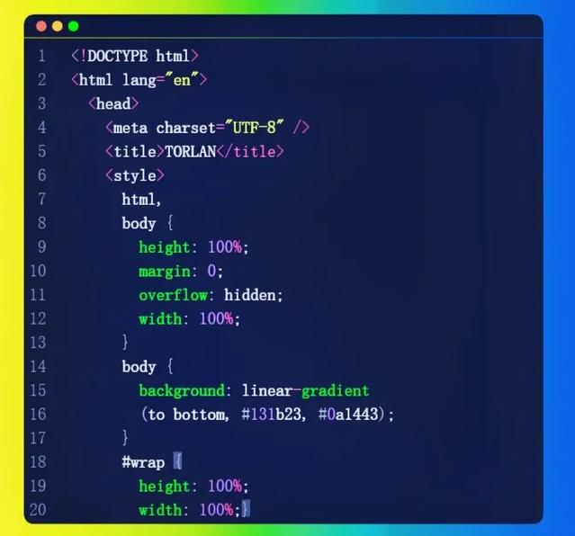
<!DOCTYPE html>
<html lang="zh-CN">
<head>
    <meta charset="UTF-8">
    <meta name="viewport" content="width=device-width, initial-scale=1.0">背景自适应缩放 - Cover方法</title>
    <style>
        /* 全局重置 */
        html, body {
            height: 100%;
            margin: 0;
            padding: 0;
            font-family: Arial, sans-serif;
        }
        /* 背景容器样式 */
        .background-container {
            /* 使用 cover 方法 */
            background-image: url('https://images.unsplash.com/photo-1506905925346-21bda4d32df4?q=80&w=2070&auto=format&fit=crop'); /* 使用一张示例图片 */
            background-size: cover;
            background-repeat: no-repeat;
            background-position: center center;
            background-attachment: fixed; /* 固定背景,视差效果 */
            /* 让容器撑满整个屏幕 */
            width: 100%;
            height: 100vh; /* 100vh = 100% of the viewport height */
            /* 为了让内容可见,需要一些半透明的覆盖层 */
            position: relative;
        }
        /* 内容层样式 */
        .content {
            position: relative; /* 相对于.background-container定位 */
            z-index: 1; /* 确保内容在背景之上 */
            /* 为了在纯色背景上也能看清文字,添加一个半透明遮罩 */
            background-color: rgba(0, 0, 0, 0.5);
            color: white;
            padding: 50px;
            text-align: center;
            border-radius: 10px;
            margin-top: 200px; /* 下推内容,使其居中 */
        }
        /* 为了确保内容可读,添加一些内边距 */
        .content p {
            max-width: 600px;
            margin: 20px auto;
            line-height: 1.6;
        }
    </style>
</head>
<body>
    <div class="background-container">
        <div class="content">
            <h1>欢迎来到我的网站</h1>
            <p>这个页面使用了 background-size: cover 属性来实现背景图片的自适应缩放,无论您如何调整浏览器窗口大小,背景图片都会始终覆盖整个屏幕。</p>
            <p>尝试调整浏览器窗口的大小,看看背景是如何自动适应的!</p>
        </div>
    </div>
</body>
</html>
background-size: cover 的工作原理:
浏览器会计算图片的宽高比和窗口的宽高比。
- 如果窗口比图片“更宽”(即窗口的宽高比大于图片的宽高比),浏览器会将图片的高度拉伸到100%,宽度按比例放大,然后裁剪掉左右两侧多余的部分。
- 如果窗口比图片“更高”(即窗口的宽高比小于图片的宽高比),浏览器会将图片的宽度拉伸到100%,高度按比例放大,然后裁剪掉上下两侧多余的部分。
使用 background-size: contain
contain 的行为与 cover 相反,它会将背景图片缩放至足够大,以使其完全包含在背景区域内,但可能会在背景区域的两侧或上下留出空白。
核心CSS代码
只需将 cover 改为 contain。
body {
  background-image: url('your-image-path.jpg');
  background-size: contain; /* 使用 contain */
  background-repeat: no-repeat;
  background-position: center center;
  height: 100%;
  margin: 0;
}
适用场景
当你需要完整显示背景图片,不希望任何部分被裁剪时,可以使用 contain,一个带有Logo的背景图,你希望整个Logo都能被看到。

(图片来源网络,侵删)
使用 <img> 标签 + object-fit: cover (更灵活)
这种方法不使用 background-image,而是将图片作为 <img> 标签直接放在HTML中,这种方法的优势在于图片可以被浏览器工具(如屏幕阅读器)识别,并且可以应用CSS滤镜等效果。
核心HTML/CSS代码
<div class="background-wrapper">
  <img src="your-image-path.jpg" alt="背景图片" class="background-img">
  <div class="content">
    <!-- 你的页面内容 -->
  </div>
</div>
html, body {
  height: 100%;
  margin: 0;
  padding: 0;
}
.background-wrapper {
  position: relative; /* 作为定位上下文 */
  width: 100%;
  height: 100%;
  overflow: hidden; /* 隐藏超出容器的图片部分 */
}
.background-img {
  /* 关键属性:让图片像背景一样填充 */
  position: absolute;
  top: 0;
  left: 0;
  width: 100%;
  height: 100%;
  object-fit: cover; /* 和 background-size: cover 效果一样 */
  z-index: -1; /* 将图片置于内容之下 */
}
.content {
  position: relative;
  z-index: 1;
  color: white;
  text-align: center;
  padding: 20px;
}
使用 vw 和 vh 单位 (JavaScript辅助)
这是一种更高级的技巧,可以让你对背景图片的尺寸有更精确的控制,比如确保图片始终完全可见(不裁剪)且不留白,这通常需要一点JavaScript来计算。
原理: 使用 vw (viewport width) 和 vh (viewport height) 单位来动态设置图片的宽高,使其始终大于或等于视口的尺寸。
示例代码
<!DOCTYPE html>
<html lang="zh-CN">
<head>
    <meta charset="UTF-8">vw/vh 背景自适应</title>
    <style>
        html, body {
            margin: 0;
            padding: 0;
            height: 100%;
            overflow: hidden; /* 防止出现滚动条 */
        }
        #background {
            position: fixed;
            top: 0;
            left: 0;
            z-index: -1;
        }
        #content {
            position: relative;
            z-index: 1;
            color: white;
            text-align: center;
            padding-top: 50px;
        }
    </style>
</head>
<body>
    <img id="background" src="https://images.unsplash.com/photo-1506905925346-21bda4d32df4?q=80&w=2070&auto=format&fit=crop" alt="自适应背景">
    <div id="content">
        <h1>使用 vw/vh 单位</h1>
        <p>这个例子使用JavaScript动态设置图片尺寸,确保背景始终覆盖整个视口。</p>
    </div>
    <script>
        function resizeBackground() {
            const img = document.getElementById('background');
            const windowWidth = window.innerWidth;
            const windowHeight = window.innerHeight;
            // 计算图片的原始宽高比
            const imgRatio = img.naturalWidth / img.naturalHeight;
            // 计算视口的宽高比
            const windowRatio = windowWidth / windowHeight;
            let newWidth, newHeight;
            if (windowRatio > imgRatio) {
                // 视口比图片宽,图片高度应设为100vh
                newHeight = windowHeight;
                newWidth = newHeight * imgRatio;
            } else {
                // 视口比图片高,图片宽度应设为100vw
                newWidth = windowWidth;
                newHeight = newWidth / imgRatio;
            }
            // 应用计算出的尺寸
            img.style.width = newWidth + 'px';
            img.style.height = newHeight + 'px';
            // 居中图片
            img.style.left = (windowWidth - newWidth) / 2 + 'px';
            img.style.top = (windowHeight - newHeight) / 2 + 'px';
        }
        // 页面加载和窗口大小改变时执行
        window.addEventListener('load', resizeBackground);
        window.addEventListener('resize', resizeBackground);
    </script>
</body>
</html>
总结与选择建议
| 方法 | 优点 | 缺点 | 适用场景 |
|---|---|---|---|
background-size: cover |
代码最简洁、性能最好、最标准 | 图片可能被裁剪 | 绝大多数情况下的首选,尤其是全屏背景。 |
background-size: contain |
图片完整显示,不被裁剪 | 可能在两侧或上下留白 | 需要完整显示Logo或特定图形背景时。 |
<img> + object-fit: cover |
灵活性高,可被浏览器识别,可加滤镜 | 结构稍复杂,需要额外元素 | 需要对图片进行CSS滤镜、动画等高级操作时。 |
vw/vh + JS |
精确控制,可确保不裁剪不留白 | 代码最复杂,依赖JS,有性能开销 | 对背景显示有特殊、复杂需求的定制化项目。 |
对于99%的网页背景自适应需求,强烈推荐使用方法一:background-size: cover,它简单、高效且是现代Web设计的标准实践。
(图片来源网络,侵删)


