示例1:最简单的单页结构
这个例子展示了HTML5的基本语义化标签和最基础的CSS样式。
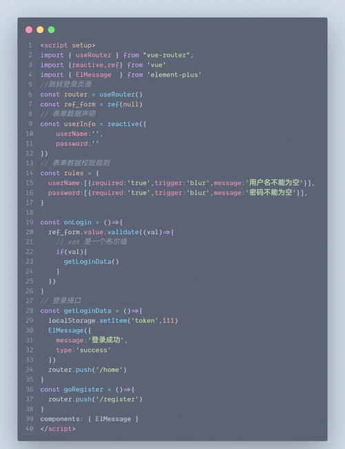
(图片来源网络,侵删)
index.html
<!DOCTYPE html>
<html lang="zh-CN">
<head>
<meta charset="UTF-8">
<meta name="viewport" content="width=device-width, initial-scale=1.0">我的第一个HTML5页面</title>
<link rel="stylesheet" href="style.css">
</head>
<body>
<header>
<h1>欢迎来到我的网站</h1>
<nav>
<ul>
<li><a href="#home">首页</a></li>
<li><a href="#about">lt;/a></li>
<li><a href="#contact">联系</a></li>
</ul>
</nav>
</header>
<main>
<section id="home">
<h2>这是首页部分</h2>
<p>这是一个使用HTML5语义化标签构建的简单页面。</p>
</section>
<section id="about">
<h2>关于我们</h2>
<p>我们是一个致力于创造美好网页体验的团队。</p>
</section>
</main>
<footer>
<p>© 2025 我的网站. 保留所有权利.</p>
</footer>
</body>
</html>
style.css
/* 全局样式 */
body {
    font-family: -apple-system, BlinkMacSystemFont, "Segoe UI", Roboto, Helvetica, Arial, sans-serif;
    margin: 0;
    background-color: #f4f4f4;
    color: #333;
    line-height: 1.6;
}
/* 头部样式 */
header {
    background: #333;
    color: #fff;
    padding: 1rem 0;
    text-align: center;
}
header h1 {
    margin: 0;
}
/* 导航栏样式 */
nav ul {
    list-style-type: none;
    padding: 0;
    margin: 0;
}
nav ul li {
    display: inline;
    margin: 0 15px;
}
nav a {
    color: #fff;
    text-decoration: none;
    font-weight: bold;
}
nav a:hover {
    text-decoration: underline;
}
区域样式 */
main {
    max-width: 800px;
    margin: 20px auto;
    padding: 20px;
    background: #fff;
    border-radius: 8px;
    box-shadow: 0 2px 5px rgba(0,0,0,0.1);
}
section {
    margin-bottom: 30px;
}
section h2 {
    border-bottom: 2px solid #eee;
    padding-bottom: 10px;
}
/* 页脚样式 */
footer {
    text-align: center;
    padding: 20px;
    margin-top: 20px;
    background: #333;
    color: #fff;
}
示例2:带Flexbox布局和CSS3动画的卡片
这个例子在上一个的基础上,增加了Flexbox布局(用于居中卡片)和CSS3动画(鼠标悬停效果)。
index.html
(与示例1的index.html相同,但内容可以修改为展示卡片)
<!DOCTYPE html>
<html lang="zh-CN">
<head>
<meta charset="UTF-8">
<meta name="viewport" content="width=device-width, initial-scale=1.0">卡片展示</title>
<link rel="stylesheet" href="style.css">
</head>
<body>
<header>
<h1>产品展示</h1>
</header>
<main>
<div class="card-container">
<div class="card">
<img src="https://via.placeholder.com/150" alt="产品图片">
<h3>产品一</h3>
<p>这是产品一的简要描述。</p>
</div>
<div class="card">
<img src="https://via.placeholder.com/150" alt="产品图片">
<h3>产品二</h3>
<p>这是产品二的简要描述。</p>
</div>
<div class="card">
<img src="https://via.placeholder.com/150" alt="产品图片">
<h3>产品三</h3>
<p>这是产品三的简要描述。</p>
</div>
</div>
</main>
<footer>
<p>© 2025 我的网站. 保留所有权利.</p>
</footer>
</body>
</html>
style.css
/* 全局样式 */
body {
    font-family: -apple-system, BlinkMacSystemFont, "Segoe UI", Roboto, Helvetica, Arial, sans-serif;
    margin: 0;
    background-color: #f0f2f5;
    color: #333;
}
/* 头部样式 */
header {
    background: #2c3e50;
    color: #fff;
    padding: 2rem 0;
    text-align: center;
}
区域 - 使用Flexbox */
main {
    padding: 2rem;
}
.card-container {
    display: flex;          /* 启用Flexbox布局 */
    justify-content: center; /* 水平居中 */
    flex-wrap: wrap;        /* 允许换行 */
    gap: 20px;              /* 卡片之间的间距 */
}
/* 卡片样式 */
.card {
    background: #fff;
    border-radius: 10px;
    box-shadow: 0 4px 8px rgba(0,0,0,0.1);
    width: 250px;
    padding: 20px;
    text-align: center;
    transition: transform 0.3s ease, box-shadow 0.3s ease; /* 添加过渡效果 */
}
/* 鼠标悬停时的动画效果 */
.card:hover {
    transform: translateY(-10px); /* 向上移动 */
    box-shadow: 0 8px 16px rgba(0,0,0,0.2); /* 阴影加深 */
}
.card img {
    max-width: 100%;
    border-radius: 5px;
    margin-bottom: 15px;
}
.card h3 {
    margin-top: 0;
    color: #2c3e50;
}
/* 页脚样式 */
footer {
    text-align: center;
    padding: 1.5rem;
    margin-top: 2rem;
    background: #2c3e50;
    color: #fff;
}
示例3:响应式导航栏
这个例子展示了一个在桌面端和移动端表现不同的导航栏,是现代网页的必备功能。
index.html
<!DOCTYPE html>
<html lang="zh-CN">
<head>
<meta charset="UTF-8">
<meta name="viewport" content="width=device-width, initial-scale=1.0">响应式导航栏</title>
<link rel="stylesheet" href="style.css">
</head>
<body>
<header>
<div class="logo">
<h1>Logo</h1>
</div>
<nav class="navbar">
<a href="#" class="nav-toggle" id="nav-toggle">☰</a>
<ul class="nav-links">
<li><a href="#">首页</a></li>
<li><a href="#">服务</a></li>
<li><a href="#">lt;/a></li>
<li><a href="#">联系</a></li>
</ul>
</nav>
</header>
<main>
<h2>响应式设计示例</h2>
<p>调整浏览器窗口大小,观察导航栏的变化。</p>
</main>
<footer>
<p>© 2025 我的网站. 保留所有权利.</p>
</footer>
<script>
const navToggle = document.getElementById('nav-toggle');
const navLinks = document.querySelector('.nav-links');
navToggle.addEventListener('click', () => {
// 切换 'active' 类来显示/隐藏导航链接
navLinks.classList.toggle('active');
});
</script>
</body>
</html>
style.css
/* 全局样式 */
body {
    font-family: Arial, sans-serif;
    margin: 0;
    background-color: #ecf0f1;
}
/* 头部样式 */
header {
    background: #34495e;
    color: #fff;
    padding: 1rem;
    display: flex;
    justify-content: space-between;
    align-items: center;
}
.logo h1 {
    margin: 0;
    font-size: 1.5rem;
}
/* 导航链接容器 */
.navbar {
    position: relative;
}
/* 桌面端导航链接样式 */
.nav-links {
    display: flex; /* 使用Flexbox水平排列 */
    list-style: none;
    padding: 0;
    margin: 0;
}
.nav-links li {
    margin-left: 20px;
}
.nav-links a {
    color: #fff;
    text-decoration: none;
    font-weight: bold;
}
.nav-links a:hover {
    text-decoration: underline;
}
/* 移动端切换按钮 */
.nav-toggle {
    display: none; /* 默认隐藏 */
    background: none;
    border: none;
    color: #fff;
    font-size: 1.5rem;
    cursor: pointer;
}
区域 */
main {
    padding: 2rem;
    text-align: center;
}
/* 页脚样式 */
footer {
    text-align: center;
    padding: 1rem;
    background: #2c3e50;
    color: #fff;
    margin-top: auto;
}
/* --- 响应式设计 --- */
/* 当屏幕宽度小于 600px 时 */
@media (max-width: 600px) {
    /* 显示切换按钮 */
    .nav-toggle {
        display: block;
    }
    /* 隐藏导航链接 */
    .nav-links {
        position: absolute;
        right: 0;
        top: 100%; /* 放在导航栏下方 */
        background: #34495e;
        flex-direction: column; /* 改为垂直排列 */
        width: 100%;
        max-height: 0; /* 初始高度为0,实现隐藏效果 */
        overflow: hidden; /* 隐藏溢出的内容 */
        transition: max-height 0.3s ease-in-out; /* 添加高度变化的过渡动画 */
    }
    /* 当 'active' 类被添加时,显示导航链接 */
    .nav-links.active {
        max-height: 300px; /* 设置一个足够大的高度 */
    }
    /* 调整导航链接在移动端的样式 */
    .nav-links li {
        margin: 10px 0;
        text-align: center;
        width: 100%;
    }
}
如何运行这些代码
- 创建文件:为每个示例创建一个文件夹,然后在文件夹内分别创建
index.html和style.css两个文件,并将对应的代码复制进去。 - 放置图片(示例2):如果你使用示例2,请确保有一张名为
placeholder.jpg的图片放在与style.css相同的目录下,或者直接使用在线占位图链接。 - 打开浏览器:直接用 Chrome、Firefox 或 Edge 等现代浏览器打开
index.html文件即可看到效果。 - 测试响应式:对于示例3,打开浏览器后,尝试调整浏览器窗口的大小,你会看到导航栏的布局会发生变化。
希望这些示例能帮助你理解HTML5和CSS3的基本用法!
(图片来源网络,侵删)
(图片来源网络,侵删)


