项目概述:大学生个人作品集网站
这个网页将包含以下几个核心部分:
(图片来源网络,侵删)
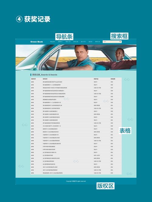
- 导航栏:固定在顶部,方便用户在不同部分间跳转。
- 首页/横幅:一个视觉冲击力强的欢迎区域,包含个人简介和“关于我”的按钮。
- 关于我:详细介绍个人背景、技能和兴趣爱好。
- 我的项目:展示参与过的项目,每个项目包含标题、描述、技术栈和链接。
- 联系方式:提供社交媒体链接和联系方式。
我们将使用现代、简洁的设计风格,并加入一些简单的动画效果,让页面更生动。
第一步:项目结构
创建一个项目文件夹,并在其中创建以下文件:
/my-portfolio
|-- index.html
|-- css/
|   |-- style.css
|-- js/
|   |-- script.js
|-- images/
|   |-- profile.jpg (你的个人照片)
|-- favicon.ico (可选的网站图标)
第二步:HTML 代码 (index.html)
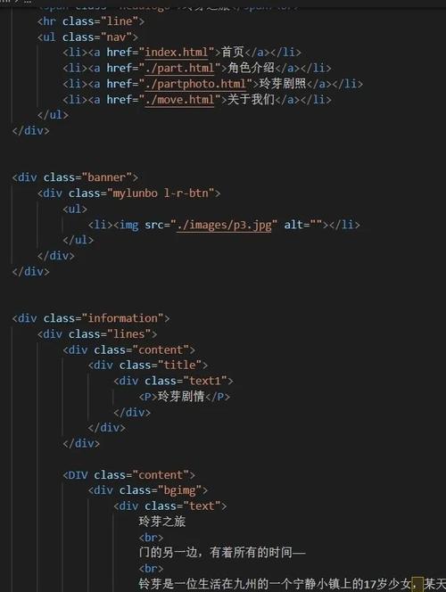
HTML是网页的骨架,我们将使用语义化的标签(如<header>, <nav>, <section>, <footer>)来构建页面结构,这有利于SEO和可访问性。
<!DOCTYPE html>
<html lang="zh-CN">
<head>
<meta charset="UTF-8">
<meta name="viewport" content="width=device-width, initial-scale=1.0">张三 - 个人作品集</title>
<link rel="stylesheet" href="css/style.css">
<!-- 引入字体图标库 (Font Awesome) -->
<link rel="stylesheet" href="https://cdnjs.cloudflare.com/ajax/libs/font-awesome/6.0.0-beta3/css/all.min.css">
</head>
<body>
<!-- 导航栏 -->
<header id="header">
<nav class="navbar">
<a href="#home" class="nav-link">首页</a>
<a href="#about" class="nav-link">关于我</a>
<a href="#projects" class="nav-link">我的项目</a>
<a href="#contact" class="nav-link">联系方式</a>
</nav>
</header>
<main>
<!-- 首页/横幅 -->
<section id="home" class="hero">
<div class="hero-content">
<h1>你好,我是 <span class="highlight">张三</span></h1>
<p>一名热爱编程与设计的大学生</p>
<a href="#about" class="cta-button">了解更多</a>
</div>
</section>
<!-- 关于我 -->
<section id="about" class="about">
<h2 class="section-title">关于我</h2>
<div class="about-content">
<img src="images/profile.jpg" alt="张三的个人照片" class="profile-img">
<div class="about-text">
<p>我是一名计算机科学与技术专业的大三学生,对前端开发和用户体验设计充满热情,我热衷于将复杂的问题转化为简单、优雅的解决方案。</p>
<h3>技能</h3>
<div class="skills">
<span>HTML5</span>
<span>CSS3</span>
<span>JavaScript</span>
<span>React</span>
<span>Python</span>
<span>Git</span>
</div>
</div>
</div>
</section>
<!-- 我的项目 -->
<section id="projects" class="projects">
<h2 class="section-title">我的项目</h2>
<div class="project-grid">
<!-- 项目卡片 1 -->
<div class="project-card">
<img src="https://via.placeholder.com/400x250" alt="在线图书商城项目截图" class="project-img">
<h3>在线图书商城</h3>
<p>一个基于React和Node.js的全栈电商网站,实现了用户注册、登录、商品浏览、购物车和订单管理等功能。</p>
<div class="project-tech">
<span>React</span>
<span>Node.js</span>
<span>MongoDB</span>
</div>
<a href="#" class="project-link">查看详情 <i class="fas fa-arrow-right"></i></a>
</div>
<!-- 项目卡片 2 -->
<div class="project-card">
<img src="https://via.placeholder.com/400x250" alt="任务管理应用项目截图" class="project-img">
<h3>任务管理应用</h3>
<p>一个简洁的待办事项(To-Do List)应用,支持任务的增删改查、分类和优先级设置,数据存储在本地。</p>
<div class="project-tech">
<span>Vue.js</span>
<span>LocalStorage</span>
</div>
<a href="#" class="project-link">查看详情 <i class="fas fa-arrow-right"></i></a>
</div>
<!-- 项目卡片 3 -->
<div class="project-card">
<img src="https://via.placeholder.com/400x250" alt="校园活动日历项目截图" class="project-img">
<h3>校园活动日历</h3>
<p>一个展示学校各类活动的日历平台,用户可以按时间、类别筛选活动,并一键添加到个人日程。</p>
<div class="project-tech">
<span>JavaScript</span>
<span>HTML/CSS</span>
<span>Google Calendar API</span>
</div>
<a href="#" class="project-link">查看详情 <i class="fas fa-arrow-right"></i></a>
</div>
</div>
</section>
<!-- 联系方式 -->
<section id="contact" class="contact">
<h2 class="section-title">联系我</h2>
<p>如果你对我的工作感兴趣,或者有任何问题,欢迎随时联系我!</p>
<div class="social-links">
<a href="mailto:zhangsan@example.com" target="_blank"><i class="fas fa-envelope"></i></a>
<a href="https://github.com/zhangsan" target="_blank"><i class="fab fa-github"></i></a>
<a href="https://linkedin.com/in/zhangsan" target="_blank"><i class="fab fa-linkedin-in"></i></a>
<a href="https://twitter.com/zhangsan" target="_blank"><i class="fab fa-twitter"></i></a>
</div>
</section>
</main>
<!-- 页脚 -->
<footer>
<p>© 2025 张三. All Rights Reserved.</p>
</footer>
<!-- 引入JavaScript文件 -->
<script src="js/script.js"></script>
</body>
</html>
第三步:CSS 代码 (css/style.css)
CSS负责网页的样式和布局,我们将使用Flexbox和Grid来实现响应式布局,并添加一些过渡和悬停效果。
(图片来源网络,侵删)
/* --- 全局样式 --- */
@import url('https://fonts.googleapis.com/css2?family=Poppins:wght@300;400;600;700&display=swap');
:root {
    --primary-color: #3498db;
    --secondary-color: #2c3e50;
    --text-color: #333;
    --light-bg: #ecf0f1;
    --white: #ffffff;
}
* {
    margin: 0;
    padding: 0;
    box-sizing: border-box;
}
html {
    scroll-behavior: smooth; /* 平滑滚动 */
}
body {
    font-family: 'Poppins', sans-serif;
    line-height: 1.6;
    color: var(--text-color);
    background-color: var(--white);
}
h1, h2, h3 {
    font-weight: 600;
    line-height: 1.2;
}
.section-title {
    text-align: center;
    font-size: 2.5rem;
    margin-bottom: 2rem;
    color: var(--secondary-color);
}
/* --- 导航栏 --- */
#header {
    position: fixed;
    top: 0;
    left: 0;
    width: 100%;
    background-color: rgba(255, 255, 255, 0.95);
    box-shadow: 0 2px 10px rgba(0, 0, 0, 0.1);
    z-index: 1000;
    transition: background-color 0.3s ease;
}
.navbar {
    display: flex;
    justify-content: center;
    align-items: center;
    padding: 1rem 5%;
}
.nav-link {
    color: var(--secondary-color);
    text-decoration: none;
    margin: 0 1.5rem;
    font-weight: 500;
    transition: color 0.3s ease;
}
.nav-link:hover, .nav-link.active {
    color: var(--primary-color);
}
/* --- 首页/横幅 --- */
.hero {
    height: 100vh;
    display: flex;
    justify-content: center;
    align-items: center;
    text-align: center;
    background: linear-gradient(rgba(0, 0, 0, 0.5), rgba(0, 0, 0, 0.5)), url('https://source.unsplash.com/random/1600x900/?tech,code') no-repeat center center/cover;
    color: var(--white);
    padding-top: 60px; /* 为固定导航栏留出空间 */
}
.hero-content h1 {
    font-size: 3.5rem;
    margin-bottom: 1rem;
}
.highlight {
    color: var(--primary-color);
    font-weight: 700;
}
.cta-button {
    display: inline-block;
    background-color: var(--primary-color);
    color: var(--white);
    padding: 12px 30px;
    border-radius: 50px;
    text-decoration: none;
    font-weight: 600;
    margin-top: 1.5rem;
    transition: background-color 0.3s ease, transform 0.3s ease;
}
.cta-button:hover {
    background-color: #2980b9;
    transform: translateY(-3px);
}
/* --- 关于我 --- */
.about {
    padding: 80px 5%;
    background-color: var(--light-bg);
}
.about-content {
    display: flex;
    align-items: center;
    justify-content: space-around;
    max-width: 1200px;
    margin: 0 auto;
    flex-wrap: wrap; /* 在小屏幕上换行 */
}
.profile-img {
    width: 300px;
    height: 300px;
    border-radius: 50%;
    object-fit: cover;
    margin-right: 2rem;
    box-shadow: 0 10px 30px rgba(0, 0, 0, 0.1);
}
.about-text {
    flex: 1;
    max-width: 600px;
}
.skills {
    display: flex;
    flex-wrap: wrap;
    gap: 10px;
    margin-top: 1rem;
}
.skills span {
    background-color: var(--primary-color);
    color: var(--white);
    padding: 5px 15px;
    border-radius: 20px;
    font-size: 0.9rem;
}
/* --- 我的项目 --- */
.projects {
    padding: 80px 5%;
    text-align: center;
}
.project-grid {
    display: grid;
    grid-template-columns: repeat(auto-fit, minmax(320px, 1fr));
    gap: 2rem;
    max-width: 1200px;
    margin: 0 auto;
}
.project-card {
    background-color: var(--white);
    border-radius: 10px;
    box-shadow: 0 5px 15px rgba(0, 0, 0, 0.1);
    overflow: hidden;
    transition: transform 0.3s ease, box-shadow 0.3s ease;
}
.project-card:hover {
    transform: translateY(-10px);
    box-shadow: 0 15px 30px rgba(0, 0, 0, 0.15);
}
.project-img {
    width: 100%;
    height: 200px;
    object-fit: cover;
}
.project-card h3 {
    padding: 1rem;
    margin: 0;
    color: var(--secondary-color);
}
.project-card p {
    padding: 0 1rem;
    color: #777;
}
.project-tech {
    padding: 0 1rem;
    margin-top: 1rem;
}
.project-tech span {
    background-color: #e0e0e0;
    color: var(--secondary-color);
    padding: 3px 10px;
    border-radius: 15px;
    font-size: 0.8rem;
    margin-right: 5px;
}
.project-link {
    display: block;
    text-align: center;
    padding: 1rem;
    text-decoration: none;
    color: var(--primary-color);
    font-weight: 600;
    transition: background-color 0.3s ease;
}
.project-link:hover {
    background-color: var(--light-bg);
}
/* --- 联系方式 --- */
.contact {
    padding: 80px 5%;
    background-color: var(--light-bg);
    text-align: center;
}
.social-links {
    margin-top: 2rem;
}
.social-links a {
    display: inline-block;
    color: var(--secondary-color);
    font-size: 1.5rem;
    margin: 0 1rem;
    transition: color 0.3s ease, transform 0.3s ease;
}
.social-links a:hover {
    color: var(--primary-color);
    transform: translateY(-5px);
}
/* --- 页脚 --- */
footer {
    text-align: center;
    padding: 20px;
    background-color: var(--secondary-color);
    color: var(--white);
}
/* --- 响应式设计 --- */
@media (max-width: 768px) {
    .navbar {
        flex-direction: column;
        padding: 1rem;
    }
    .nav-link {
        margin: 5px 0;
    }
    .hero-content h1 {
        font-size: 2.5rem;
    }
    .about-content {
        flex-direction: column;
        text-align: center;
    }
    .profile-img {
        margin-right: 0;
        margin-bottom: 2rem;
    }
}
第四步:JavaScript 代码 (js/script.js)
JavaScript用于增加页面的交互性,在这个案例中,我们将实现一个简单的高亮当前导航项的功能,当用户滚动到页面不同部分时,对应的导航链接会高亮显示。
// 等待整个文档加载完成
document.addEventListener('DOMContentLoaded', () => {
    // 获取所有导航链接
    const navLinks = document.querySelectorAll('.nav-link');
    // 获取所有需要监听的section
    const sections = document.querySelectorAll('section');
    // 滚动事件监听器
    window.addEventListener('scroll', () => {
        let current = '';
        // 遍历所有section,找到当前在视口中的section
        sections.forEach(section => {
            const sectionTop = section.offsetTop;
            const sectionHeight = section.clientHeight;
            if (scrollY >= (sectionTop - 200)) {
                current = section.getAttribute('id');
            }
        });
        // 更新导航链接的active类
        navLinks.forEach(link => {
            link.classList.remove('active');
            if (link.getAttribute('href').slice(1) === current) {
                link.classList.add('active');
            }
        });
    });
    // (可选) 点击导航链接后,可以平滑滚动到对应部分
    // 这里的HTML已经通过 `scroll-behavior: smooth;` 实现了
    // 如果想用JS实现,可以取消下面的注释
    /*
    navLinks.forEach(link => {
        link.addEventListener('click', (e) => {
            e.preventDefault();
            const targetId = link.getAttribute('href').slice(1);
            const targetSection = document.getElementById(targetId);
            if (targetSection) {
                targetSection.scrollIntoView({ behavior: 'smooth' });
            }
        });
    });
    */
});
如何运行和使用
- 保存文件:将上述代码分别保存到对应的文件中。
- 准备图片:在
images文件夹中放入一张名为profile.jpg的个人照片,项目中的项目截图使用了via.placeholder.com,这是一个在线占位图服务,你可以替换成你自己的项目截图。 - 打开网页:直接用浏览器打开
index.html文件,你就可以看到你的个人作品集网站了。
如何进阶和扩展
这个案例是一个很好的起点,你可以在此基础上进行很多扩展:
- 增加动画效果:使用 AOS (Animate On Scroll) 库或 GSAP 库,让元素在滚动时以动画形式出现。
- 添加表单:在“联系我”部分添加一个联系表单,将表单数据发送到你的邮箱(需要后端支持)。
- 博客功能:添加一个博客页面,分享你的学习心得和技术文章。
- 暗黑模式:使用CSS变量和JavaScript,为网站添加一个切换暗黑/明亮模式的功能。
- 部署上线:学习使用 GitHub Pages、Vercel 或 Netlify 等免费平台,将你的网站部署到互联网上,分享给更多人。
希望这个详细的案例能帮助你!祝你学习愉快!
(图片来源网络,侵删)


