- 基础 HTML 结构
- 基础 CSS 样式
- 添加悬停效果
- 响应式设计
- 完整代码示例
最终效果预览
在我们开始之前,先看看我们最终要实现的效果:
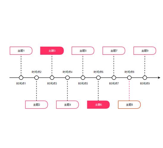
(图片来源网络,侵删)
- 垂直排列的时间线。
- 时间线左侧是事件内容,右侧是日期。
- 中间有一条垂直线连接所有事件。
- 鼠标悬停在事件上时,会有高亮和动画效果。
- 在小屏幕上,事件会堆叠显示,时间轴变为单列布局。
基础 HTML 结构
我们需要构建时间轴的骨架,HTML 结构非常清晰,我们使用一个容器 div 包裹所有的时间轴项目,每个项目都是一个 div,里面包含事件内容、日期和连接点。
<!DOCTYPE html>
<html lang="zh-CN">
<head>
    <meta charset="UTF-8">
    <meta name="viewport" content="width=device-width, initial-scale=1.0">CSS 垂直时间轴</title>
    <link rel="stylesheet" href="style.css">
</head>
<body>
    <div class="timeline-container">
        <!-- 时间轴项目 1 -->
        <div class="timeline-item">
            <div class="timeline-content">
                <h3>项目启动</h3>
                <p>这是项目启动阶段的详细描述,我们组建了团队,明确了项目目标和范围。</p>
            </div>
            <div class="timeline-date">2025年1月</div>
        </div>
        <!-- 时间轴项目 2 -->
        <div class="timeline-item">
            <div class="timeline-content">
                <h3>设计阶段</h3>
                <p>完成了 UI/UX 设计,并与客户确认了最终的设计稿,包括线框图和高保真原型。</p>
            </div>
            <div class="timeline-date">2025年3月</div>
        </div>
        <!-- 时间轴项目 3 -->
        <div class="timeline-item">
            <div class="timeline-content">
                <h3>开发阶段</h3>
                <p>前端和后端团队开始并行开发,我们采用了敏捷开发模式,每两周进行一次迭代。</p>
            </div>
            <div class="timeline-date">2025年5月</div>
        </div>
        <!-- 时间轴项目 4 -->
        <div class="timeline-item">
            <div class="timeline-content">
                <h3>项目上线</h3>
                <p>经过多轮测试和修复,项目终于成功上线!感谢所有团队成员的辛勤付出。</p>
            </div>
            <div class="timeline-date">2025年8月</div>
        </div>
    </div>
</body>
</html>
结构解析:
.timeline-container: 整个时间轴的包裹器,用于设置宽度和居中。.timeline-item: 每一个独立的时间轴事件。.timeline-content: 事件的具体内容(标题、描述等)。.timeline-date: 事件的日期。
基础 CSS 样式
我们来为这个骨架添加样式,让它看起来像一个时间轴,创建一个 style.css 文件,并添加以下 CSS 代码。
/* style.css */
/* --- 全局和容器样式 --- */
body {
    font-family: 'Arial', sans-serif;
    background-color: #f4f4f4;
    color: #333;
    margin: 0;
    padding: 20px;
}
.timeline-container {
    max-width: 800px;
    margin: 50px auto;
    padding: 20px;
    position: relative; /* 为伪元素定位提供参考 */
}
/* --- 时间轴项目样式 --- */
.timeline-item {
    position: relative; /* 为内部绝对定位元素提供参考 */
    padding-left: 40px; /* 为左侧内容留出空间 */
    margin-bottom: 30px;
    border-left: 2px solid #ccc; /* 这是时间轴的主线 */
}
/* --- 时间轴连接点 --- */
.timeline-item::before {
    content: '';
    position: absolute;
    top: 5px; /* 调整垂直位置,使其在内容中间 */
    left: -9px; /* 调整水平位置,使其在边线上 */
    width: 16px;
    height: 16px;
    background-color: #fff;
    border: 2px solid #007bff; /* 连接点的颜色和边框 */
    border-radius: 50%; /* 将其变成圆形 */
    z-index: 1; /* 确保它在边线之上 */
}
/* --- 内容和日期样式 --- */
.timeline-content {
    background-color: #fff;
    padding: 20px;
    border-radius: 8px;
    box-shadow: 0 3px 10px rgba(0,0,0,0.1);
    transition: transform 0.3s ease, box-shadow 0.3s ease;
}
.timeline-date {
    position: absolute; /* 绝对定位,使其脱离文档流 */
    top: 5px; /* 与连接点对齐 */
    right: 0; /* 靠右对齐 */
    background-color: #007bff;
    color: #fff;
    padding: 5px 15px;
    border-radius: 20px;
    font-size: 0.9em;
    font-weight: bold;
}
样式解析:
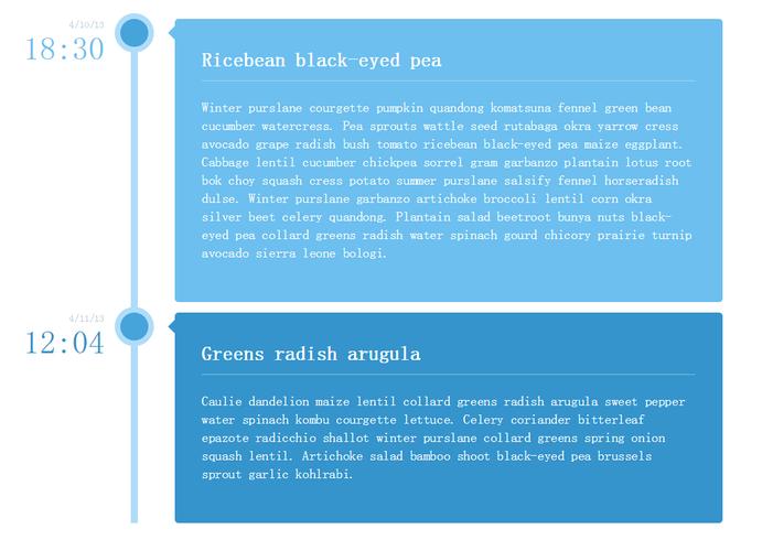
(图片来源网络,侵删)
.timeline-item: 我们给它添加了一个border-left,这构成了时间轴的垂直主线。position: relative是关键,因为它内部的.timeline-date和:before伪元素会相对于它进行定位。.timeline-item::before: 这是创建连接点的“魔法”所在。content: '': 伪元素必须有content属性才能显示。position: absolute: 让它相对于.timeline-item定位。left: -9px; top: 5px: 将其精确地定位在垂直边线的左侧,并与内容顶部对齐。border-radius: 50%: 将一个正方形元素变成圆形。
.timeline-date: 使用position: absolute将其从正常的文档流中“拉”出来,然后通过top和right属性将其固定在时间轴的右上角。.timeline-content: 添加了背景、内边距、圆角和阴影,使其看起来像一个卡片。
添加悬停效果
一个没有交互的时间轴是乏味的,让我们为 .timeline-item 添加悬停效果,当用户将鼠标移到某个事件上时,该事件会放大并显示更明显的阴影。
在 style.css 中添加以下 CSS 规则:
/* 添加到 style.css 的末尾 */
/* --- 悬停效果 --- */
.timeline-item:hover .timeline-content {
    transform: scale(1.03);
    box-shadow: 0 5px 20px rgba(0,0,0,0.15);
}
.timeline-item:hover::before {
    background-color: #007bff; /* 悬停时,连接点颜色与边框一致 */
    border-color: #0056b3; /* 加深边框颜色 */
}
效果解析:
hover伪类用于定义鼠标悬停时的样式。transform: scale(1.03): 将内容卡片轻微放大1.03倍。box-shadow: 增加阴影的模糊程度和扩散范围,使其看起来更“浮”起来。- 连接点的背景色也改变了,与边框色融合,形成一个实心圆点,增强了视觉反馈。
响应式设计
为了让时间轴在手机等小屏幕设备上也能良好显示,我们需要使用媒体查询,当屏幕宽度变小时,我们将时间轴从左右布局切换为上下布局。
(图片来源网络,侵删)
在 style.css 的末尾添加以下代码:
/* 添加到 style.css 的末尾 */
/* --- 响应式设计 --- */
@media screen and (max-width: 768px) {
    .timeline-container {
        max-width: 95%; /* 在小屏幕上占据更多宽度 */
        padding: 10px;
    }
    .timeline-item {
        padding-left: 20px; /* 减少左侧内边距 */
        margin-bottom: 20px;
    }
    .timeline-date {
        position: static; /* 取消绝对定位,让它回到文档流中 */
        display: block; /* 让它独占一行 */
        text-align: center; /* 文字居中 */
        margin-top: 10px; /* 与内容卡片拉开一点距离 */
    }
}
响应式解析:
@media screen and (max-width: 768px): 当浏览器窗口宽度小于或等于768像素时,应用此块内的样式。.timeline-date { position: static; }: 这是最关键的一步。static会取消绝对定位,让日期回到它原来的位置(内容下方)。display: block;: 让日期元素成为一个块级元素,自动换行并占据整行宽度。text-align: center;: 让日期文字居中显示,看起来更整洁。
完整代码示例
以下是 index.html 和 style.css 的完整代码,您可以直接复制使用。
index.html
<!DOCTYPE html>
<html lang="zh-CN">
<head>
    <meta charset="UTF-8">
    <meta name="viewport" content="width=device-width, initial-scale=1.0">CSS 垂直时间轴</title>
    <link rel="stylesheet" href="style.css">
</head>
<body>
    <h1 style="text-align: center;">项目发展时间轴</h1>
    <div class="timeline-container">
        <div class="timeline-item">
            <div class="timeline-content">
                <h3>项目启动</h3>
                <p>这是项目启动阶段的详细描述,我们组建了团队,明确了项目目标和范围。</p>
            </div>
            <div class="timeline-date">2025年1月</div>
        </div>
        <div class="timeline-item">
            <div class="timeline-content">
                <h3>设计阶段</h3>
                <p>完成了 UI/UX 设计,并与客户确认了最终的设计稿,包括线框图和高保真原型。</p>
            </div>
            <div class="timeline-date">2025年3月</div>
        </div>
        <div class="timeline-item">
            <div class="timeline-content">
                <h3>开发阶段</h3>
                <p>前端和后端团队开始并行开发,我们采用了敏捷开发模式,每两周进行一次迭代。</p>
            </div>
            <div class="timeline-date">2025年5月</div>
        </div>
        <div class="timeline-item">
            <div class="timeline-content">
                <h3>项目上线</h3>
                <p>经过多轮测试和修复,项目终于成功上线!感谢所有团队成员的辛勤付出。</p>
            </div>
            <div class="timeline-date">2025年8月</div>
        </div>
    </div>
</body>
</html>
style.css
/* --- 全局和容器样式 --- */
body {
    font-family: 'Arial', sans-serif;
    background-color: #f4f4f4;
    color: #333;
    margin: 0;
    padding: 20px;
}
.timeline-container {
    max-width: 800px;
    margin: 50px auto;
    padding: 20px;
    position: relative;
}
/* --- 时间轴项目样式 --- */
.timeline-item {
    position: relative;
    padding-left: 40px;
    margin-bottom: 30px;
    border-left: 2px solid #ccc;
}
/* --- 时间轴连接点 --- */
.timeline-item::before {
    content: '';
    position: absolute;
    top: 5px;
    left: -9px;
    width: 16px;
    height: 16px;
    background-color: #fff;
    border: 2px solid #007bff;
    border-radius: 50%;
    z-index: 1;
}
/* --- 内容和日期样式 --- */
.timeline-content {
    background-color: #fff;
    padding: 20px;
    border-radius: 8px;
    box-shadow: 0 3px 10px rgba(0,0,0,0.1);
    transition: transform 0.3s ease, box-shadow 0.3s ease;
}
.timeline-date {
    position: absolute;
    top: 5px;
    right: 0;
    background-color: #007bff;
    color: #fff;
    padding: 5px 15px;
    border-radius: 20px;
    font-size: 0.9em;
    font-weight: bold;
}
/* --- 悬停效果 --- */
.timeline-item:hover .timeline-content {
    transform: scale(1.03);
    box-shadow: 0 5px 20px rgba(0,0,0,0.15);
}
.timeline-item:hover::before {
    background-color: #007bff;
    border-color: #0056b3;
}
/* --- 响应式设计 --- */
@media screen and (max-width: 768px) {
    .timeline-container {
        max-width: 95%;
        padding: 10px;
    }
    .timeline-item {
        padding-left: 20px;
        margin-bottom: 20px;
    }
    .timeline-date {
        position: static;
        display: block;
        text-align: center;
        margin-top: 10px;
    }
}
总结与扩展
恭喜!您已经成功使用纯 CSS 创建了一个功能完善、美观且响应式的垂直时间轴。
关键点回顾:
- 结构清晰: 使用语义化的 HTML 标签构建层级结构。
- CSS 定位:
position: relative和position: absolute是实现时间轴布局的核心。 - 伪元素:
:before用于创建连接点,无需额外的 HTML 标签。 - 交互与响应: 通过
hover和@media查询,可以极大地提升用户体验。
如何扩展这个时间轴?
- 改变方向: 将
border-left改为border-right,并调整left和right的值,即可创建一个右侧时间轴。 - 添加图标: 在
:before中使用background-image或者在 HTML 中添加<i>标签,可以为连接点或内容添加图标。 - 不同样式: 尝试使用虚线 (
border-style: dashed) 或点线 (border-style: dotted) 作为时间轴主线。 - 多列布局: 对于非常多的项目,可以考虑使用 CSS Grid 或 Flexbox 创建多列时间轴布局。


