使用 HTML 制作好看的动态背景是一个非常棒的主意,它能极大地提升网页的视觉吸引力和用户体验,下面我将从简单到复杂,为你介绍几种主流且效果出色的方法,并提供详细的代码示例。
(图片来源网络,侵删)
纯 CSS 动态背景 (最简单、性能最好)
这种方法不依赖 JavaScript,通过 CSS3 的动画和渐变就能实现很多酷炫的效果,是首选方案。
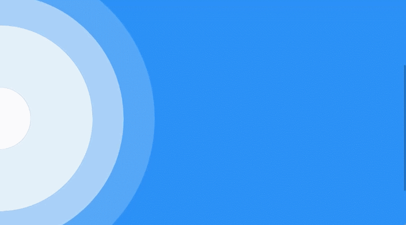
渐变背景动画
通过改变 background-position 或 background-size 来让静态渐变动起来。
效果: 流动的彩色渐变,非常现代和时尚。
<!DOCTYPE html>
<html lang="zh-CN">
<head>
    <meta charset="UTF-8">
    <meta name="viewport" content="width=device-width, initial-scale=1.0">CSS 渐变动态背景</title>
    <style>
        * {
            margin: 0;
            padding: 0;
            box-sizing: border-box;
        }
        body {
            /* 使用大尺寸的背景,以便移动 */
            background: linear-gradient(-45deg, #ee7752, #e73c7e, #23a6d5, #23d5ab);
            background-size: 400% 400%;
            /* 设置背景尺寸为视窗大小 */
            height: 100vh;
            /* 让背景居中 */
            display: flex;
            justify-content: center;
            align-items: center;
            font-family: Arial, sans-serif;
            color: white;
            text-align: center;
        }
        /* 核心动画:改变背景位置 */
        @keyframes gradientBG {
            0% {
                background-position: 0% 50%;
            }
            50% {
                background-position: 100% 50%;
            }
            100% {
                background-position: 0% 50%;
            }
        }
        /* 将动画应用到 body */
        body {
            animation: gradientBG 15s ease infinite;
        }
        .content {
            background-color: rgba(0, 0, 0, 0.3);
            padding: 2rem 3rem;
            border-radius: 10px;
            backdrop-filter: blur(5px); /* 毛玻璃效果 */
        }
    </style>
</head>
<body>
    <div class="content">
        <h1>欢迎来到我的网站</h1>
        <p>这是一个使用纯 CSS 实现的动态渐变背景。</p>
    </div>
</body>
</html>
代码解析:
(图片来源网络,侵删)
background: linear-gradient(...)定义了一个由四种颜色组成的对角线渐变。background-size: 400% 400%将背景尺寸放大到原来的4倍,这样我们才有足够的空间来移动它,从而产生流动效果。@keyframes gradientBG定义了一个名为gradientBG的动画,它会改变background-position的值。animation: gradientBG 15s ease infinite将这个动画应用到body上,持续15秒,使用ease缓动函数,并且无限循环 (infinite)。
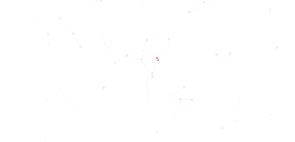
粒子/浮动点背景
使用多个绝对定位的小圆点,并让它们以不同的速度和轨迹移动,营造出漂浮的星空或尘埃效果。
<!DOCTYPE html>
<html lang="zh-CN">
<head>
    <meta charset="UTF-8">
    <meta name="viewport" content="width=device-width, initial-scale=1.0">CSS 粒子背景</title>
    <style>
        body {
            margin: 0;
            height: 100vh;
            background-color: #0f0f23; /* 深色背景 */
            overflow: hidden; /* 隐藏超出视窗的部分 */
            display: flex;
            justify-content: center;
            align-items: center;
            font-family: Arial, sans-serif;
            color: white;
        }
        .content {
            z-index: 10; /* 确保内容在粒子之上 */
            text-align: center;
        }
        /* 粒子容器 */
        .particles {
            position: absolute;
            width: 100%;
            height: 100%;
        }
        /* 单个粒子 */
        .particle {
            position: absolute;
            background-color: rgba(255, 255, 255, 0.5);
            border-radius: 50%;
            animation: float linear infinite;
        }
        /* 定义不同大小的粒子 */
        .particle:nth-child(1) { width: 5px; height: 5px; left: 10%; animation-duration: 8s; }
        .particle:nth-child(2) { width: 3px; height: 3px; left: 20%; animation-duration: 15s; }
        .particle:nth-child(3) { width: 7px; height: 7px; left: 30%; animation-duration: 12s; }
        .particle:nth-child(4) { width: 4px; height: 4px; left: 40%; animation-duration: 20s; }
        .particle:nth-child(5) { width: 6px; height: 6px; left: 50%; animation-duration: 10s; }
        .particle:nth-child(6) { width: 2px; height: 2px; left: 60%; animation-duration: 18s; }
        .particle:nth-child(7) { width: 8px; height: 8px; left: 70%; animation-duration: 14s; }
        .particle:nth-child(8) { width: 5px; height: 5px; left: 80%; animation-duration: 9s; }
        .particle:nth-child(9) { width: 4px; height: 4px; left: 90%; animation-duration: 16s; }
        .particle:nth-child(10) { width: 6px; height: 6px; left: 5%; animation-duration: 11s; }
        /* 粒子向上漂浮的动画 */
        @keyframes float {
            from {
                transform: translateY(100vh) rotate(0deg);
                opacity: 1;
            }
            to {
                transform: translateY(-100px) rotate(720deg);
                opacity: 0;
            }
        }
    </style>
</head>
<body>
    <div class="particles">
        <div class="particle"></div>
        <div class="particle"></div>
        <div class="particle"></div>
        <div class="particle"></div>
        <div class="particle"></div>
        <div class="particle"></div>
        <div class="particle"></div>
        <div class="particle"></div>
        <div class="particle"></div>
        <div class="particle"></div>
    </div>
    <div class="content">
        <h1>星空下的网站</h1>
        <p>粒子正在缓缓飘向天空...</p>
    </div>
</body>
</html>
代码解析:
.particles是一个全屏的容器,用于放置所有粒子。.particle是单个粒子的样式,设置为绝对定位,圆形,半透明白色。nth-child(n)选择器用来创建不同大小和位置的粒子,并为它们设置不同的动画持续时间 (animation-duration),这样看起来更自然。@keyframes float定义了粒子从屏幕底部 (100vh) 移动到屏幕顶部 (-100px) 的动画,同时伴随旋转和透明度变化。
Canvas 动态背景 (功能强大、性能可控)
Canvas 可以绘制复杂的图形和动画,非常适合制作粒子系统、波浪、连线等效果。
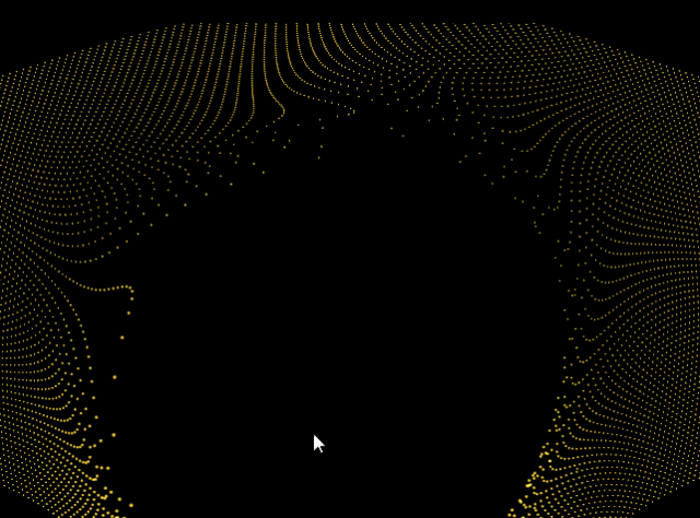
Canvas 粒子连线效果
这是非常流行的一种背景效果,粒子在屏幕上移动,当它们靠近时会用线连接起来。
(图片来源网络,侵删)
<!DOCTYPE html>
<html lang="zh-CN">
<head>
    <meta charset="UTF-8">
    <meta name="viewport" content="width=device-width, initial-scale=1.0">Canvas 粒子连线背景</title>
    <style>
        body {
            margin: 0;
            overflow: hidden;
            background-color: #111;
        }
        canvas {
            display: block;
        }
    </style>
</head>
<body>
    <canvas id="myCanvas"></canvas>
    <script>
        const canvas = document.getElementById('myCanvas');
        const ctx = canvas.getContext('2d');
        // 设置 canvas 尺寸为窗口大小
        function resizeCanvas() {
            canvas.width = window.innerWidth;
            canvas.height = window.innerHeight;
        }
        resizeCanvas();
        window.addEventListener('resize', resizeCanvas);
        // 粒子类
        class Particle {
            constructor() {
                this.x = Math.random() * canvas.width;
                this.y = Math.random() * canvas.height;
                this.size = Math.random() * 2 + 1;
                this.speedX = Math.random() * 3 - 1.5;
                this.speedY = Math.random() * 3 - 1.5;
            }
            update() {
                this.x += this.speedX;
                this.y += this.speedY;
                // 边界检测
                if (this.x > canvas.width || this.x < 0) this.speedX = -this.speedX;
                if (this.y > canvas.height || this.y < 0) this.speedY = -this.speedY;
            }
            draw() {
                ctx.fillStyle = 'white';
                ctx.beginPath();
                ctx.arc(this.x, this.y, this.size, 0, Math.PI * 2);
                ctx.fill();
            }
        }
        // 创建粒子数组
        const particlesArray = [];
        const numberOfParticles = 100;
        for (let i = 0; i < numberOfParticles; i++) {
            particlesArray.push(new Particle());
        }
        // 连接粒子
        function connect() {
            for (let a = 0; a < particlesArray.length; a++) {
                for (let b = a; b < particlesArray.length; b++) {
                    const distance = Math.sqrt(
                        Math.pow(particlesArray[a].x - particlesArray[b].x, 2) +
                        Math.pow(particlesArray[a].y - particlesArray[b].y, 2)
                    );
                    if (distance < 100) {
                        ctx.strokeStyle = `rgba(255, 255, 255, ${1 - distance / 100})`;
                        ctx.lineWidth = 0.5;
                        ctx.beginPath();
                        ctx.moveTo(particlesArray[a].x, particlesArray[a].y);
                        ctx.lineTo(particlesArray[b].x, particlesArray[b].y);
                        ctx.stroke();
                    }
                }
            }
        }
        // 动画循环
        function animate() {
            ctx.clearRect(0, 0, canvas.width, canvas.height);
            for (let i = 0; i < particlesArray.length; i++) {
                particlesArray[i].update();
                particlesArray[i].draw();
            }
            connect();
            requestAnimationFrame(animate);
        }
        animate();
    </script>
</body>
</html>
代码解析:
- Canvas 设置:获取
canvas元素,并设置其宽高为窗口大小,并监听resize事件。 - Particle 类:封装了粒子的属性(位置、大小、速度)和行为(更新位置、绘制自身)。
- 粒子数组:创建多个粒子实例并存入数组。
connect函数:遍历所有粒子,计算它们之间的距离,如果距离小于某个值(如100像素),就在它们之间画一条线,线的透明度根据距离动态变化。animate函数:这是动画的核心,它每一帧都执行以下操作:- 清空画布 (
clearRect)。 - 更新并绘制所有粒子。
- 调用
connect函数来绘制连线。 - 使用
requestAnimationFrame调用自身,形成无限循环,实现流畅的动画。
- 清空画布 (
使用 GIF 或视频背景 (最简单、但灵活性差)
如果你有现成的素材,这是最快的方法。
效果: 播放一段循环的动态背景图或视频。
<!DOCTYPE html>
<html lang="zh-CN">
<head>
    <meta charset="UTF-8">GIF/视频背景</title>
    <style>
        body, html {
            margin: 0;
            padding: 0;
            height: 100%;
            overflow: hidden;
        }
        /* 使用视频作为背景 */
        #video-background {
            position: fixed;
            right: 0;
            bottom: 0;
            min-width: 100%;
            min-height: 100%;
            width: auto;
            height: auto;
            z-index: -1; /* 确保在内容下方 */
            background-size: cover;
        }
        /* 使用 GIF 作为背景 */
        /* body {
            background: url('your-awesome-animation.gif') no-repeat center center fixed;
            background-size: cover;
        } */
        .content {
            position: relative;
            z-index: 1;
            color: white;
            text-align: center;
            padding-top: 20vh;
        }
    </style>
</head>
<body>
    <!-- 视频 (请替换成你自己的视频文件) -->
    <video autoplay muted loop id="video-background">
        <source src="path/to/your/video.mp4" type="video/mp4">
        <!-- 可以添加多种格式的源以兼容不同浏览器 -->
        <source src="path/to/your/video.webm" type="video/webm">
        您的浏览器不支持 HTML5 视频。
    </video>
    <!-- GIF 只需将上面的 video 标签替换掉,并取消 body 注释即可 -->
    <div class="content">
        <h1>视频/GIF 背景示例</h1>
        <p>内容会显示在动态背景之上。</p>
    </div>
</body>
</html>
优缺点:
- 优点:实现最简单,只需要一个文件。
- 缺点:文件体积通常很大,影响页面加载速度;动画内容固定,无法与用户交互;性能可能不如 CSS 或 Canvas。
总结与建议
| 方法 | 优点 | 缺点 | 适用场景 |
|---|---|---|---|
| 纯 CSS | 性能最佳,代码简单,不依赖 JS,易于维护。 | 动画效果相对简单,实现复杂图形困难。 | 简单的渐变、浮动、旋转等效果,追求高性能和简洁。 |
| Canvas | 功能最强大,可创建极其复杂和交互式的动画,性能可控。 | 需要编写 JavaScript,代码量较大,对性能有一定要求(需优化)。 | 粒子系统、波浪、连线、物理模拟等复杂动态效果。 |
| GIF/视频 | 实现最简单,直接使用现成素材。 | 文件体积大,加载慢,灵活性差,无法交互。 | 快速原型设计,或有特定高质量动态素材时。 |
给你的建议:
- 从 CSS 开始:先尝试用 CSS 实现你想要的效果,因为它最简单且性能最好。
- 需要复杂效果时用 Canvas:CSS 无法满足(比如需要粒子连线),再使用 Canvas,网上有大量优秀的 Canvas 背景库(如 particles.js),可以直接集成。
- 谨慎使用 GIF/视频:除非有特殊需求,否则尽量避免,因为它会拖慢你的网站速度。
希望这些方法能帮助你创造出惊艳的网页动态背景!


